 |
| Photo ©Darren Bradley |
The principal architect, Rob Wellington Quigley, is one of San Diego's most celebrated architects. He received this commission in 2001 (and was earlier commissioned to design the library at other sites). For this effort, he was joined by Tucker Sadler Architects, another long-time San Diego firm, well known locally for their modernist buildings dating back to the 1950s.
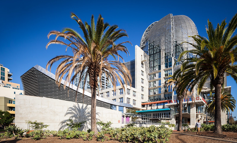
As you can tell from my photos of the library, Quigley's more of a post-modernist / deconstructionist. There are definitely some classic modernist elements in this design - but often incorporated in a post-modern way. That is to say, in bits and pieces that seem to reference this design vernacular with a wink and a nod. Post-modernism is not usually my thing, but I do like Quigley's Children's Museum and the UCSD Student Center. This library also really impressed me.
Anyway, the photos above and below are the result of my first quick walk-through of the building. I spent an hour or so walking quickly through and taking pictures off the cuff, without a tripod or any planning - a bit of a scouting mission, if you will. I hope to find the time to come back soon for more.
 |
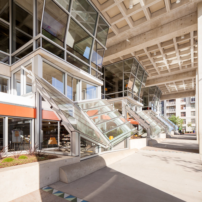
| The main entrance. These cantilevered window alcoves are a design theme with Quigley. He used the same in his UCSD Student Center. Photo ©Darren Bradley |
 |
| This building is an open book. Photo ©Darren Bradley |
 |
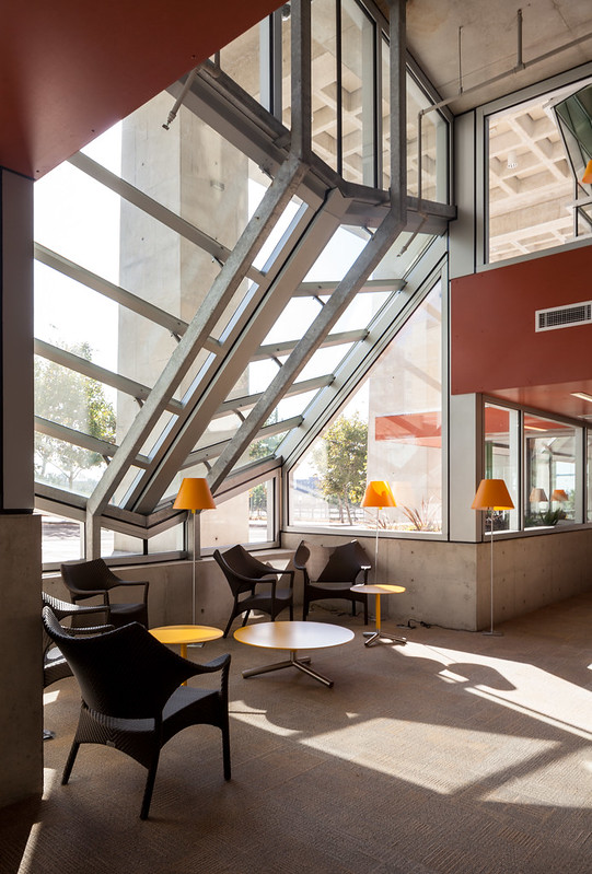
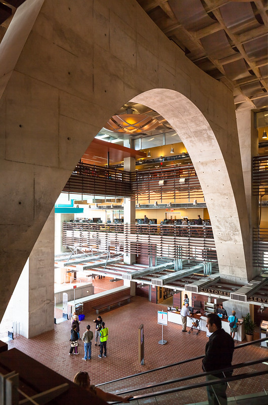
| Entry atrium, looking back towards the main entrance. Only a couple of minutes after it opened, it was already filling up rapidly. Photo ©Darren Bradley |
 |
| Photo ©Darren Bradley |
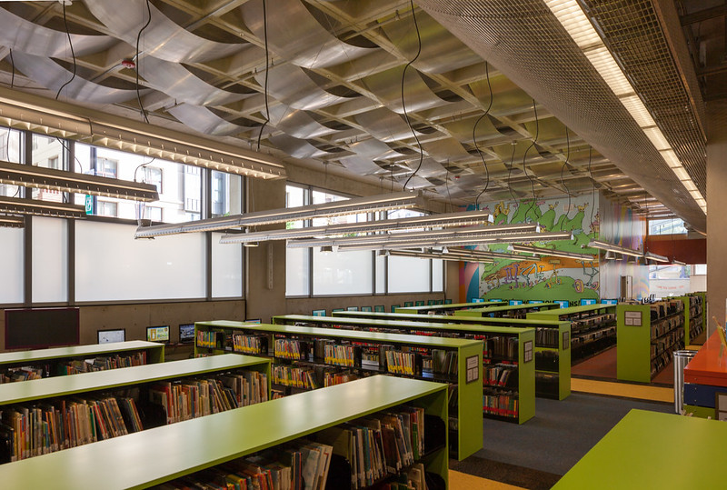 |
| San Diego's hometown favorite, Dr. Seuss, is on murals around the area. Photo ©Darren Bradley |
 |
| Photo ©Darren Bradley |
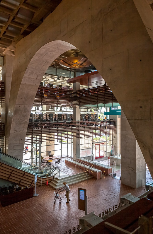 |
| This guy looked so excited to see this place. Photo ©Darren Bradley |
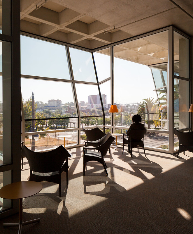 |
| Enjoying the morning sun. Photo ©Darren Bradley |
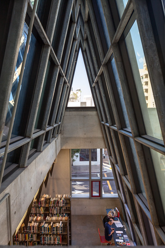 |
| Photo ©Darren Bradley |
Every one of the nine floors tells a different story as you climb up, and has different designs. Watching how the light plays off the windows in these various spaces was fascinating to me, and quite beautiful.
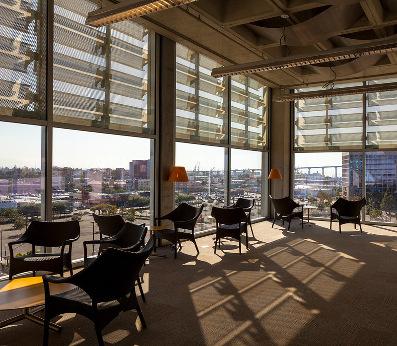
There's even a little rock garden on a terrace of one of the middle floors.
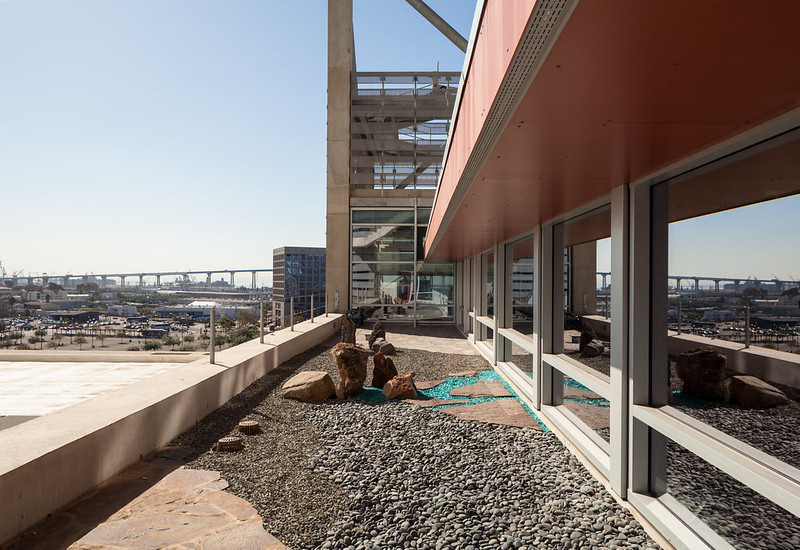 |
| Photo ©Darren Bradley |
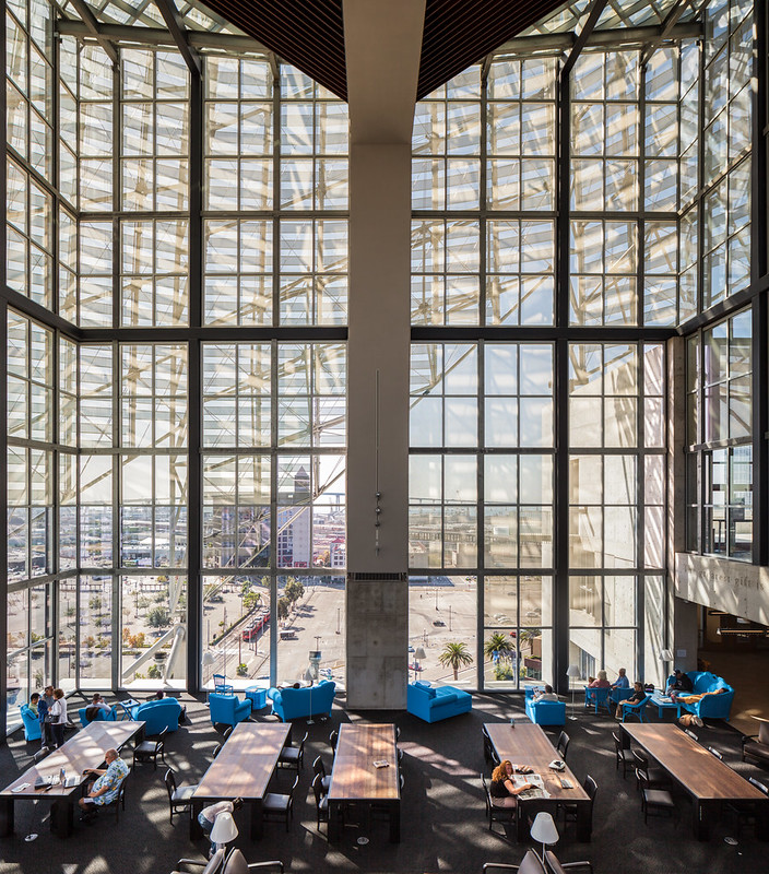 |
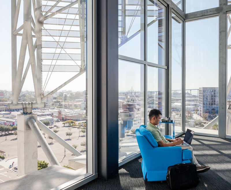
| The main atrium under the dome is 5 or 6 storeys tall, with stunning views of the south bay and Coronado Bridge. That campanile is the main transit center. Photo ©Darren Bradley |
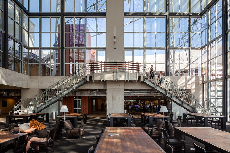 |
| View of the atrium looking back. Most people will enter this space from the low ceiling area seen at background. Photo ©Darren Bradley |
 |
| Photo ©Darren Bradley |
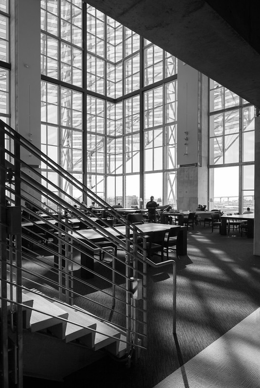
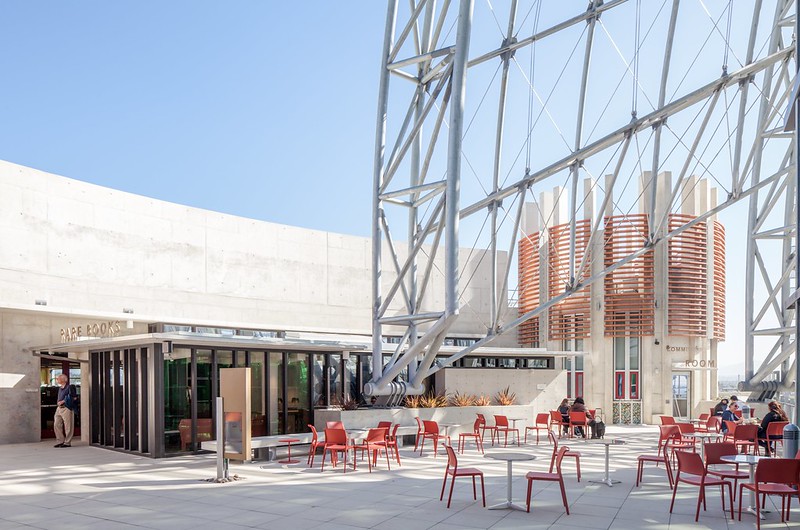
The stairs lead to a rooftop terrace on the 9th floor, which includes the rare book section, an art gallery, and several functional and conference spaces.
 |
| Photo ©Darren Bradley |
 |
| Photo ©Darren Bradley |
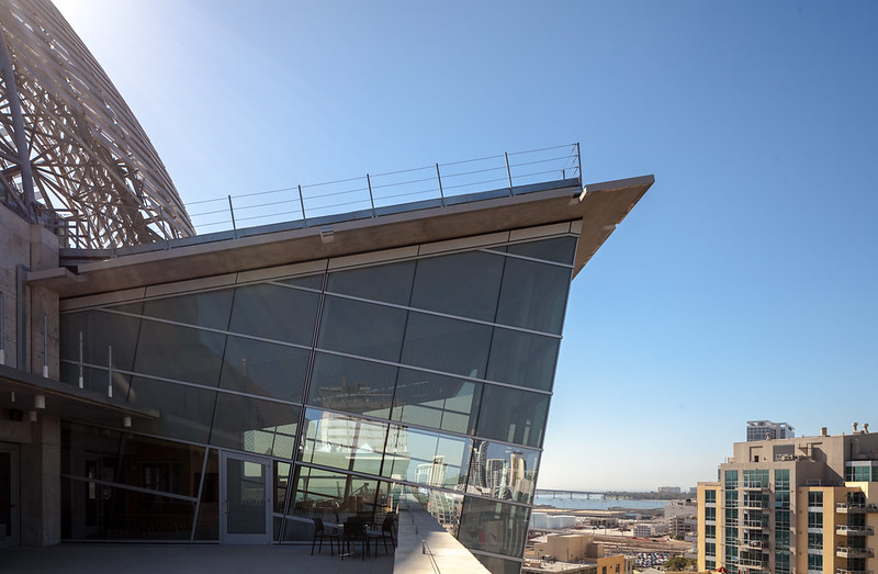 |
| Worst possible time of day to try to shoot this, but you get the idea. Photo ©Darren Bradley |
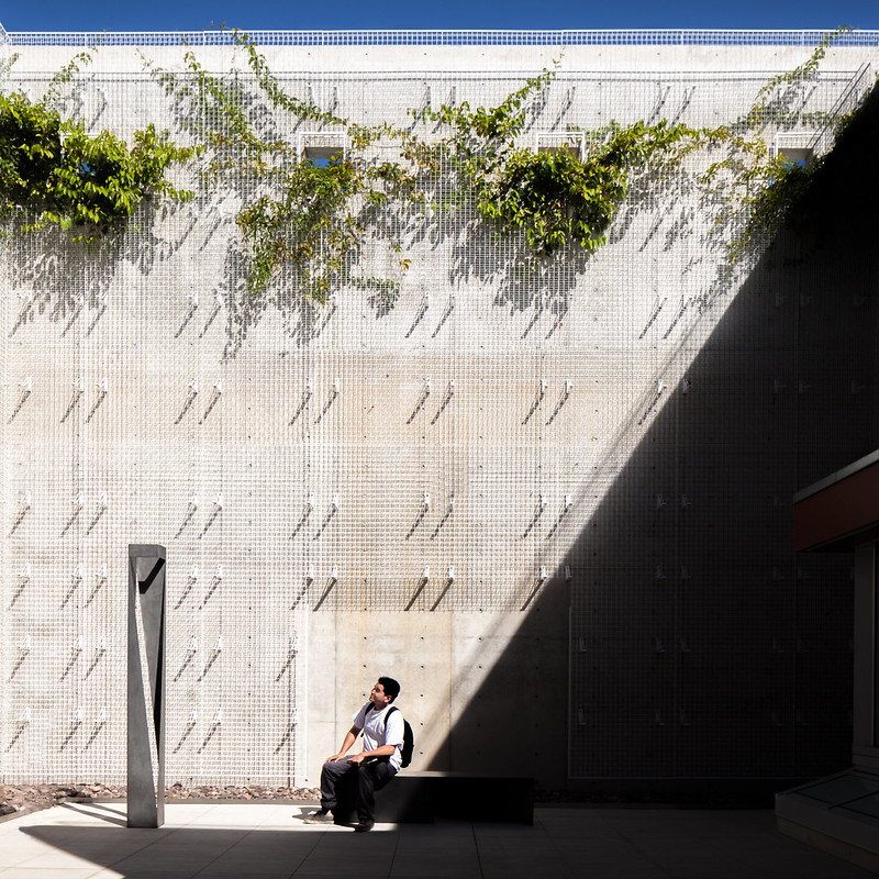 |
| I assume this will become a vertical garden wall at some point, once those plants fill in. Photo ©Darren Bradley |
 |
| Photo ©Darren Bradley |
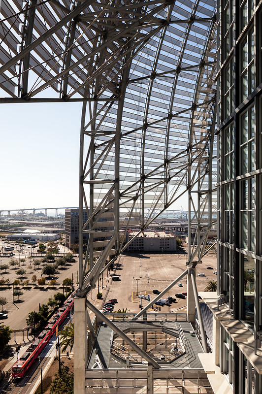 |
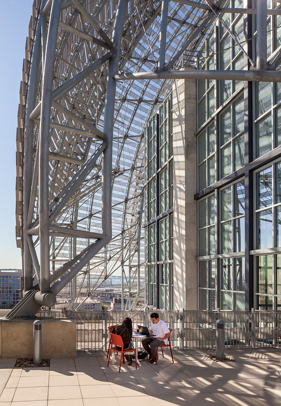
| More trusses. And yes, I waited intentionally until a trolley passed before taking this. Photo ©Darren Bradley |
 |
| Photo ©Darren Bradley |

5 comments:
Lovely pics and some really obviously successful elements but still not convinced that the whole assembly has any unity.
Excellent photo essay – mirrors my initial impression. I need to go back to the library to sort it out and find the places where I feel most comfortable.
I agree with Unknown, Oct 20, 13 commenter, about possible lack of unity. Stunning images on first take, but seems there's a lot going on not all of which relates to one another. It's almost as if there were themes taken from separate buildings. Although there are bits of continuity here and there but overall massive diversity within it seem to dominate.
Seems exciting place though from that, and if variety within a structure is what the design is seeking that's certainly accomplished.
Great images btw, but who's Chimay Bleue? At first i thought it was someone stealing credit for your copyright photos; is that a pen name you have or something? Very confusing to have that come up as one's mouse drags oveer each image. At first I thoght bradley was the name of the library, eac h photo here says " by Chimay Bleue on fliker, do you know that?
Post-modernism is not usually my thing, but I do like Quigley's Children's Museum and the UCSD Student Center. This library also really impressed me. كم اسعار الخيام الاوروبية | اسعار الخيام الاوروبية
The post is really awesome and I’d like to share it on social media. Don't forget to visit Chinese b2b platform
Post a Comment