 |
| Stairs to the Academic Quadrangle. One of two mosaic tile murals by artist Gordon Smith is visible. Photo ©Darren Bradley |
I was just in Vancouver, Canada for a quick two-day trip to visit family for Christmas. The short visit meant that I would have almost no time to see or photograph any architecture - despite Vancouver being full of great modernist treasures. Fortunately, I did find an opening on Christmas Day to sneak away for a couple of hours. Most people, when given the opportunity spend a couple of hours in one of the world's most beautiful cities, would probably head to someplace like Granville Island or Stanley Park, to take in the sites. I went to Burnaby...
 |
The main entrance to the campus is through this low bridge/tunnel thing, which leads to stairs on either side. Walk to the light...
Photo ©Darren Bradley |
Burnaby is probably not the first choice in any guide book on Vancouver, but it is the location of the renowned architectural masterpiece by great Canadian architect Arthur Erickson - Simon Fraser University. And I had never been there.
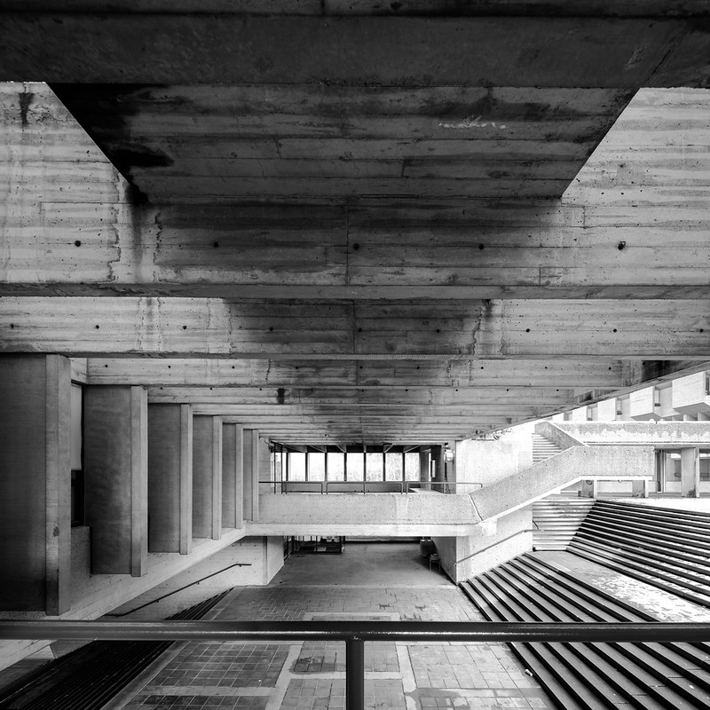 |
| Complicated geometry in the underground portion of the main entrance. Photo ©Darren Bradley |
With the drive out and back, it would mean I'd have about 20 minutes to photograph the place. That's not even close to enough time, but the sun was threatening to come out (for a change), and I thought I'd take what I could get. What's here is just a small sampling of what that campus has to offer to any modernist architecture fan. I need to go back.
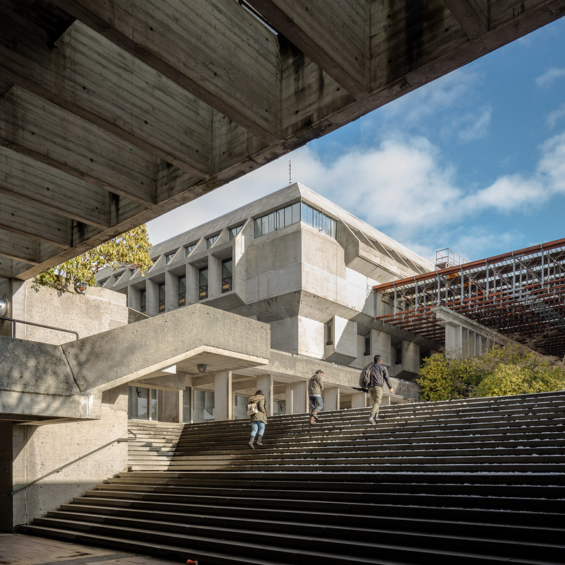 |
| Popping up from the underground entrance, we are first greeted with a nice view of the main library. Photo ©Darren Bradley |
Simon Fraser University (SFU) is located high atop Burnaby Mountain, in the far eastern edge of the Vancouver metropolitan area. It was the result of a competition held in 1963 for an entirely new campus. UBC Architecture Professor Arthur Erickson and his colleague, George Massey, won it handily.
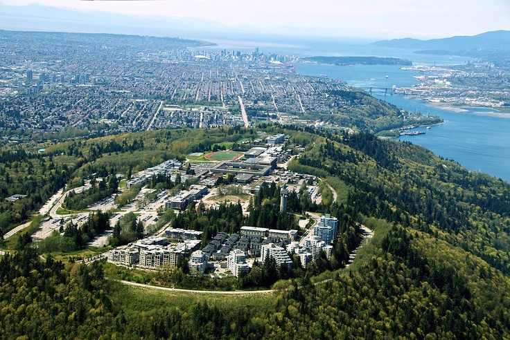 |
| Aerial view showing how the campus sits atop a mountain dominating all of Vancouver, like a modern day Acropolis (which was Erickson's conceptual vision for the design). None of the buildings in the foreground were part of the original Erickson concept, however. Note the towers which are contrary to Erickson's original design. |
The new school's first chancellor, Dr. Gordon M. Shrum, had provided a few informal guidelines to give the contestants an idea of what he was looking for in a successful design. Among his recommendations were that students should be able to move from one part of the university to another without going outside, and that the large lecture theaters should be grouped together rather than scattered over the whole campus. But he also wanted a campus that would project a view to the future, and would look just as modern in 1995 as it did in 1965. Erickson and Massey's brutalist modernist vision was just the thing (which is somewhat ironic, considering most people's view of brutalist modernism today).
SFU would be Erickson's first major commission, but others soon followed. He would go on to design the Canadian Pavilion at Expo '67 in Montreal.
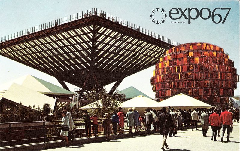 |
| Vintage postcard from Expo '67 in Montreal, showing Erickson's Canadian National Pavilion. |
Erickson had a host of other prestigious and high-profile commissions throughout his career - including the Canadian Embassy in Washington, DC. In San Diego, we have his convention center on the harbor.
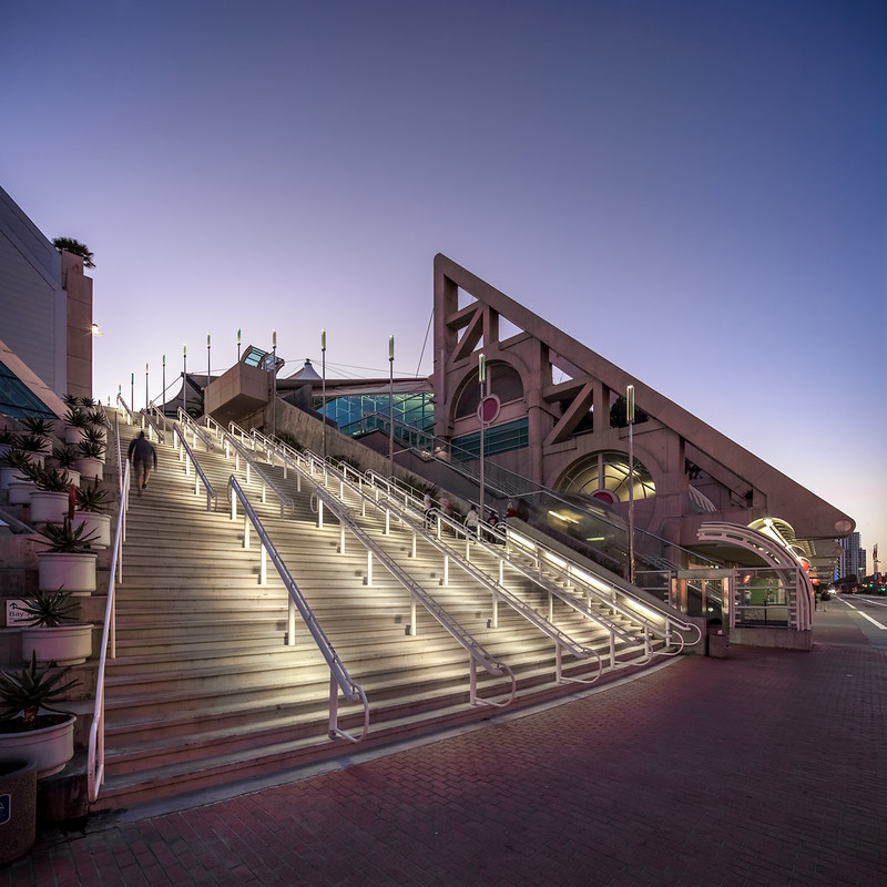 |
| The San Diego Convention Center by Arthur Erickson is the site of the annual Comic-Con. Photo ©Darren Bradley |
He was a devout modernist, and strongly disliked post-modernism. In a speech he gave to his alma mater, McGill University, in 2000, he said“... after 1980, you never heard reference to space again. Surface, the most convincing evidence of the descent into materialism, has become the focus of design. Space - the essence of architectural expression at its highest level - has disappeared." I couldn't agree more.
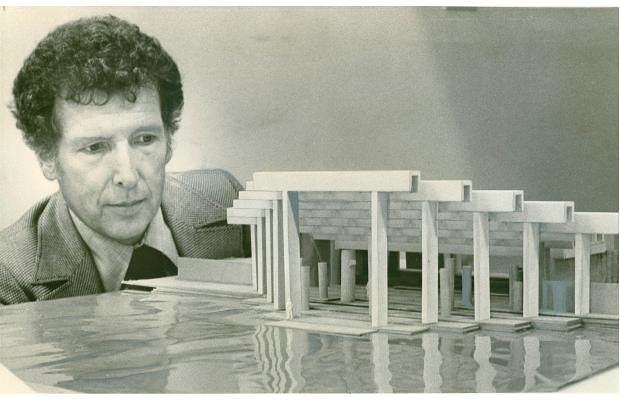 |
| Erickson with a maquette of one of my favorite of his designs, the Museum of Anthropology at UBC. |
Anyway, this rejection of post-modernism was probably responsible for his fall from popular grace for a while in the 1990s. He went deeply into debt and was forced to declare bankruptcy, but continued to design and build projects well into the 2000s. He died of Alzheimer's Disease in 2009, sadly.
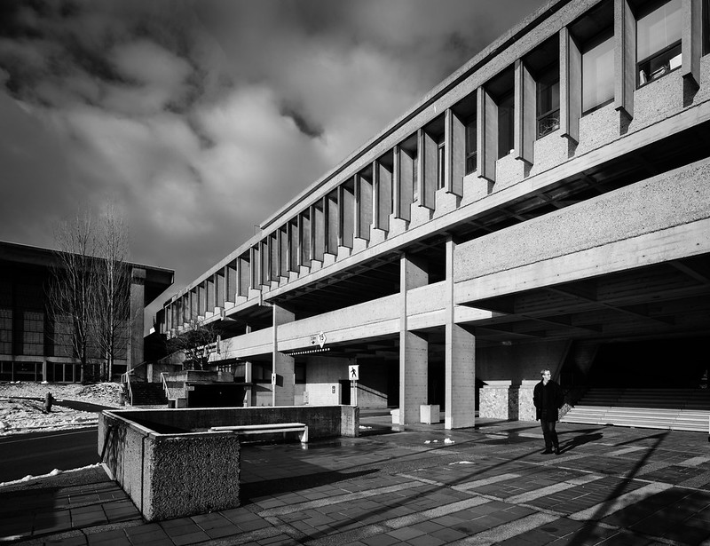 |
| Main entrance to the campus is up the stairs, under this bridge. Photo ©Darren Bradley |
But back to SFU. There were four other winners, who were selected to design sections of the campus, under Erickson's and Massey's supervision. These were William R. Rhone and Randle Iredale; Zoltan Kiss; Duncan McNab, Harry Lee, and David Logan; and Robert F. Harrison.
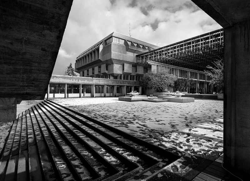 |
| From the entrance stairs to the large, covered plaza in front of the library. Photo ©Darren Bradley |
This campus would be the beginning of Erickson's long love affair with concrete. In fact, Erickson would later say that concrete was his favorite building material, and that was "the marble of our time".
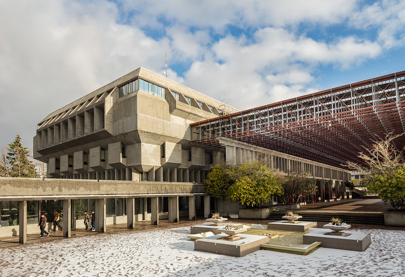 |
| Main Library and canopy over the plaza in front of its main entrance, intended to provide large spaces for students to congregate while shielded from the rain (and snow). Photo ©Darren Bradley |
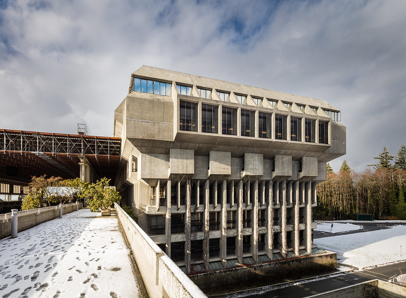 |
| That amazing library, as seen from the other side. Photo ©Darren Bradley |
His design for SFU was innovative in that he wanted a design that would be well adapted to the mountain top design. He envisioned a sort of modern-day Acropolis. His buildings would be low to the ground, often built into the hillsides, and terraced down the sides of the mountain, almost like a Mediterranean hillside town.
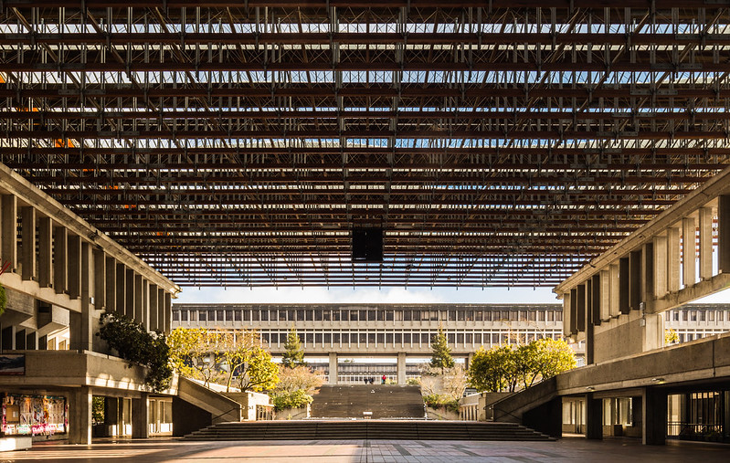 |
| A peek of the Academic Quadrangle on top of the mountain, with the long series of stairs leading to it. As seen from the covered plaza in front of the library. Photo ©Darren Bradley |
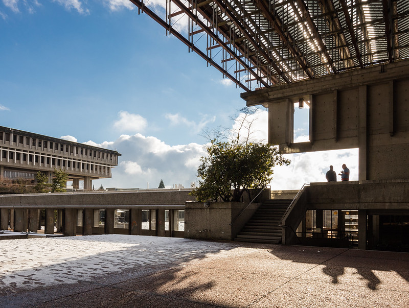 |
| Having a quick chat. Photo ©Darren Bradley |
But despite being a horizontal campus, classrooms, offices and lecture halls are laid out in a way to minimize travel time between them, and the overall design is quite compact.
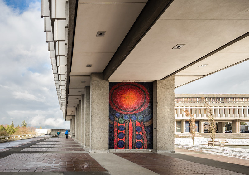 |
| Entrance to the elevated Academic Quadrangle, where visitors are greeted by two giant mosaic tile murals by the Canadian artist Gordon Smith. Photo ©Darren Bradley |
Traditionally, various faculties and departments would have their own, separate buildings. But Erickson also wanted a design that would encourage academic departments to work together and collaborate, and would eschew traditional hierarchies in academia. So buildings were connected into single, collaborative environments that blurred all those lines. Remember, this was the 1960s, after all, and SFU became a hotbed of political and social activism.
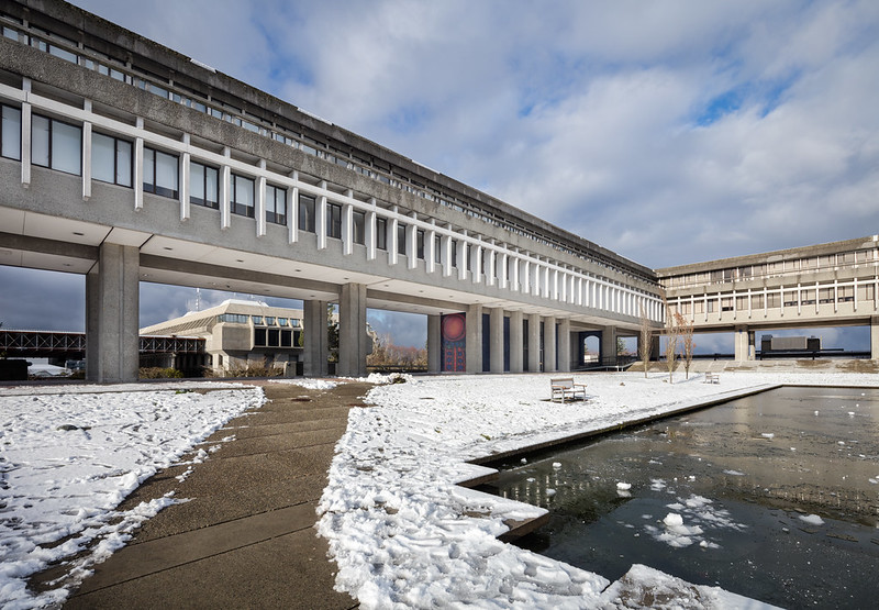 |
| Most classrooms and offices were designed to be in this elevated square building, called the Academic Quadrangle, which was joined on all four sides. In the courtyard in the center is a park and reflecting pool (seen here frozen over). Photo ©Darren Bradley |
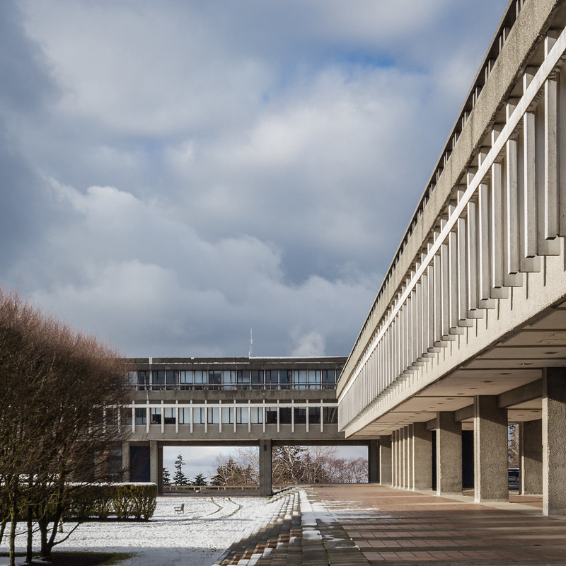 |
| Inside the courtyard of the Academic Quadrangle. Photo ©Darren Bradley |
Ironically, this activism eventually led to a huge dispute between the faculties of several departments and the academic experiment was put to rest. So much for Erickson's idea of forcing people to work together...
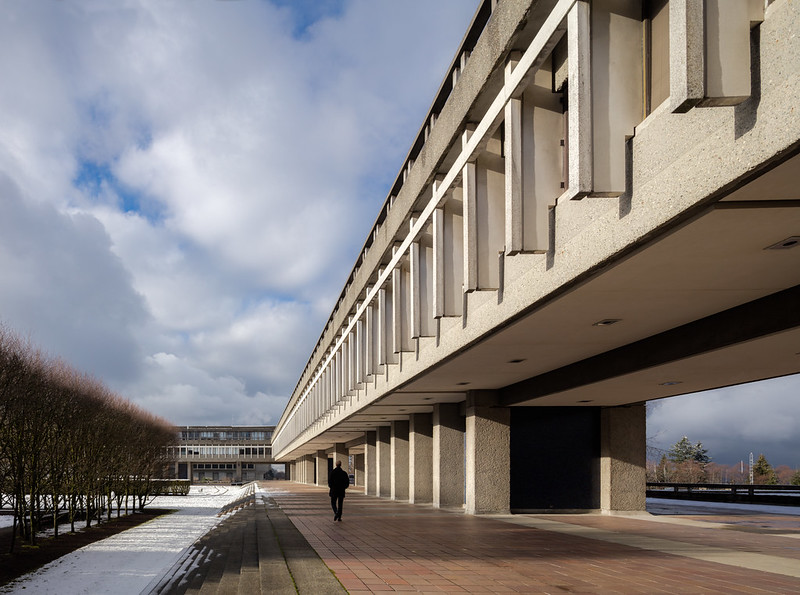 |
| Loving those fins... Photo ©Darren Bradley |
SFU is celebrating is 50th anniversary in 2015 and still looks great. Fortunately, subsequent additions to the campus have been done in an extremely sensitive manner. Yes, you can tell where the 60s ended and the 70s, 80s, and 90s began with various parts of the campus. I didn't have time to photograph any of that. But the overall effect is still very striking and cohesive. And the original Erickson campus is lovingly preserved.
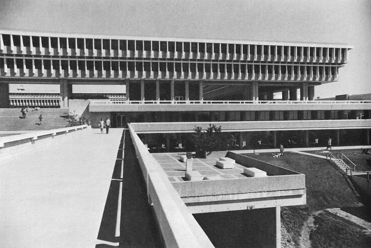 |
| Vintage photo of the original campus, with the Academic Quadrangle above. Photographer unknown. |
Next time you're in Vancouver, a trip out to Burnaby Mountain is definitely worth the effort.




I come here to follow your blog from your instagram...got to tell you I enjoy reading your blog post very much! Please continue to share more fabulous buildings' photos and your thoughts on them :)
ReplyDeleteThe quote about surface as the “evidence of the descent into materialism” was very interesting to read. Maybe it was the “descent” or may be “surface” is easier to understand and relate to. Still, it was a loss.
ReplyDeleteThere is an office building going up not far from my house. It is simple in shape, just a box really. When driving past by it recently, I noticed it is being beautified by ornamental panels of plants or fruits or something of that nature. Looked like terracotta imitation. Welcome to 2016.
On an related subject, it looks like you beat the time record of the googie project in NJ. What’s your day rate again?
Happy New Year!
Just discovered this recently while watching a random netflix sci-fi movie Halo 4: Forward Unto Dawn, which sounds silly, and it was, but kinda fun. Thought 'that cant be real' but since it wasnt very high budget, thought id better look it up, and to my surprise found it was not only real, but better than in the movie ! Now that Ive looked it up the other way round, seems its been used for many sci-fi movies and tv series. A vision of the future from the past still works as a vision of the future ! Love the library particularly.
ReplyDeleteThis activism eventually led to a huge dispute between the faculties of several departments and the academic experiment
ReplyDeleteBeautiful Structure. it's a huge pleasure to see such trasure
ReplyDeleteThis comment has been removed by the author.
ReplyDeleteThis comment has been removed by the author.
ReplyDeleteHello, I am very impressed by your ideas and choices of vocabulary. To be honest, my first impression of SFU was not very good, "brutalist architecture" was what I had in mind. However as time passes, my university never seem to age... it just looks as mordern and futuristic as the designer perhaps wished for. After graduating for 10 years roughly, I began to feel the warmth and power of all those raw concrete. Thanks a lot for your article, it helps me to understand my special feelings towards my uni, and I recommend it to all the SFU students. We are so lucky...
ReplyDeleteI was really enjoying the photos so much.It's just outstanding designs.I have no more words to say anything about it.Just mind blowing.
ReplyDeleteWhat a magnificent architect design.Thanks for sharing this lovely post with us
ReplyDeleteRaster to vector convertion
Is this a university or a museum! I mean it's just mind blowing designs.So so beautiful.Thanks
ReplyDeleteClipping path service
Excellent and superb post
ReplyDeleteclipping path service provider
clipping path service
background removal service
Thank you so much for your travel pictures. Hope you are capturing some awesome moments in your devices. We are clipping USA, offering the best background Service and image retouching service to make your pictures great. Check out our website for a free trial.
ReplyDeleteNice...Our website : https://imagecutoutartist.com/
ReplyDeleteHow spanking this well post you have shared with us . A great thanks for for this well published . Keep it up . Ghost Mannequin | Photo Resize | Drop Shadow
ReplyDeleteZkteco Bangladesh is a Brandable access control and fingerprint product supplier. They Have many useful access control products like ZKTeco F18 Fingerprint Access Control and Time Attendance Machine. Do you know about zkteco f18 bangladesh? ZKTeco F18 is popular in bd as the name of zkteco f18 bangladesh. it is really nice and high quality.
ReplyDeleteBoris, thank you. As I mentioned, I only had a very limited time to photograph the house so I focused on a few key shots that I wanted. There were lots of rooms and angles that I did not take. So views are restricted outside of the courtyard and pool areas. Thanks again.
ReplyDeleteClipping Expert Asia provides the best high-quality Bulk Photo Retouch and Clipping Path services around the world at unbeatable prices.
Clipping Expert Asia
Conference System made easy for us to arrange meeting easily. AhujaBD offer you top quality wireless conference system at affordable price in Bangladesh.
ReplyDeleteZkteco is one of the most familiar Access Control and Attendance Management System Device In Bangladesh. It is famous for zkteco bangladesh strong security system. Its also popular for it’s quality. Because They never compromise with their quality.
ReplyDeleteNonwoven polypropylene is the new miracle of fabric. Its recyclable plastic fabric that is often used to promotional tote bags. The question why its recyclable it’s because the non woven bag can be wiped clean, and some of them are machine washable in cold water if they are drip dried.
ReplyDeleteAppreciated for sharing. Clipping Way
ReplyDeleteHighly appreciation. Thanks. Color Correction Service
ReplyDeleteCan i know, which camera you use for taking those photography, Looking so clear and professional photography. We Clipping service USA Graphic Design house provide clipping path service for our clients, if you need any kind of photo editing service feel free to contact with us.
ReplyDeleteeCommerce revenue growth in Canada is surprisingly flat but has a compelling future as consumer patterns change and Canadian retailers invest. Shifting demographics and a lack of brand e-commerce dominance provide a great opportunity for retailers to establish competitive advantages in a relatively untapped marketplace. car transparent background
ReplyDeleteI really appreciate reading such kinds of blogs. Thanks for sharing such informative articles.
ReplyDeleteDrop Shadow Service
Background Removal Service
Yes, I also look the Modernism through the eyes of an architectural photographer. You have great insight. Your photos are revealing how beautiful these campuses are!
ReplyDeleteOffice Space Rent In Gulshan
I really like your blog post, Thanks for sharing. I appreciated this well shared . Keep it up sharing .
ReplyDeleteClipping Path Service
An excellent post of modernism through the eyes of an architectural photographer. The Simon Fraser University is looking great in photographer's captures.
ReplyDeleteVerified Neteller Account
Amazing architectural photography of Simon Fraser University. It is a big architectural wonder in Vancouver.
ReplyDeleteWhat is others in storage Android
So good and effective shared. I have read and applaud this job. Neck Joint
ReplyDeleteClipping Path
Background Remove
Image Editing
eCommerce Photo Editing
Photo Cut Out
Image Manipulation
Image Retouching
Drop Shadow Helps
Clipping Path Tutorial
Hello, I am very impressed by your ideas and choices of vocabulary. To be honest, my first impression of SFU was not very good, "brutalist architecture" was what I had in mind. However as time passes, my university never seem to age... it just looks as mordern and futuristic as the designer perhaps wished for. After graduating for 10 years roughly, I began to feel the warmth and power of all those raw concrete. Thanks a lot for your article, it helps me to understand my special feelings towards my uni, and I recommend it to all the SFU students. We are so lucky...
ReplyDeleteClipping Path
This comment has been removed by the author.
ReplyDeleteI want to say that this article blows my mind. I realize that now I can edit my photos easily. Thank you so much for this wonderful article. It helped me a lot.
ReplyDeleteclipping path
Really good post! it's a very helpful article Maintain sharing more useful and also useful posts. Thanks.
ReplyDeleteYou can also visit:
image masking service
Image Masking Service
ReplyDeleteYet the old time fairy tale, having served for generations, may now be classed as “historical” in the children’s library; for the time has come for a series of newer “wonder tales” in which the stereotyped genie, dwarf and fairy are eliminated, together with all the horrible and blood-curdling incidents devised by their authors to point a fearsome moral to each tale. Modern education includes morality; therefore the modern child seeks only entertainment in its wonder tales and gladly dispenses with all disagreeable incident.
ReplyDeleteL. Frank Baum, "The Wonderful Wizard of Oz", 2
Buy Smart TV Now click here Buy New TV
ReplyDeleteIt's really nice to read and very informative. So much thanks for the sharing. I was looking for that and this is very important for me. Thanks! Verified Coinpayment Account
ReplyDeleteNice Post
ReplyDeleteCheck Me Out
Mortgage broker in surrey
This is so much more effective for us. Thanks for the discussion.
ReplyDeleteYou can visit our website. Web- https://graphicexpertsindia.com/clipping-path-service-provider-company/
I find this article very informative about Simon Fraser University. Thanks for sharing such a good piece of information. It's time to get Telemarketing Services click for more information.
ReplyDeleteThanks for sharing.
ReplyDeleteVisit for cheese burger Ballarat
As soon as your microwave turns into glowing clear, you'll really feel a lot lighter and more healthy, psychologically, and would get a brand new zest and zeal to cook dinner delightfully scrumptious microwave recipes and might't cease patting your self in your achievement. If you want to learn more about this topic please visit remove over the range microwave.
ReplyDeleteI am watching a not-too-good film called The Groundstar Conspiracy and the star isn't George Peppard or Michael Sarrazin but the architecture. I thought it would be a university and checked imdb to find out. Very striking spaces and structures. Not sure if the materials will have lasted though, the film is from 1972.
ReplyDeleteBest Indian Travel Agency Database at Best Price In india
ReplyDeleteBest Services of upholstery cleaning brisbane at best price
ReplyDeleteThe concept of a brutalist Acropolis in Great White, which refers to a monumental, bare-concrete structure set against a stark white landscape, can elicit a range of reactions from different individuals. Some may appreciate the raw, uncompromising aesthetic of brutalism, which often emphasizes functionality and a sense of timelessness. Others may find it austere and uninviting.
ReplyDeleteSee Some our photo booth picture frame Picture
I absolutely love the article about Simon Fraser University! I am from Vancouver and have been on the campus many times. Its unique architecture has always caught my eye and I love learning about its origin and history. I think it is such a great example of Brutalist architecture and how it can be used to add a distinct charm to a place. Thanks for bringing this to my attention!
ReplyDeleteCheck out our Image Retouching
best blog keep posting what a wonderful blog Dpi For Web
ReplyDeleteThis type of artistic creation has something special I think. Photoshop image clipping path
ReplyDeleteprivate notary in Dubai are authorized individuals or law firms that offer notary services for private use. Although their services are not recognized by the government, they can still be useful for certifying and authenticating legal documents.
ReplyDeleteLime Kiln Dust Orlando is a versatile and high-quality product that proves to be an exceptional addition in various construction and agricultural applications.
ReplyDeleteRamma Foundation Repair is the trusted name for Foundation Repair Edmonton services. With their expertise and commitment to excellence, they ensure the stability and longevity of your property's foundation. Trust Ramma Foundation Repair for reliable and effective solutions for all your foundation repair needs in Edmonton.
ReplyDeleteDiscover luxurious Cabo San Lucas Villas offering unparalleled comfort and breathtaking views. Indulge in the ultimate getaway with our exquisite casa cielo cabo services, ensuring a memorable and sumptuous stay in paradise.
ReplyDeleteTo be very honest, "brutalist architecture" was what I had in mind when I initially saw SFU. But as time goes on, my institution doesn't seem to age—rather, it simply seems as modern and futuristic as the architect could have imagined. About ten years after I graduated, I started to sense the force and warmth of all that raw concrete. Thanks for sharing informative news.
ReplyDeleteeCommerce photo editing service
CMOLDS emerges as the premier mobile app development company in uae, blending innovation with excellence. Our dedicated team crafts tailor-made solutions, leveraging state-of-the-art technologies for unparalleled user experiences. Partner with CMOLDS for transformative digital solutions in the dynamic landscape of the UAE.
ReplyDeleteVisiting Simon Fraser University was a brilliant choice! The Erickson design is a stunning example of brutalist architecture, seamlessly blending with the natural landscape. Your photos beautifully capture the unique geometry and thoughtful layout. SFU truly stands as a modernist gem, and your insights make me eager to visit!
ReplyDeleteClipping Path service
Ramma Foundation Repair offers expert Foundation Repair Edmonton, addressing structural issues with precision. Our team ensures lasting stability and safety for your home with top-notch techniques and materials.
ReplyDeleteFor precise and efficient concrete cutting services in Ballarat, experienced professionals are ready to handle projects of all sizes. Whether you need concrete removal, wall sawing, or core drilling, you can rely on local experts to deliver top-notch results with minimal disruption. Concrete Cutting Ballarat
ReplyDeleteI ended up here because I am visiting Boston and the city hall here reminds me so much of SFU. I loved the architecture, look, feel and function of SFU when I was an undergrad there in the 90’s. This was long before I had heard of brutalist architecture, it just felt right. It felt somehow reassuring and epic at the same time, and there were tons of hidden gardens and spaces. Incidentally I was working on a “interdisciplinary studies” degree while there, the only rule was you had to take classes in at least 7 different schools I think. So at least in that way the cooperation between departments persisted (into the 90s).
ReplyDeleteThis is the kind of content that keeps me coming back. Thank you!
ReplyDeleteVisit Here: Photo Color Correction Service
Great Article!
ReplyDeleteClipping Path Service Provider
Image Masking Service
Ghost Mannequin Service
The idea of a brutalist Acropolis in Great White, with its massive concrete structure against a stark white backdrop, really makes an impression. Some people love the bold, raw aesthetic of brutalism—it's simple, functional, and has a timeless feel. Others might find it a bit cold or unwelcoming.
ReplyDeleteIf you enjoy striking visuals like that, check out some of our car photo editing and retouching work—there’s a lot of cool frames we’ve worked on that you might like!
Loved this in-depth look at Simon Fraser University's iconic architecture! Just like great architecture enhances a campus, ecommerce photo editing enhances product presentation—making images stand out and convert better. And if you're aiming for precision in visuals, clipping path services are essential for achieving that clean, professional look. Great design—whether in buildings or photos—always makes an impact!
ReplyDeleteShop stylish Buy designer pret wear California, offering ready-to-wear outfits that blend contemporary cuts with rich cultural elegance. Perfect for casual and semi-formal events.
ReplyDeleteWhen it comes to protecting your home or commercial property, nothing offers more security, privacy, and curb appeal than high-quality fencing. At Brent Wood Roofing, we proudly provide professional and reliable fencing services in Friendswood TX designed to meet every need—whether you're upgrading your backyard, enclosing a pool, or installing fences around a business facility.
ReplyDeleteNice post mate, keep up the great work, just shared this with my friendz
ReplyDeletelangley landscapers
The Goodsill Residence is a beautiful showcase of thoughtful design and creativity truly inspiring. For students balancing academic demands with interests like architecture or design, managing coursework can be tough. That’s why support like
ReplyDeletehire someone to take my math class through Math Class Help allows learners to stay on track academically while exploring what inspires them most.
This beautifully detailed look at the Goodsill Residence really captures the essence of modernist design and its connection to nature—Ossipoff’s work is truly timeless. Showcasing architecture like this online can reach a wider audience with the right use local seo companies houston strategy to connect design enthusiasts and history lovers alike.
ReplyDeleteThis comment has been removed by the author.
ReplyDeleteVery interesting! The architectural concept of Simon Fraser University is both striking and iconic. Visit: mobile app development company in perth
ReplyDeletemobile app development company in brisbane