 |
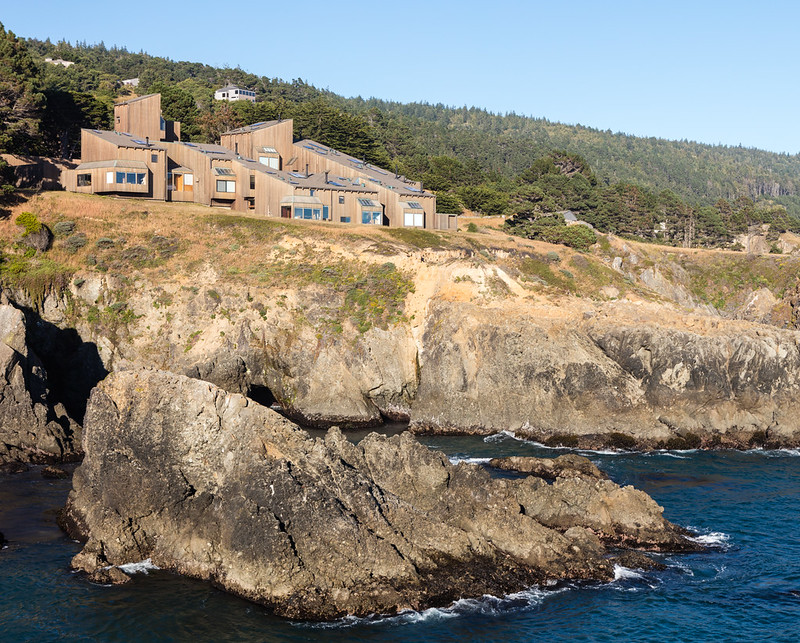
| Sea Ranch Condominium 1 by MLTW (1966). Photo ©Darren Bradley |
The Sea Ranch is an architectural masterpiece. Mention that you are visiting this mythical place to just about any architect or designer, and you are almost certain to get a look of wistful longing in return - tinged perhaps with a bit of jealousy. And what's not to love? It's really a masterful blending of architecture and nature in a stunningly beautiful environment. Even people who claim not to like modernist architecture are taken in by its beauty. And yet, one of its principal creators, Charles Moore, was an architect who later became a champion of the Post-Modern Movement, embracing kitschy and almost cartoonish themes in his work.
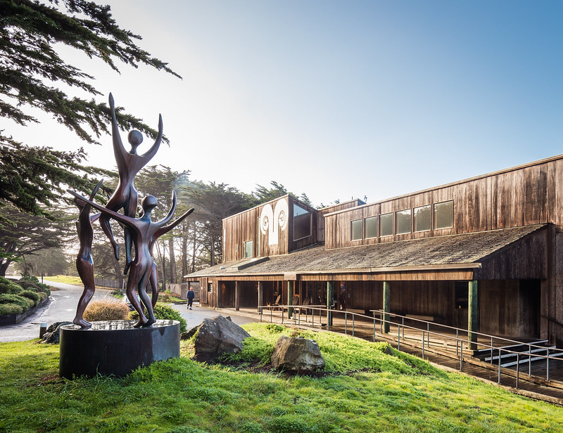 |
| Entrance to Sea Ranch Lodge & Store by Joseph Esherick (1964). Statue by Robert Holmes. Photo ©Darren Bradley |
From the beginning, everyone knew that the Sea Ranch was going to be a special place. This stretch of rugged, desolate coastline about 100 miles north of San Francisco was in an area that was relatively free of development. Oceanic Properties, the real estate subsidiary of one of Hawaii's "Big Five" corporations, Castle & Cooke, bought the land in 1964 with the intention of developing an ecologically sensitive community that would harmonize with the beauty of the natural surroundings. It was going to be free of the normal commercial pressures that generally going along with real estate speculation and development.
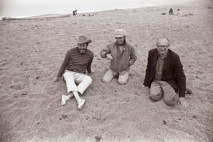 |
| Lawrence & Anna Halprin, and Charles Moore at Sea Ranch (1966). Photo by Lawrence Halprin Collection, The Architectural Archives, University of Pennsylvania. |
The guy on point for Oceanic Properties, Al Boeke, had a very specific vision. He hired landscape architect Lawrence Halprin, to do a complete study of the area to do a development plan that would be sensitive to the local ecology, microclimates, wind, and other conditions.
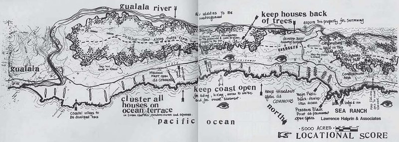 |
| One of Lawrence Halprin's original site plans for Sea Ranch development. |
The site consisted of 5,000 acres of windswept, rocky coastline with a series of exposed, relatively flat meadows on bluffs overlooking the ocean, and then turning into protected, wooded hills after a few hundred yards. The Highway 1 essentially acts as the dividing line between the two typologies. The occasional row of cyprus trees had previously been planted in the meadows to act as wind breaks, and run perpendicular to the shoreline.
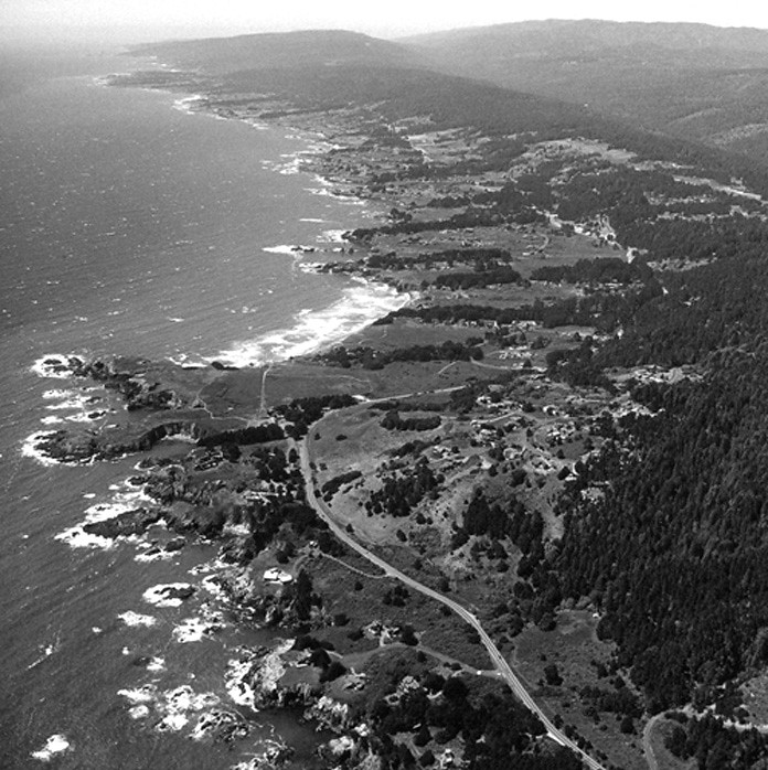 |
| Vintage aerial view of Sea Ranch |
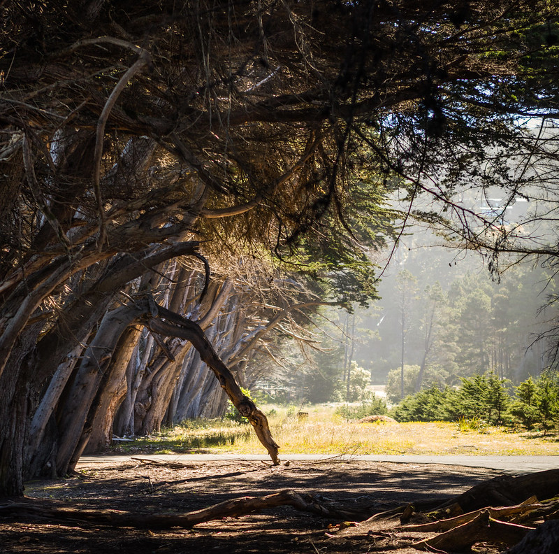 |
| One of the many "hedgerows" of cyprus trees that serve as windbreaks along the shoreline. Photo ©Darren Bradley |
Boeke then hired Joseph Esherick for the design of the store/sales office in 1965, and for the first houses shortly thereafter.
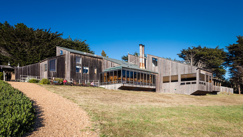 |
| Store and restaurant (now also lobby for lodge). Photo ©Darren Bradley |
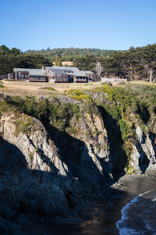 |
| Store and restaurant (and now lodge). Photo ©Darren Bradley |
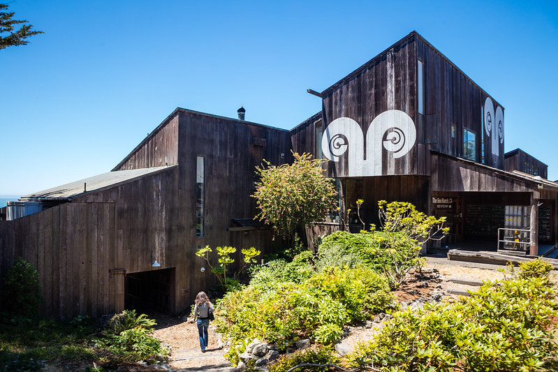 |
| The famed Sea Ranch Ram's Head logo designed by Barbara Stauffacher. Al Boeke loved it so much, he had it put on everything. Photo ©Darren Bradley |
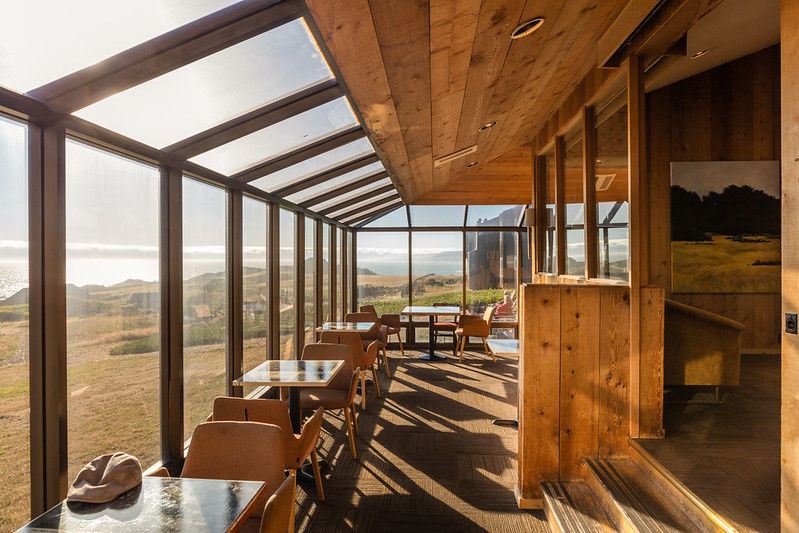 |
| Interior of the lobby / restaurant. Photo ©Darren Bradley |
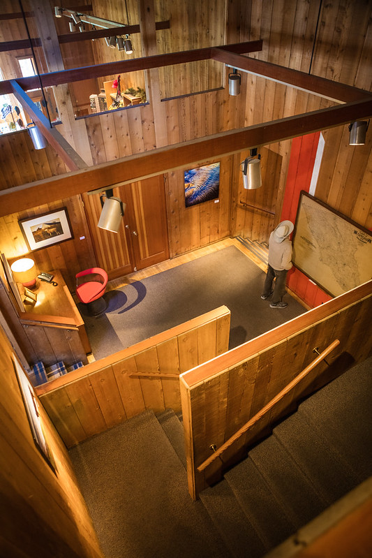 |
| Sea Ranch Lodge. Photo ©Darren Bradley |
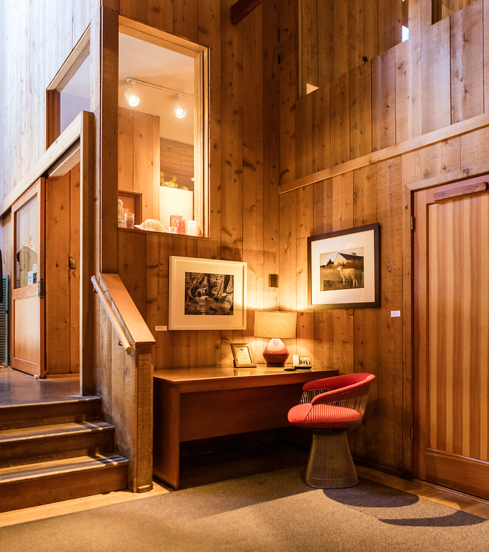 |
| Sea Ranch Lodge. Photo ©Darren Bradley |
 |
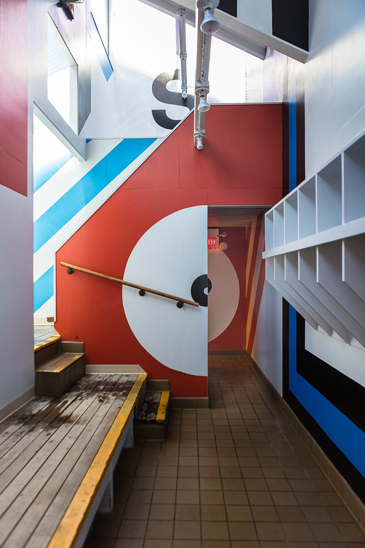
| Detail of the exit signs at the lodge. Photo ©Darren Bradley |
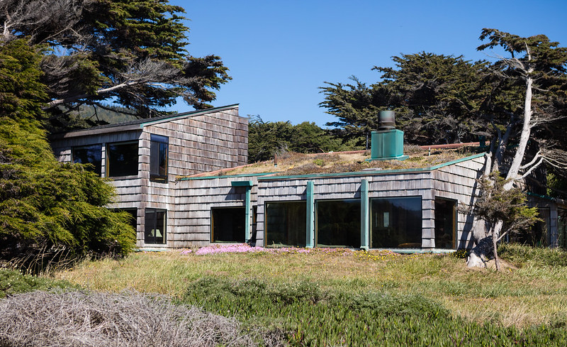 |
| One of the few original Esherick-designed houses that still has a sod roof. Photo ©Darren Bradley |
The architectural firm of Moore, Lyndon, Turnbull, Whitaker (MLTW) were brought in to design an series of condominiums in 1965. The plan was to have Esherick design small clusters of homes in and around the trees of the windbreaks. MLTW would design condos that would sit on the bluffs in the meadows. It would be Moore's first major project.
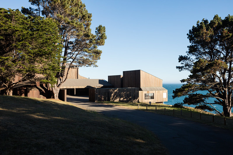
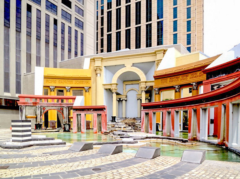
Admittedly, I first knew of Charles Moore's work through his later post-modernist projects from the 1970s and 80s. And frankly, they're not really my thing. Once, when visiting New Orleans many years ago, I came across a chintzy caricature of an Italianate piazza in bright, gaudy colors. I had no idea who designed it but assumed it was some sort of cheap, temporary exhibit. I only found out later that it was a seminal example of post-modernist architecture by none other than Charles Moore...
And let's not forget that this is also the same Charles Moore who replaced William Pereira as campus architect at the University of California Irvine. Moore treated his predecessor's work with complete disregard and lack of respect.
Besides irrevocably modifying the unique, park-like circular campus plan that Pereira had planned, he changed the design language from modernist to... well, this:
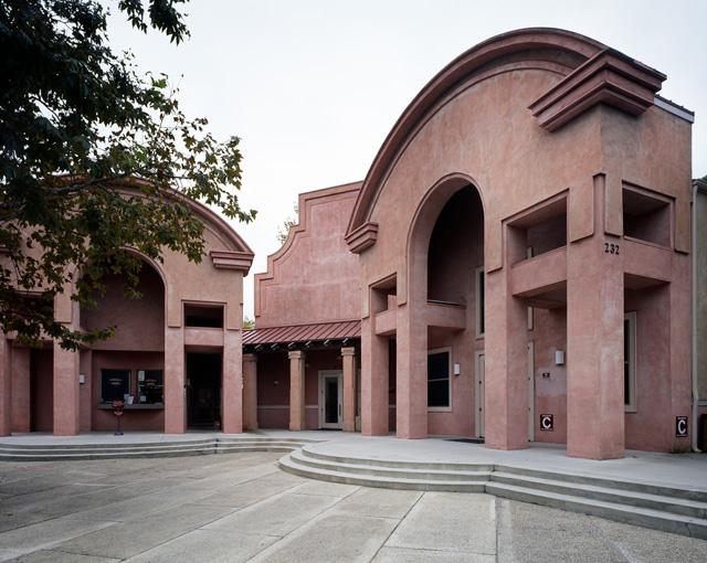 |
| UC Irvine Extension Alumni Center. Photo courtesy of UCI. |
But that was to come many years later. These were still early days, and modernism was still the thing - even for Charles Moore. For the Sea Ranch Condominium project, Moore turned to local vernacular architecture, such as the former barns of the sheep ranch that previously occupied the site.
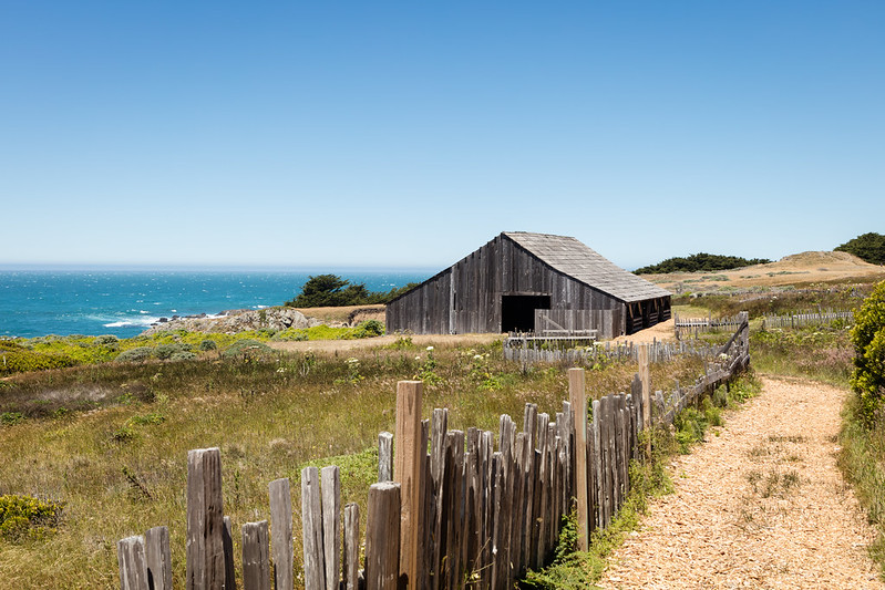 |
| One of the old barns from when Sea Ranch was a sheep ranch. Today, it sits empty save for some swallows nesting. Photo ©Darren Bradley |
He was also greatly inspired by the chapel at nearby Fort Ross - the former Russian colony that once occupied this territory in the early 19th century.
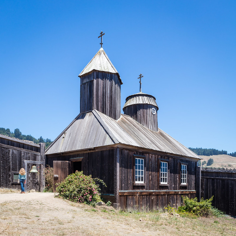 |
| Russian Orthodox Chapel at Fort Ross. Photo ©Darren Bradley |
Overall, though, Moore felt that the building would have to have a certain mass to avoid being completely dwarfed by the vast, open territory around it. For that reason, he felt that condos were more suited than houses to this land.
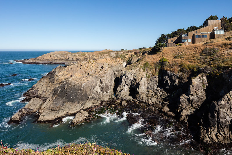 |
| Moore referred to Condominium 1 as "the Wooden Rock". Photo ©Darren Bradley |
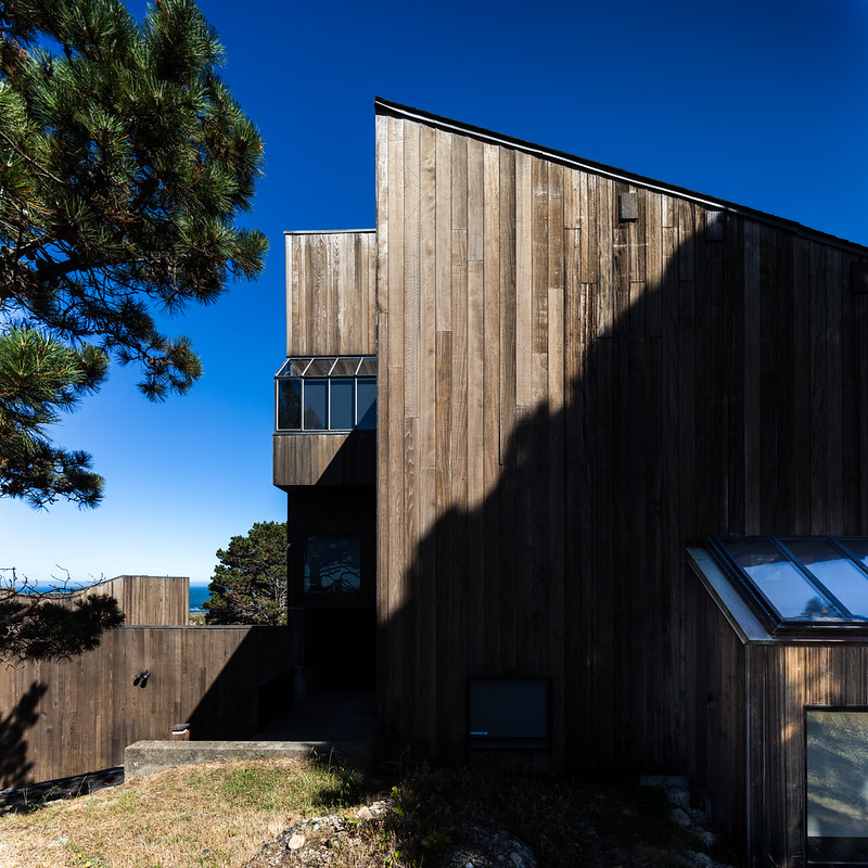
Moore claims that his firm and Esherick did not coordinate or communicate at all about their respective designs, but still ended up using basically the same design solutions because that's what the environment called for. This included sloping shed roofs angled to deflect the wind, no eaves or overhangs that could be ripped off by the strong gusts, and interior courtyards and protected gardens. Essentially, allow people to enjoy the sun without being blown away by the wind. Also, because of the strong spray of salt water coming off the ocean, which tends to coat windows, Moore didn't want a lot of clerestories - at least not too high up so they'd be hard to access and wash.
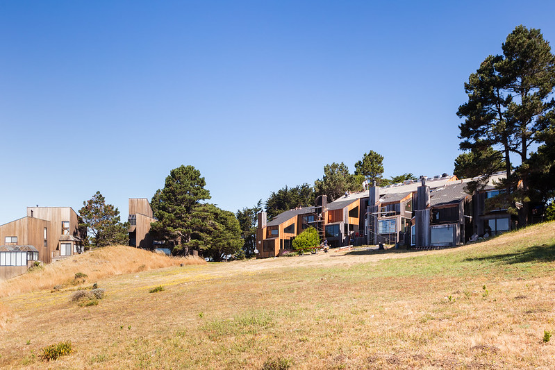
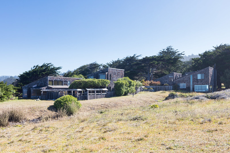
Condominium 1, completed in 1966, was the stunning result. From the outside, it evokes a modernist version of a medieval village or farming community.
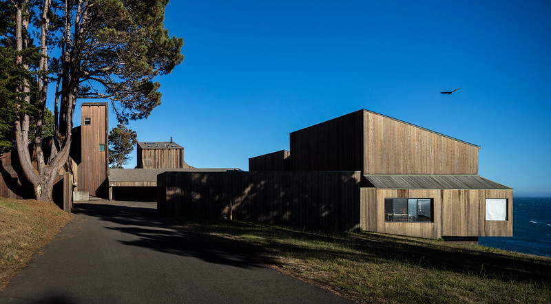 |
| Entrance to Condo 1. Photo ©Darren Bradley |
The terraced compound mirrors the sloping hillside terrain adjacent to the ocean cliffs. There is an outer courtyard for the cars.
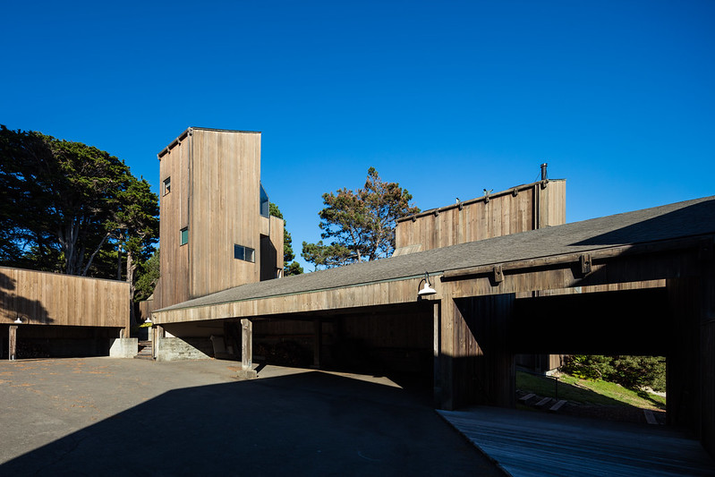 |
| Carpark courtyard at Condo 1. Photo ©Darren Bradley |
Passing through a tunnel, you will find a much more intimate and protected courtyard intended to spend time relaxing out of the wind. One feels at once both exposed to nature and protected from it. Anyone who's ever spent time on an old farm in Europe will recognize the design language.
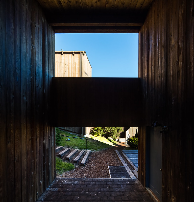 |
| Tunnel leading from the outer courtyard to the inner courtyard. Photo ©Darren Bradley |
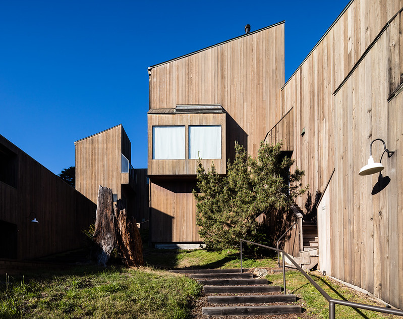 |
| Looking up the steeply sloped hill within the inner courtyard. Photo ©Darren Bradley |
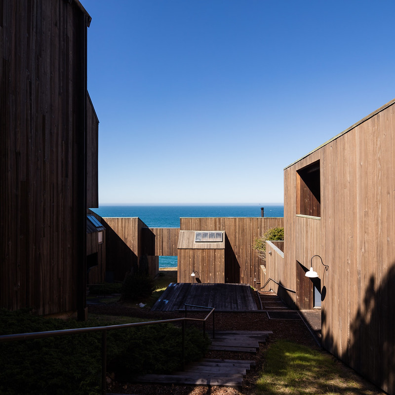 |
| Looking down the slop of the inner courtyard to the ocean below. Photo ©Darren Bradley |
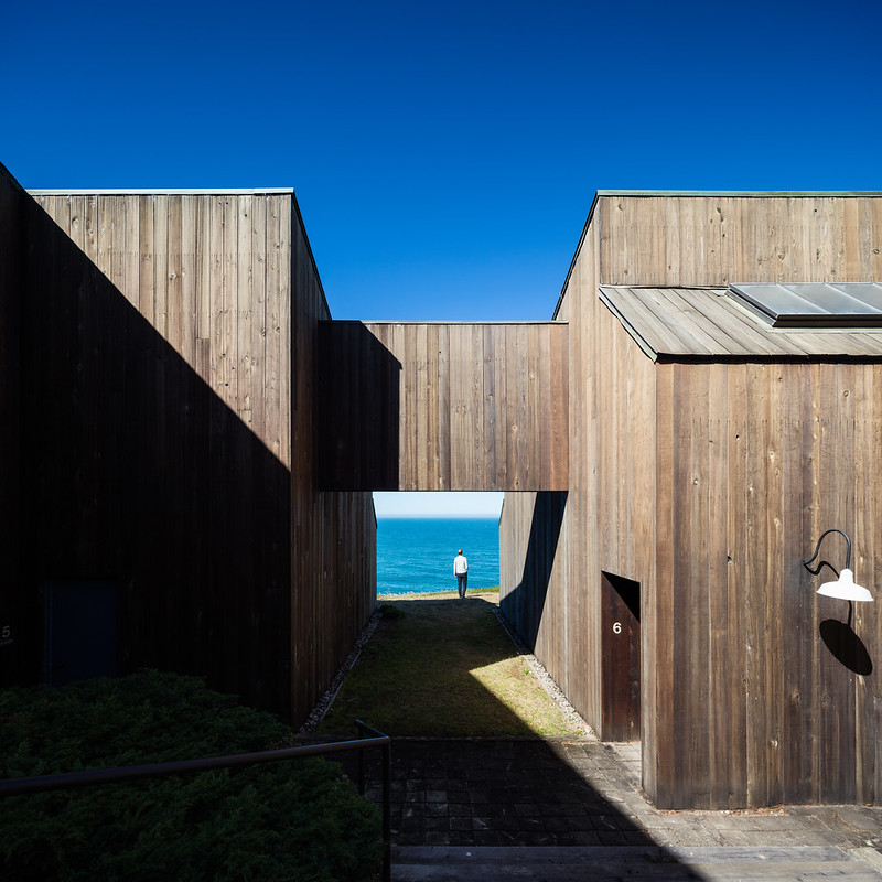 |
| Access to the ocean bluffs from the courtyard is through another tunnel. Photo ©Darren Bradley |
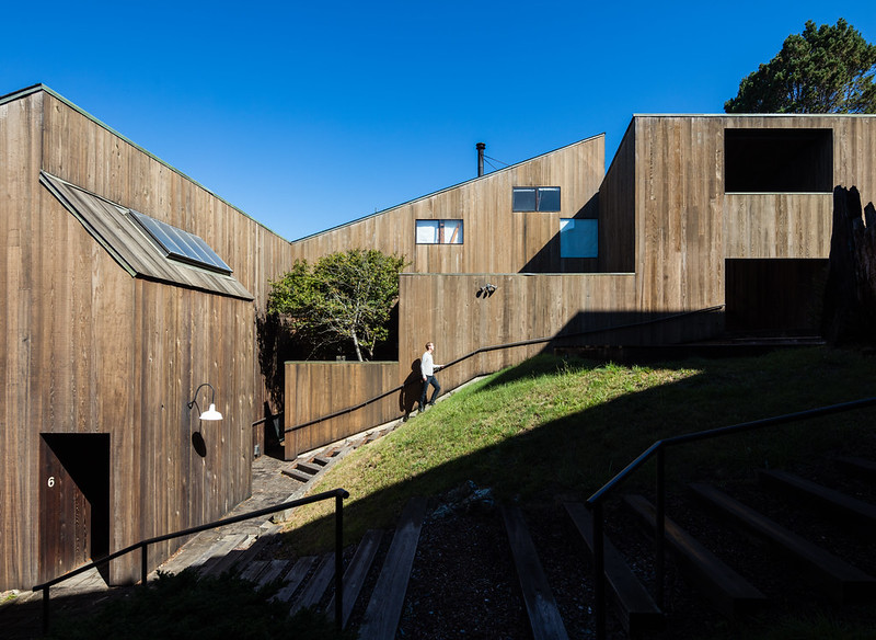 |
| Interior courtyard. Photo ©Darren Bradley |
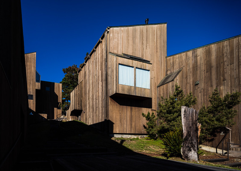 |
| Photo ©Darren Bradley |
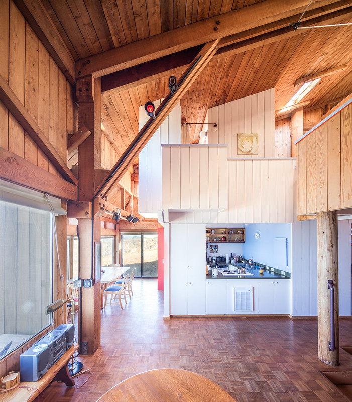 |
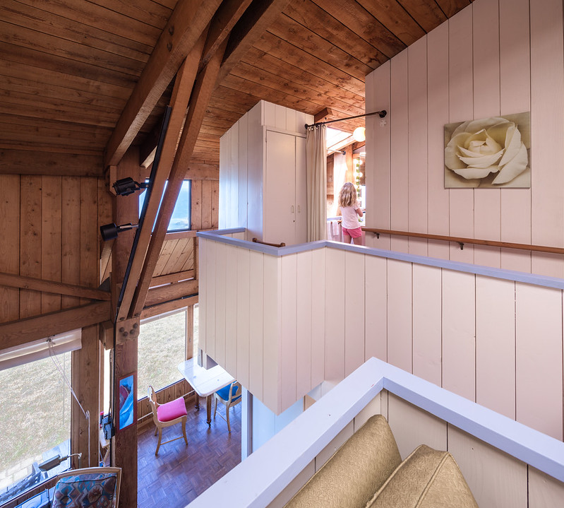
| Interior of Unit 7 of Condominium 1. Note the kitchen "pod" and the edge "four-poster" on the right are visible. Photo ©Darren Bradley |
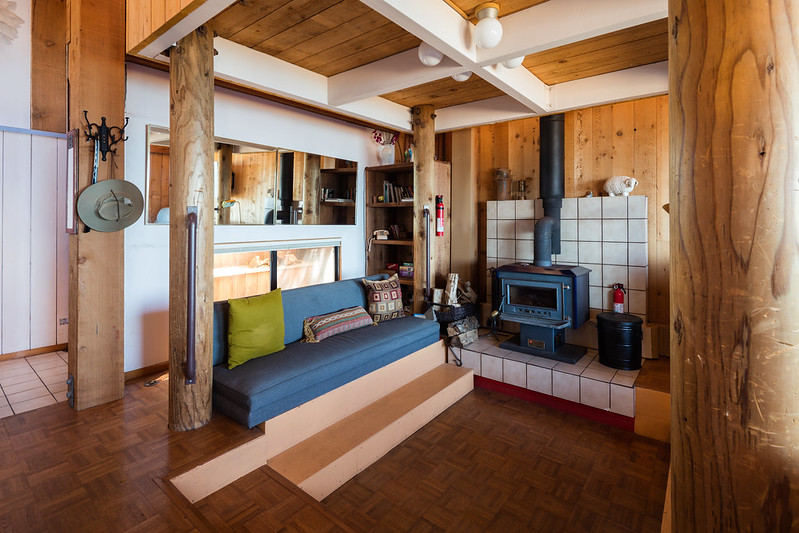
Within each unit there are essentially two miniature "houses" that feel like a space within a space. One is a kitchen/bathroom area, and the other is a sort of sleeping pod suspended on four posts above the living area, and accessible via a catwalk from a staircase.
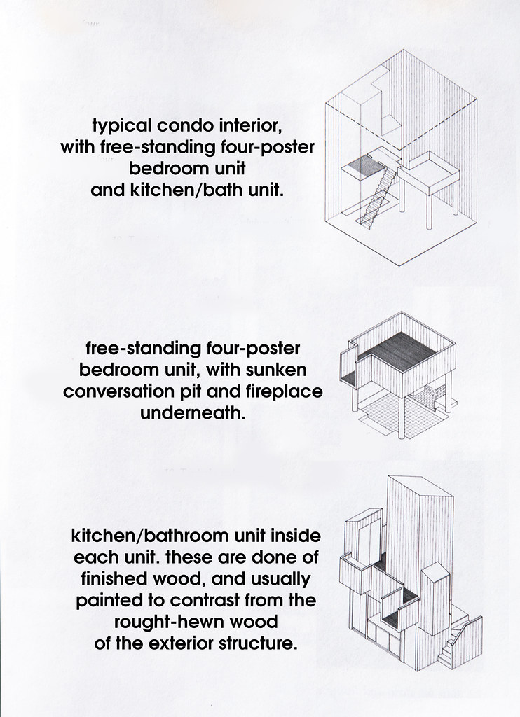
True to Moore's ideas, the windows are low to the ground but the space is light-filled and open, while cozy and intimate at the same time. You are constantly aware of the beautiful but harsh natural landscape surrounding you, while also feeling protected from it.
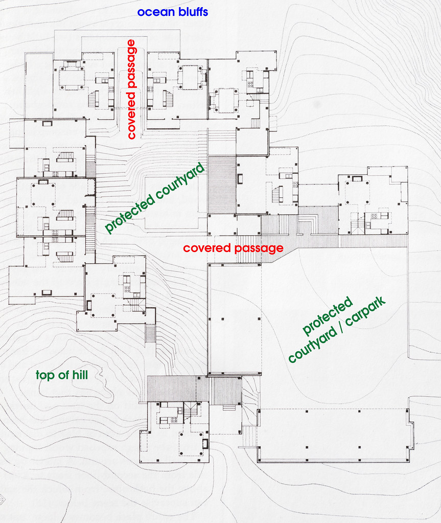 |
| Plan of the ten-unit condominium 1. Note the courtyard spaces and the very similar plans for each unit. |
 |
| Photo ©Darren Bradley |
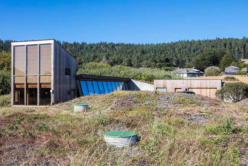
The result is that there is only one other condo complex at Sea Ranch, and it's a small building just behind Condominium 1. But this was not designed by MLTW, or even approved by the design committee. In fact, Moore hated the design and called the architect "a designer of ski condos", which I believe he meant as an insult.
 |
| Photo ©Darren Bradley |
While the Sea Ranch did change somewhat from the original vision as laid out by Boeke, Halprin, Esherick, and MLTW, it remains today remarkably cohesive in its design principles and appearance. The community, which stretches for several miles on both sides of Highway 1, generally observes the same design guidelines established by the founding group.
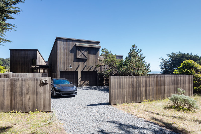 |
| Sliding barn doors, vertical wood siding, and shed roofs a plenty at Sea Ranch! Photo ©Darren Bradley |
This style, which has come to be known as "Sea Ranch Vernacular", inspired countless suburban shopping centers and apartment buildings around the country. It quickly became cliché and was the de facto style throughout the 70s and into the 80s. Unfortunately, most of those are rather poor imitations of the real thing. There are also some pretty poor imitations right in Sea Ranch, as a matter of fact.
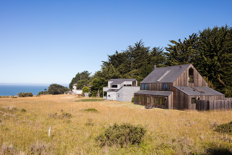 |
| This don't even make an attempt to integrate into the environment or the tree line. Some even have suburban-like lawns and landscaped yards! Photo ©Darren Bradley |
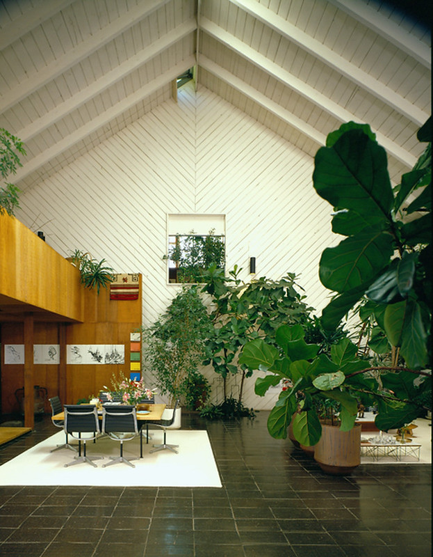 |
| Who wore it better? This is A. Quincy Jones' Barn. Photo from listing. |
I admit that before coming to Sea Ranch, I wanted to hate this place largely because I'd experienced so many of those bad imitations of the style before-hand. But I have to admit that the original examples are quite beautiful and also ingenious. The just work here , and I find the whole place to be magical.
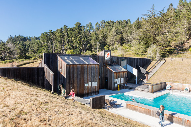 |
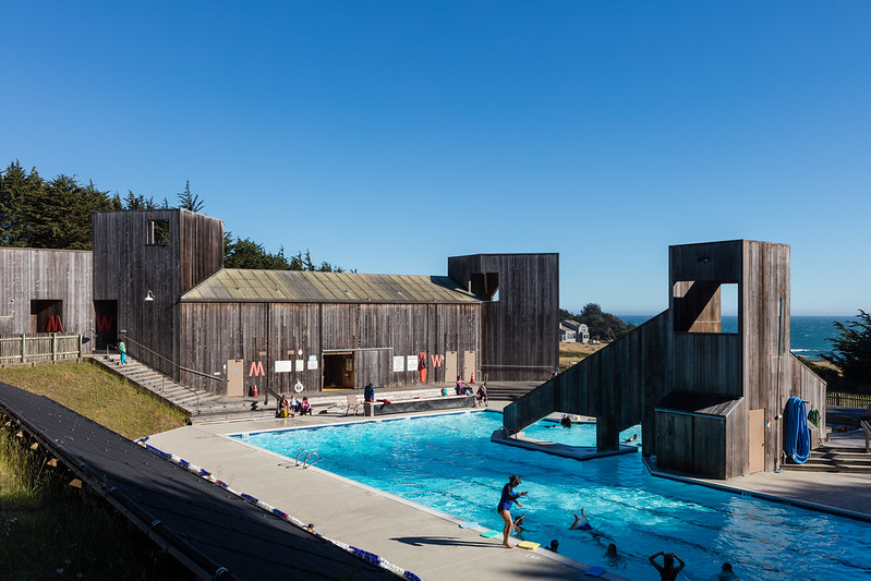
| The awesomely named Moonraker Rec Center. I didn't see Jaws, alas. Or James. Note the deep berms to keep the wind out. Designed by MLTW. Photo ©Darren Bradley |
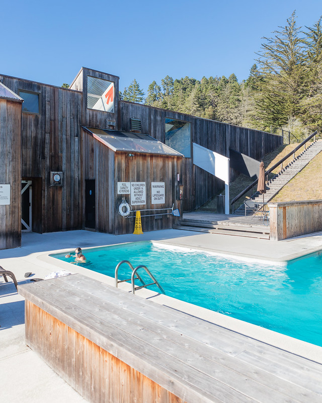 |
| Moonraker Pool. Photo ©Darren Bradley |
 |
| Ohlson Rec Center. Photo ©Darren Bradley |
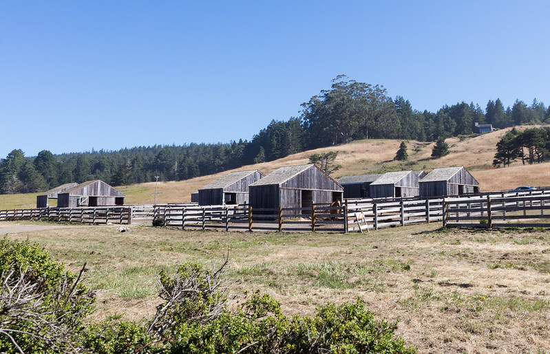 |
| Even the horses get the Sea Ranch treatment. Photo ©Darren Bradley |
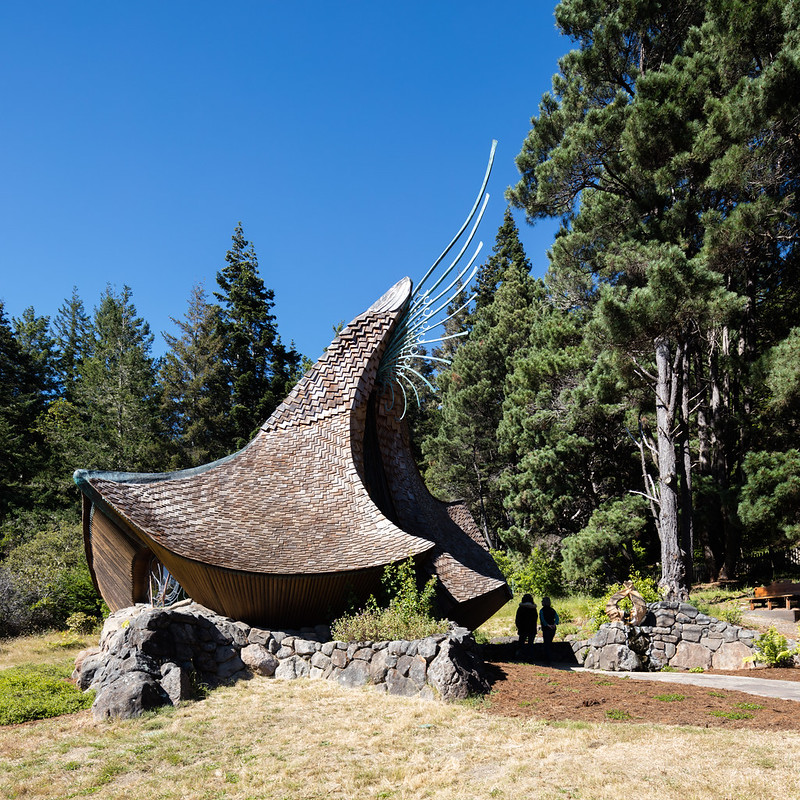 |
| Sea Ranch Chapel by James Hubbell (1985). Photo ©Darren Bradley |
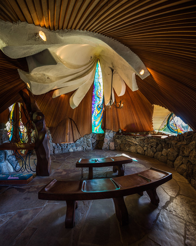 |
| Interior of the Sea Ranch Chapel by James Hubbell (1985). Photo ©Darren Bradley |
Charles Moore had a different view, however, and wrote just seven years after its construction that he considered the whole place to be a failure. This seems strange to me when you consider today how close the community adheres to the design guidelines originally established. But in the book, A Place of Houses, Moore offers a rather scathing critique of what has become arguably his most celebrated creation.
It's admittedly a bit difficult to discern just what, exactly, Moore doesn't like about his seminal project. Now, as an architectural photographer, I have to say that I know a fair number of architects. In fact, most of my closest friends are architects, so I get to hear frequently the disappointments of a finished project vs. what was initially designed. Architecture is all about compromises and there is a fair amount of heartbreak in just about every project, as one is forced to sacrifice some of their vision. Builders, developers, local governments, and especially clients are notorious for diluting the architect's original design concepts. It's frankly a miracle anything ever gets built.
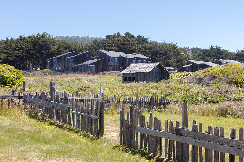 |
| The Sea Ranch Lodge was another target of Moore's criticism. He felt it lacked the refinement of his own work, and also crowded Esherick's building next to it. Also, he didn't like the parking lots. |
Anyway, the architect claims that the classic shed roof style has been poorly interpreted by numerous other architects and clients at Sea Ranch, who faced the rooflines in the wrong direction for the prevailing winds, and other sins. He claims this came from having both clients and architects who were not familiar with the terrain and didn't understand how to design for it.
Moore's criticisms not withstanding, I have to say that now more than 50 years on, The Sea Ranch has aged beautifully. And the dedication of the residents to adhere to the original vision as closely as possible is to be admired. I can't think of very many other places in the world where this is so.
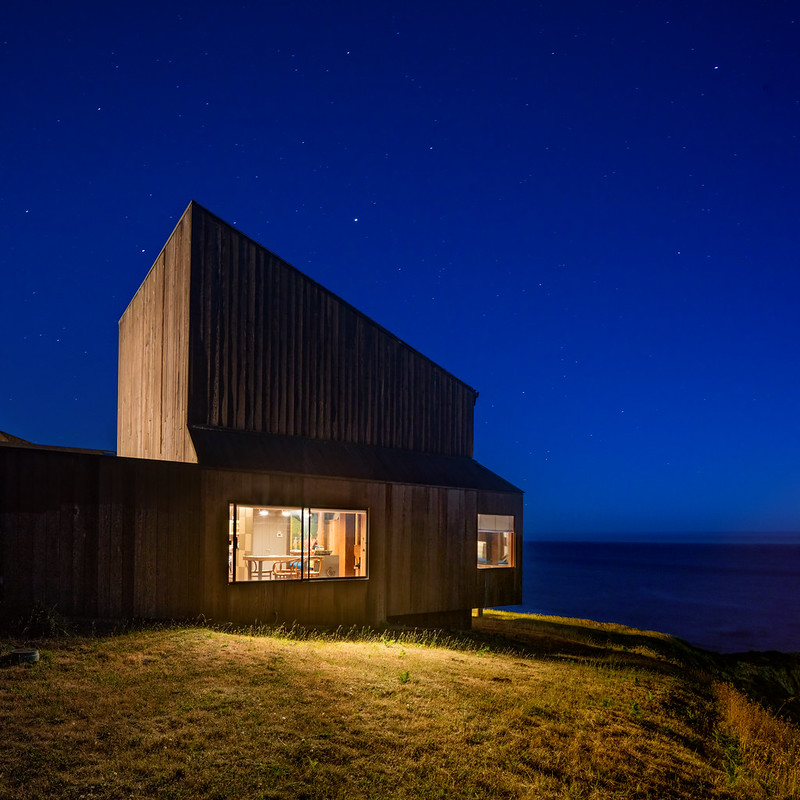 |
| Unit 9 of Condominium 1, seen here, was Charles Moore's own unit. Photo ©Darren Bradley |
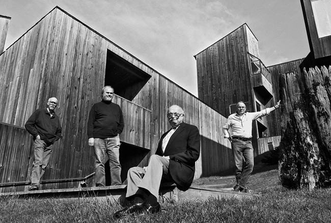 |
| From left: Richard Whitaker, Donlyn Lyndon, Charles Moore, and William Turnbull at the Sea Ranch. |
18 comments:
My initial thought was how no one could do wrong in such a stunning site. I find the use of wood too much but then your photo of Condo 1 made me see why it's so good - that village shaping. The graphics are great, too, and it's wonderful they haven't been 'updated' or eliminated. It does make me think of a million ski resorts, though...
Beautifully written essay! I think it was Goldberger who wrote something like "Architecture is a response to limits".
Deep shadows are very impressive.
Who tripped the shutter in the courtyard shot?
;-)
Did a VRBO house and had the family at Sea Ranch at the north end by the golf course for week back in March of this year. The clustering of the houses + site planning allowing views from every property, the wildlife, the trails and the retention of nature separates this project from any other that I have ever experienced. Great story and thoughts, but you overlooked the role that Lawrence Halpirn played in the site planning and blending of nature and the development.
Thank you, Colin. I know exactly what you mean!
Thanks, Boris! Appreciate you stopping by for a read! It's a great spot - very photogenic. And my timer on my shutter came in handy, as usual!
Thank you for your comments, Martin. I agree with you that the landscape architecture was a critical element of the project's success. I actually mention Halprin quite a bit, in the beginning of the post, and there is a photo of him and the landscape plan. I agree that the title of the post is a bit misleading, perhaps, but I thought I gave him plenty of credit in what I wrote in the article.
Hi there
I want to share with you about architect and design conceptPlanning and Design of Correctional Facilities: Over the last several years, the planning and design profession has gained significant knowledge of what constitutes a normalized and therapeutic environment. To know more deatils visit- http://havardcooper.com
-: Havard Cooper
Thanks and Welcome
HC
Hi, have a look at my website as well:
what is design
japan pavilion
architecture definition
roman colosseum facts
types of contractor
reasons to be an architect
roman pantheon architecture
what is vastu shastra
I'm 19 year old South Korea high school student,my dream is that visiting sea ranch with my best friends.
Your picture is so nice, but I can not save it.
when i have visit sea ranch,I must have take a picture.
I have ever search a lot of sea ranch picture but your picture is best.Thank you!
Sadly, the architectural aspect of Sea Ranch is only half the story. As the Principal Investigator for The Center for U.S. Rural Cultures Studies, I've been immersed in the Sea Ranch culture for more than a year, and the slogan "Living Lightly on the Land" is only that: a slogan to sell property. What the Center has documented in a little more than a year is a staggering lost of habitat for deer, quail, turkey, and monarch butterflies. The land management and landscape policies have long since abandoned any preservationist stance and, instead, have been geared toward the opening of the new Lodge at Sea Ranch. Although the new owners are not Sea Ranch, The Sea Ranch Association--Lisa Dundee, in particular--have approved and arranged extensive tree cutting for both Sea Ranch and the new owners of the lodge. Information can be found here: cathybglenn.com (The book with findings will be available mid-2020.)
A recent blog bite about the on-going research at Sea Ranch:
She wakes, crying. Yesterday’s images won’t leave her mind: the laughing men with roaring chainsaws telling her to calm down; the world-shattering grind of chippers; all those newly gutted spaces where trunks and branches and leaves and roots—other beings’ worlds--used to stand. In this ghost town of a development, run by an outsized homeowner’s association, just one woman continues making all the decisions, to decimate an ethic, while destroying the homes of all the other beings here except the human beings.
It never stops—there are crews constantly cutting, slashing, slicing, chopping, every single day, all over Sea Ranch. Shelter, homes, other beings' infrastructure—now sticks and cut trunks and piles of chips. The human architecture—its surrounding “garden” freshly shorn— awaits the few human visitors it’ll see all year. Some humans stop in for a few days; others stay longer; just a few others live here year-round. The ghosts in the Sea Ranch ghost town -- the "owners" who work with rental agencies to sell vacation spaces -- use this fragile part of the California coast as an investment strategy. But they can't see whose worlds they destroy because the approving woman silently stands between them and the obscenity of lost worlds.
She lies in bed, eyes closed, while the countless rabbits she's seen huddling under gutted trees won’t leave her mind, because she knows she'll see them again today. The quail scattering to find shelter and yelling for days, trying to find each other past the sheep’s electric fences and “weed” whackers. All the new bucks in the neighborhood, looking for food, hiding under shrubs because the trees are just standing trunks now. The big birds, looking for the missing big perches. The monarch butterflies, who should live in the Monarch Glen behind her house, disappearing because they can no longer overwinter in the cypresses next to the Glen. The Monterey Cypresses have been gutted by an angry "owner" next door who didn't want to mow and "clean up" anymore. A wind tunnel hole lives there now.
There’s a scene in the movie, Lone Plains Drifter, where men with whips surround an unarmed man in the middle of a rural town. It's nighttime, and all the townspeople are in their homes, silently looking out their windows. As they watch, the surrounded man is slowly whipped to death. No one comes out of their houses. No one yells, “stop!” No one tries to divert attention. No one does anything to help.
This article is an appealing wealth of useful informative that is interesting and well-written. I commend your hard work on this and thank you for this information. I know it very well that if anyone visits your blog, then he/she will surely revisit it again
Online building design
Excellent Information shared by this post. Realestatecake is the perfect Real Estate Platform you want for property investing in United States, where real estate investors get access to the lots of deals regarding different kind of properties to double their money.
Helpful information shared by you. searching for the Alabama Houses for Rent then discover the best properties deals online in Birmingham, AL at Residential Alabama.
The residence with the sod roof that you liked was designed by David Wright. He was the leading architect of the earth shelter / passive solar movement in the 70’s. Some of his work in New Mexico still impresses me, now in the Sierras the work is less inspired. This house demonstrated the difficulty of big ocean views west & winter sun south.
a8i66y4k79 j9x46d6t93 k2d31f3m50 p5j18f7a80 b3a09s8w19 v0d35h7p09
Good information.
---------------------------
I work in stabilitamerica.com
Culture
Post a Comment