 |
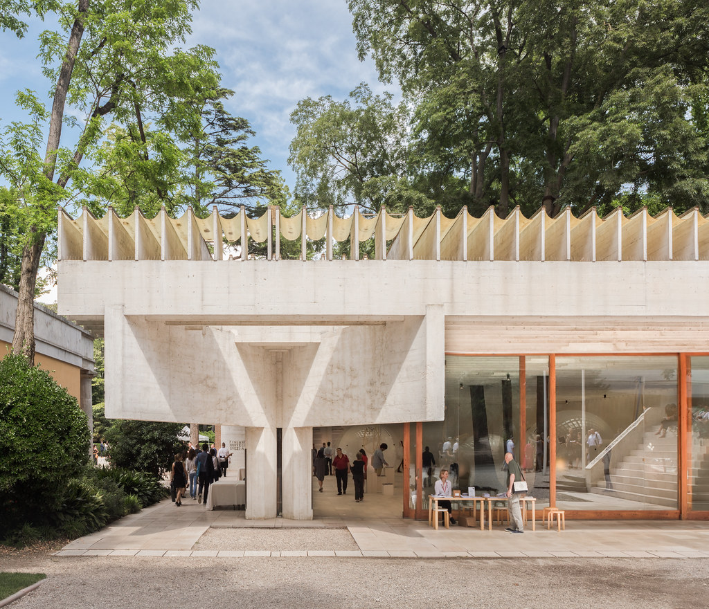
| My favorite pavilion at the Venice Biennale, the Nordic Pavilion by Sverre Fehn (1959). Photo ©Darren Bradley |
As you probably know if you follow my Instagram account, I just attended the opening week of the Venice Architecture Biennale. I was invited this year to exhibit some of my work, as part of the TIME SPACE EXISTENCE show at the Palazzo Bembo, which was a great excuse to finally get to see what is essentially the largest self-love event for architects in the world.
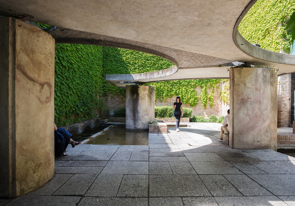 |
Carlo Scarpa's sculpture garden off the main pavilion at the Venice Biennale is a nice little surprise and a quiet corner to catch your breath from all the chaos of the show.
Photo ©Darren Bradley |
As the name indicates, the Biennale is an event that occurs every two years - usually going from the end of May through November. There's actually a Biennale every year, but the odd years are for art, and the even years are for architecture. If you've never heard of this thing before, it's essentially a sort of World's Fair for architecture. The event takes over the city, and events and exhibitions are held all over Venice. But most of the exhibits are concentrated in a few areas - the Giardini, the Arsenale, and, for the TIME SPACE EXISTENCE shows, at the Palazzi Bembo and Mora.
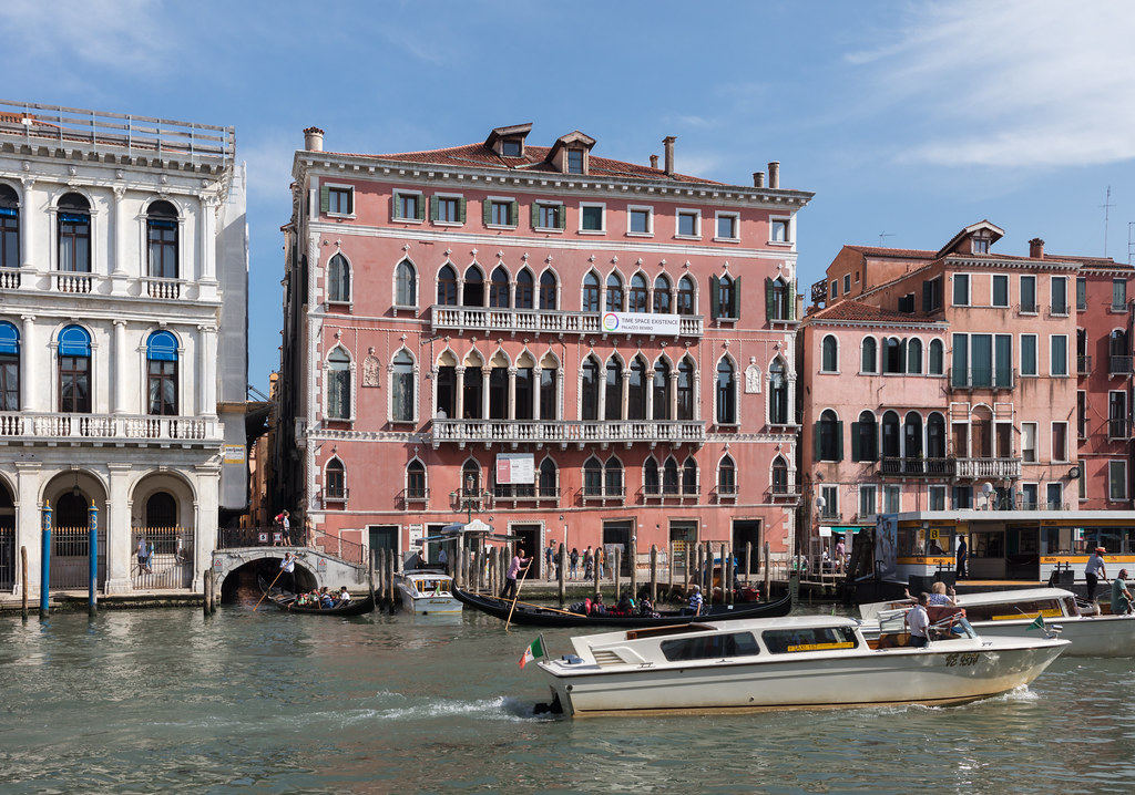 |
| The Palazzo Bembo on the Grand Canal, adjacent the Rialto Bridge, is the site of my little exhibit through November. Photo ©Darren Bradley |
The original setting for the Biennale is the park-like site called "Giardini", located near the fishtail end of Venice (Venice resembles a giant fish when seen from above - really... take a look). The Giardini has pavilions designed, built, and managed by various countries. During the Biennale, these countries send delegations (art or architecture, depending on the year) to represent what their country has to offer on the subject.
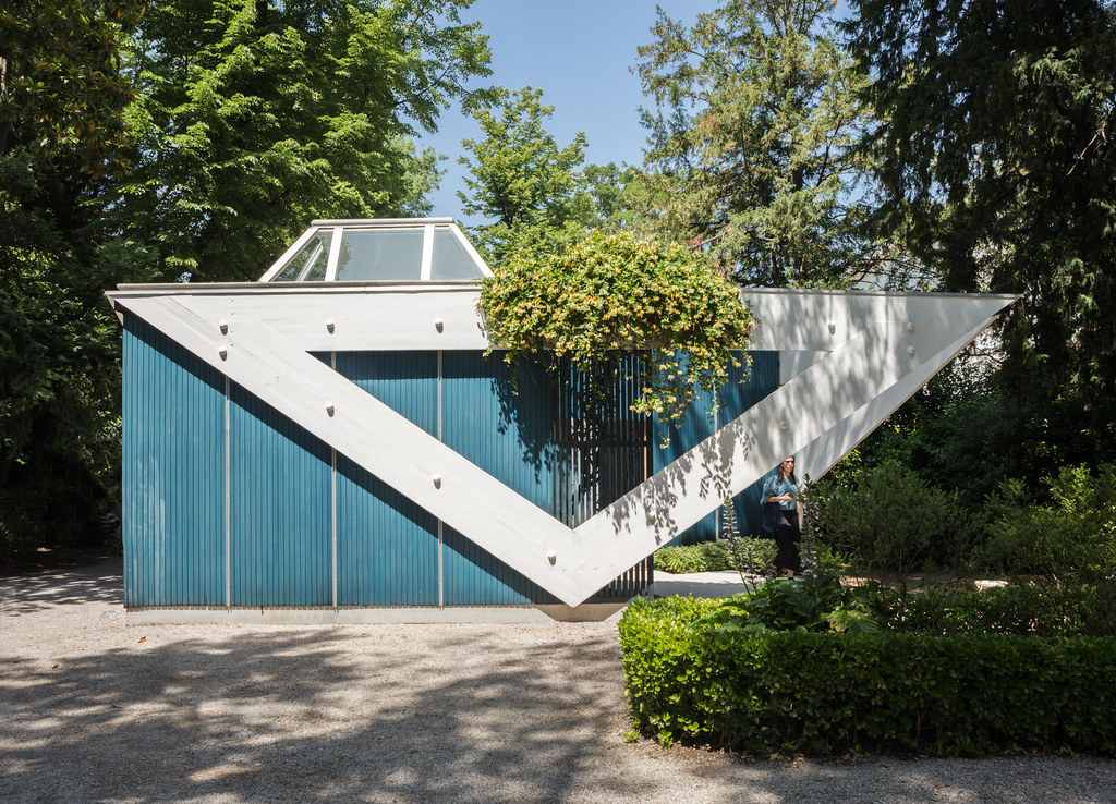 |
| The Finnish Pavilion is curious in that Finland is also represented by the adjacent Nordic Pavilion. Originally designed as a temporary structure, this building was designed by Alvar Aalto in 1955. Photo ©Darren Bradley |
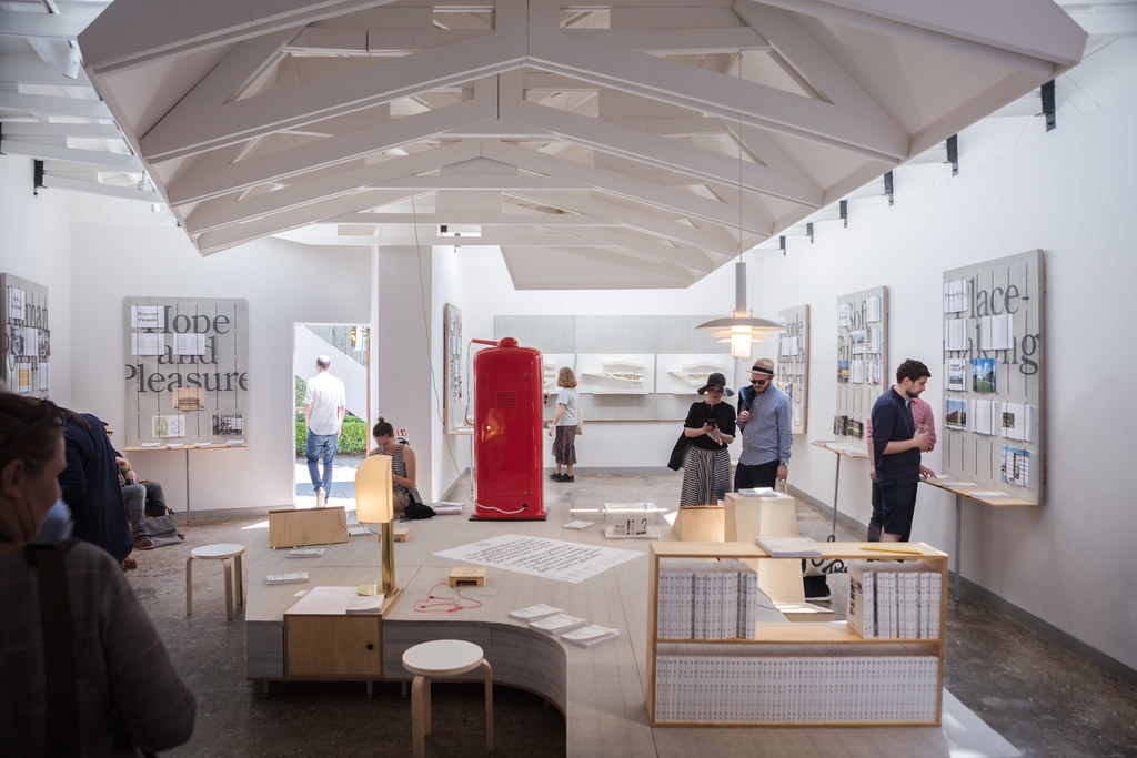 |
| This year, the Finnish Pavilion looks at the future of public libraries. It is curated by ArchInfo Finland. Photo ©Darren Bradley |
Like World's Fairs, the Biennale is a sort of throwback to the 19th and 20th century notion of state-sponsored artistic and cultural patronage that is still alive and well in most of the rest of the world, but which the United States has largely abandoned and forgotten.
The first pavilions were built in 1907, and the practice continued throughout the 20th century with even a few more recent ones (such as Australia). There are a few great examples of mid-century modern architecture, by iconic architects such as Alvar Aalto, Carlo Scarpa, and Gerrit Rietveld. There are currently 29 pavilions in the Giardini.
While the exteriors more or less stay the same from year to year, the interiors completely change depending on that year's exhibit. And as the Biennale has grown over the years, it has spilled out into the rest of the city, using the exhibition space at the Arsenale, as well as various other hotels, galleries, etc. throughout Venice.
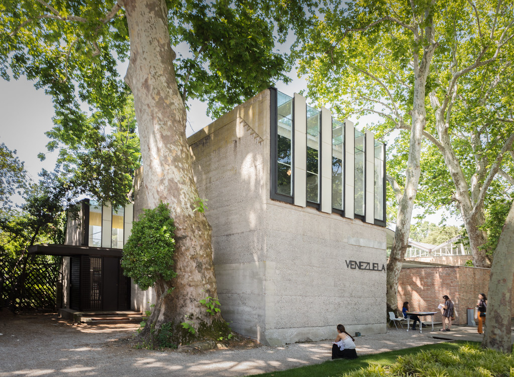 |
| One of my favorite pavilions has always been the Venezuela Pavilion, designed by Carlo Scarpa (1954). Another photo of this building that I took many years ago appeared in a book by Peter Allison called "David Adjaye: A House for an Art Collector" (Rizzoli, 2011). Photo ©Darren Bradley |
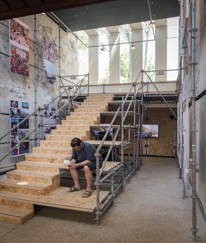 |
Best not to look inside the Venezuela Pavilion, though, as its depressed state appears to reflect the current state of affairs in that country, unfortunately.
Photo ©Darren Bradley |
I had been to Venice before, and even walked around the Biennale pavilions in the Giardini. but it was not during the show and the pavilions were abandoned and desolate. It had always been a dream to see the architecture Biennale one day. I never imagined I'd actually be exhibiting there.
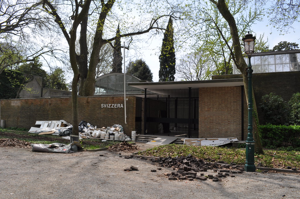 |
| Abandoned Swiss Pavilion during the off-season during my previous visit in 2009. Photo ©Darren Bradley |
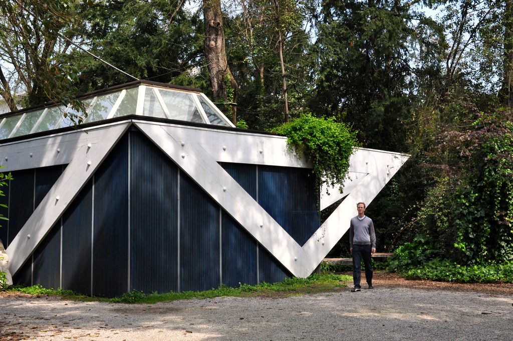 |
| Me, visiting the Finnish Pavilion in April 2009. |
For an architecture fanatic like myself, the idea of a sort of World's Fair of architecture seemed almost too good to be true. The World's Fairs themselves are already a sort of Disneyland of design and architecture, which is why I love to attend them.
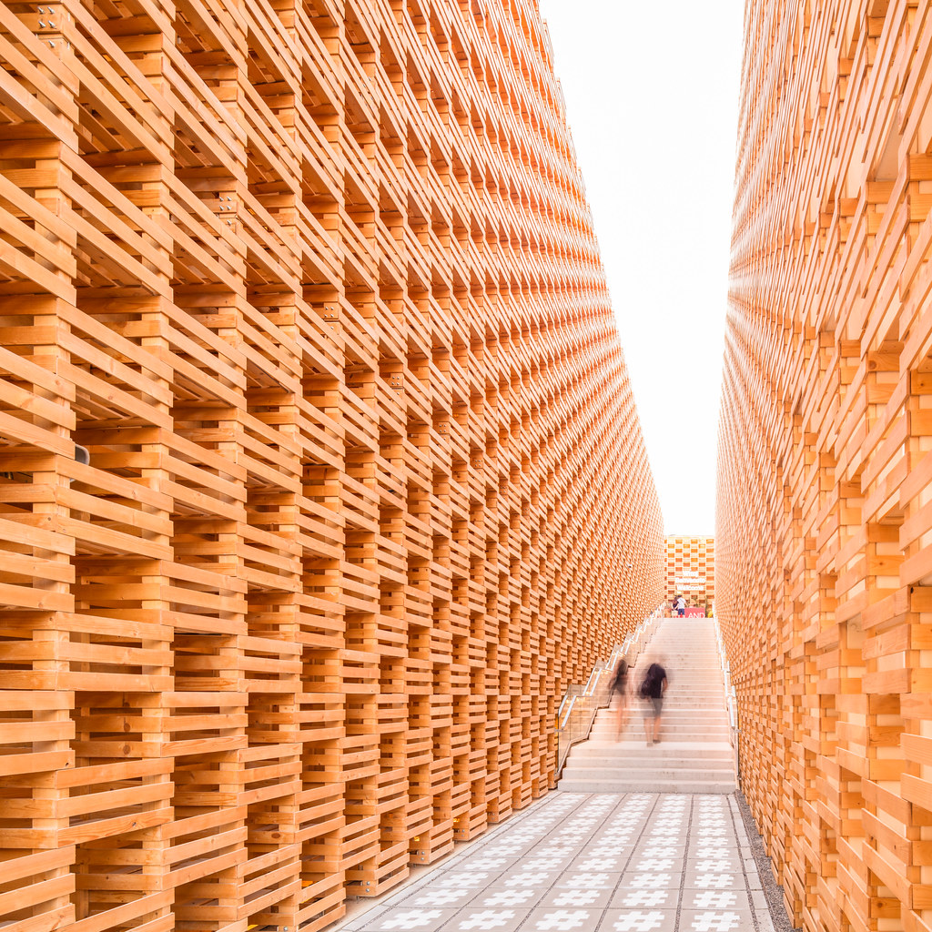 |
| The stunning Polish Pavilion at EXPO2015 in Milan, designed by 2pm Architekci. Photo ©Darren Bradley |
I really don't care about what's on display inside the pavilions at these things most of the time - I go for the architecture of the pavilions, themselves.
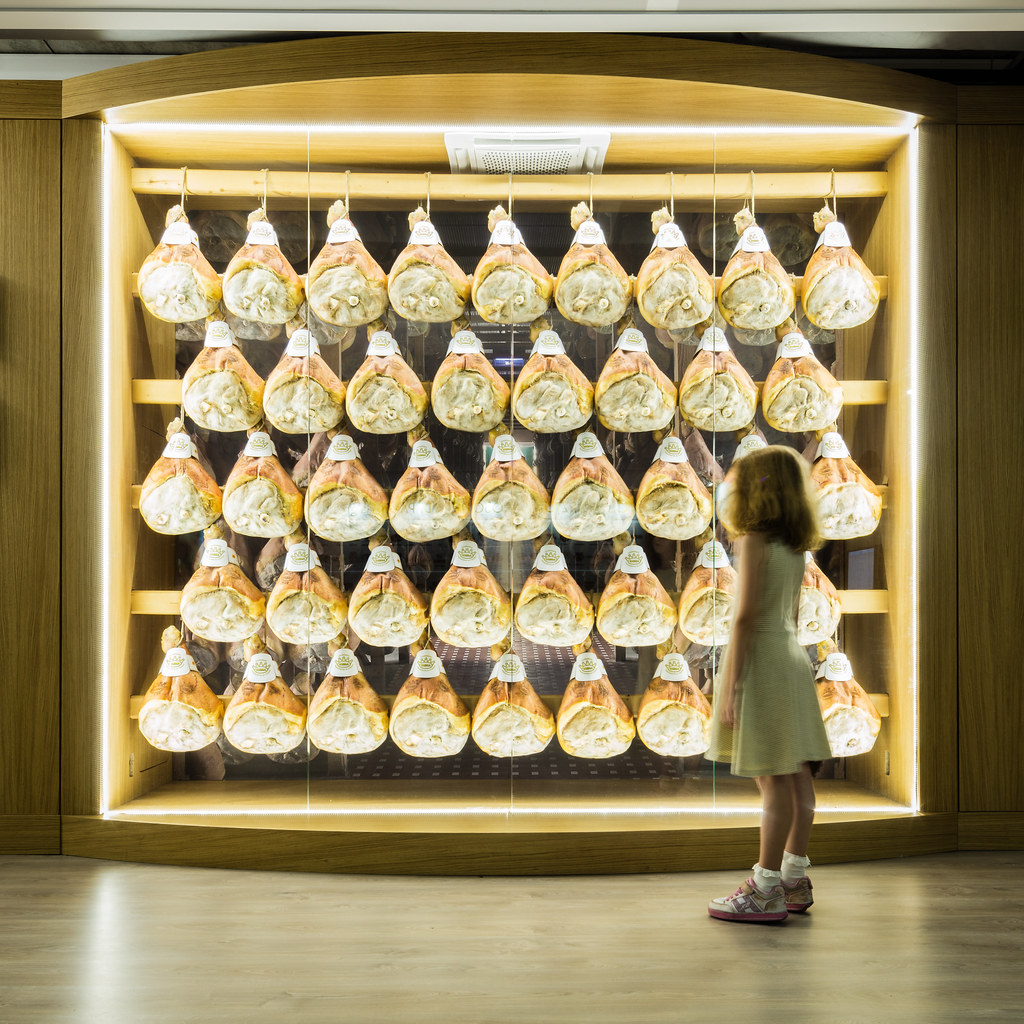 |
| Exhibit on ham inside the Italian Industry and Produce Pavilion. Photo ©Darren Bradley |
But for the Venice Biennale, the exhibits themselves would also be about architecture! What could be better than that! I was so excited at the idea, I could hardly wait.
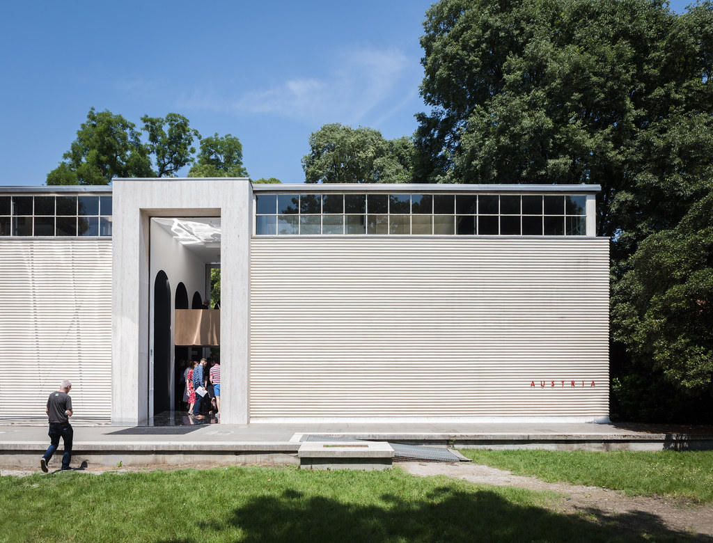 |
| The Austrian Pavilion, by Josef Hoffman and Robert Kramreiter (1934). Photo ©Darren Bradley |
Alas, it turns out that in most cases, the Biennale is no different than the World's Fairs in that regard. With just a few exceptions, I found that the architecture of the pavilions themselves was far more interesting than what was inside. Let me explain...
As you may already know, I kinda have a thing for architecture. But I'm not an architect. And to be perfectly honest, I am not terribly interested in the philosophy, science or engineering behind it. What I love about architecture is how it makes me feel when I see and experience it. It's a visceral reaction - not an intellectual one. Unfortunately, most of the delegations at the Biennale opted for an intellectual approach. Instead of filling the pavilions with models and mock-ups and sensory experiences, they covered the interior walls with texts. Texts explaining their scientific approach to solving a problem. Texts explaining their manifestos to meeting the world's social, political, economic, or ecological ills. Texts, texts, and more texts. Often, when there WERE models or mock-ups, they were incomprehensible without complicated explanations and accompanying treatises.
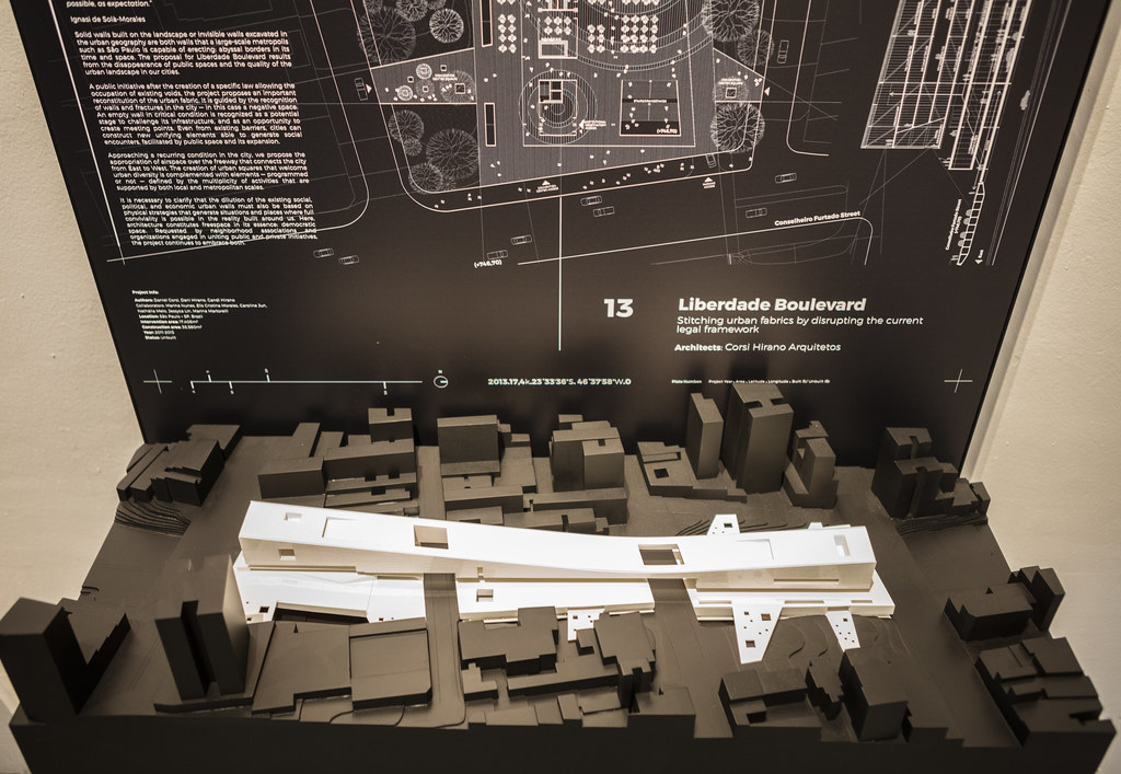 |
| Brazil's pavilion was curated by the architects Gabriel Kozlowski, Laura González Fierro, Marcelo Maia Rosa and Sol Camacho. The group, selected by the Fundação Bienal de São Paulo, will present Muros de ar [Walls of Air], an exhibition that explores the interaction of material and immaterial spaces in Brazil and its architecture. I enjoyed the models here and explanations, but the walls were filled with text that was just too dense to get through. Photo ©Darren Bradley |
In some cases, there were absolutely nothing in the pavilion EXCEPT for texts covering the walls from floor to ceiling. Spain, for example, used neon artwork at the entry to entice people in. But visitors quickly realized they were hornswoggled once they entered to find empty room after empty room, filled with walls of text.
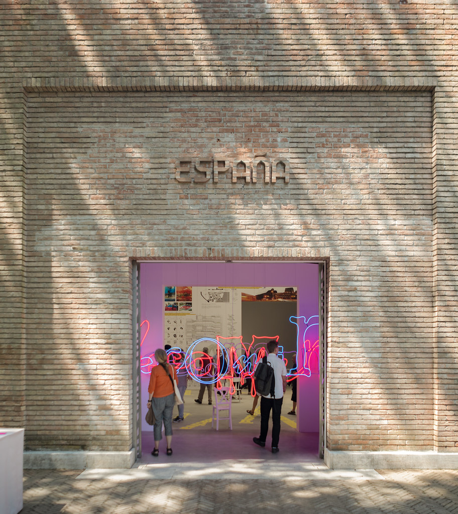 |
| Spain's pavilion is curated by Atxu Amann. I understand that most of the budget was spent restoring the building itself, which explains why there was nothing much in it, despite the promise from the neon art installation. Photo ©Darren Bradley |
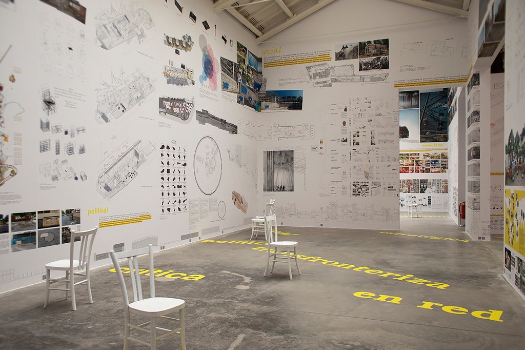 |
| Interior view of the Spanish Pavilion, which is wallpapered with 149 architecture proposals and not much else. Photo by ©Italo Rondinella, since I forgot to take one while there. |
Germany was a bit more creative in their use of infinity mirrors, and how they displayed their texts. But ultimately, it was still mostly just lots of texts.
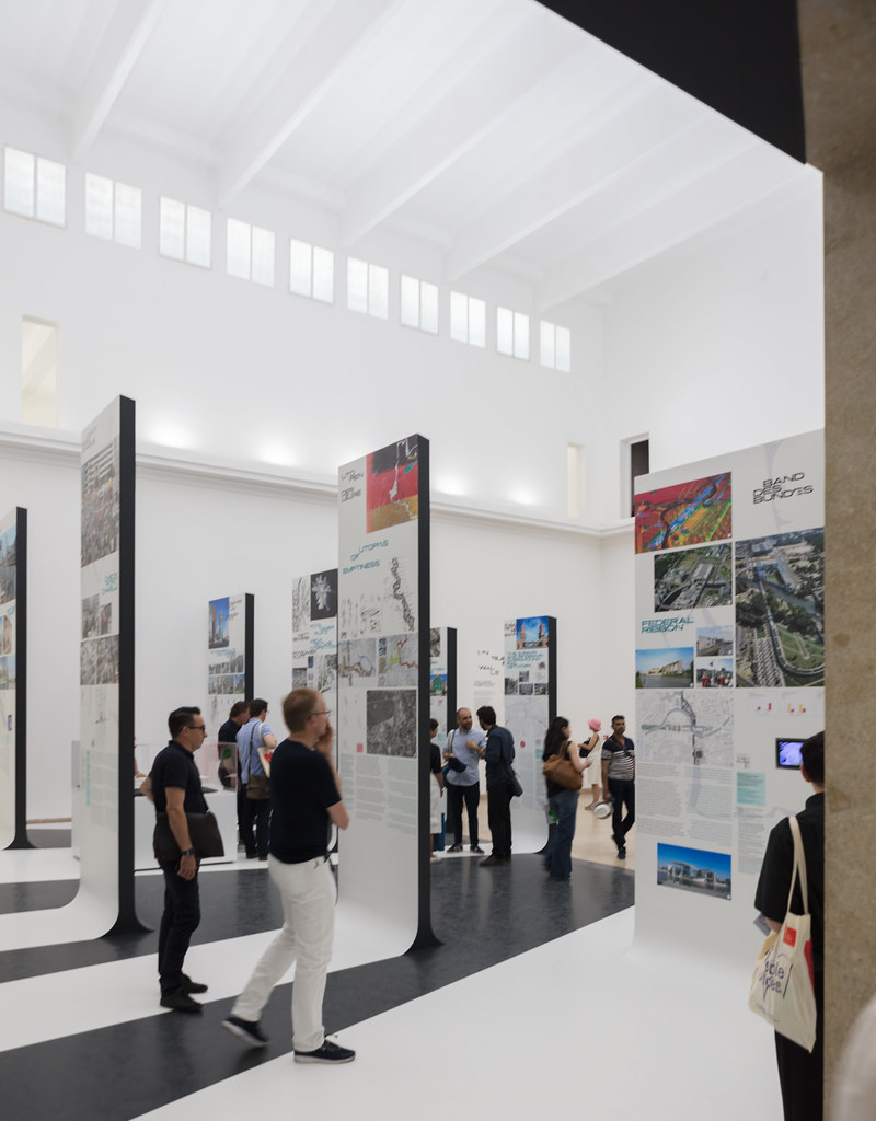 |
| More architecture proposals in the German Pavilion, albeit more creatively presented... The theme here was "Unbuilding Walls" and is curated by GRAFT and Marianne Birthler. Photo ©Darren Bradley |
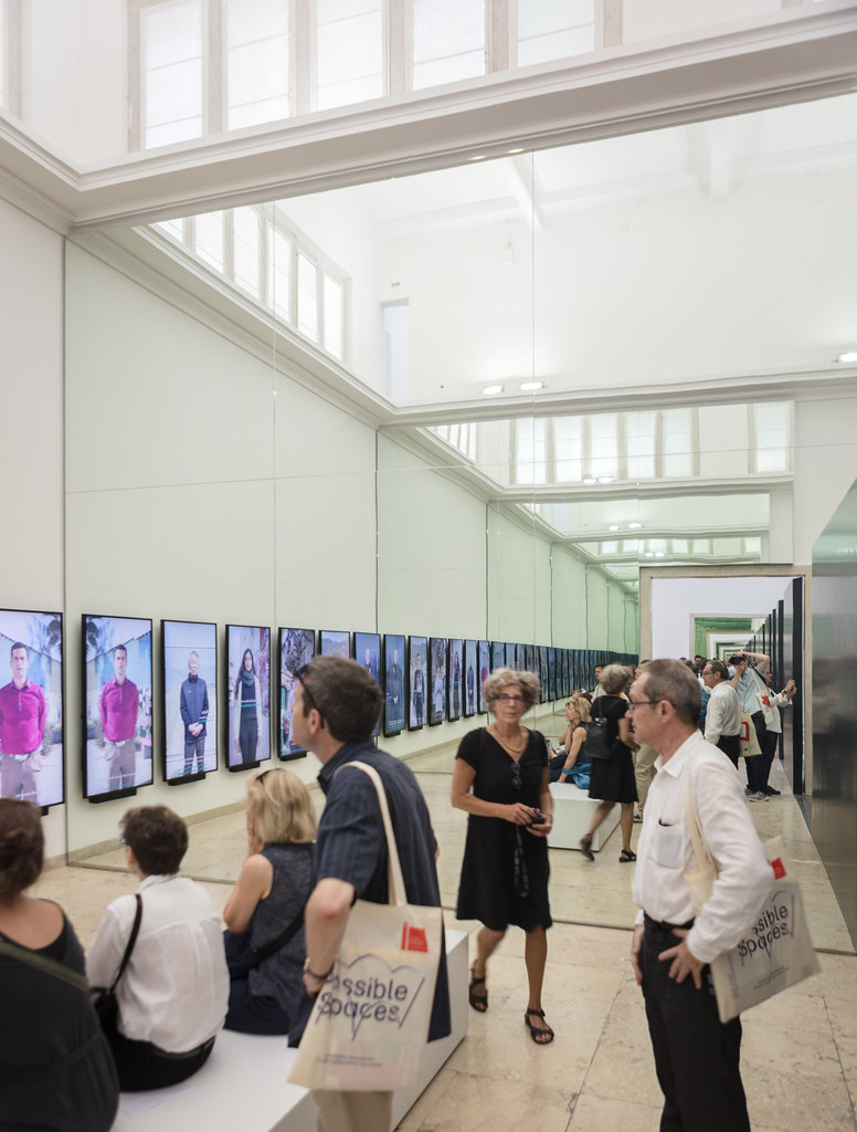 |
| To infinity and beyond at the German Pavilion. Photo ©Darren Bradley |
It's clear that architecture school has conditioned everyone because they all resorted to that same format to communicate their ideas - the giant posterboard printed with a few color computer renderings and an accompanying explanation of the program and how they've resolved it with their design. It's curious and disappointing to me that such a creative group of people would resort to such conventional and uncreative means of conveying their ideas in so many cases. I have seen more creative exhibits at industrial machine trade shows.
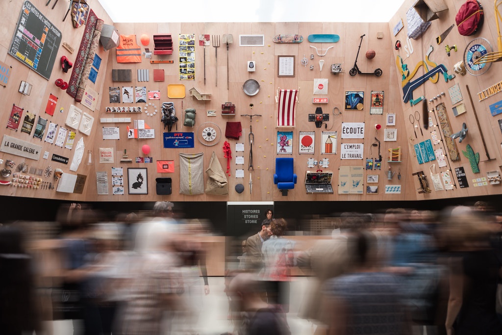 |
| Various objects and artifacts that helped to define the spaces featured in the French Pavilion. This pavilion is being curated by Encore Heureux, founded in 2001 by Julien Choppin and Nicola Delon, and joined by Sébastien Eymard. Their theme of “Lieux Infinis. Construire des Bâtiments ou des lieu?” (Infinite Spaces. Constructing buildings or places) presents ten experimental case studies of social and cultural regeneration of ten disused sites in France. I appreciated it because t's a similar theme to my own exhibit. Photo ©Darren Bradley |
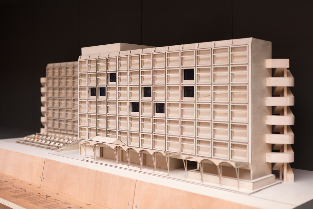 |
| They had some nice models in the French exhibit. This is an apartment block from the 60s that is being reinvented and reused. Photo ©Darren Bradley |
I quickly surmised that I must not be the target audience for the Venice Architecture Biennale. This event was obviously directed at other architects, and not really the general public, or even fanboys like me... But to my surprise, in my conversations with the architects I knew there, they all pretty much had the same impression as me.
Apparently, this shift was deliberate. As it has been explained...
"The Biennale has transformed in recent years, moving away from exhibitions representing individual buildings or architects’ bodies of work, towards an engagement with the social, political, environmental and economic forces shaping cities across the world. This can be seen as a generational shift, away from ’starchitects’ and towards a politically engaged, technologically literate and collaborative architectural culture." (ArchDaily, in an article dated 16 March 2018 about the Biennale).
So what happened? Hard for me to say, and people far more qualified than I should opine before I do. But I suspect perhaps it's a question of design by committee. Most of these pavilions were designed by a large group of people, brought together for political or other reasons - not of their own initiative. Often, this design by committee leads to a diluted approach to achieve consensus. Also, it appears that in many cases, the political or social message seems not only to drive the theme, but overshadows the design itself. Anyway, that's just my two cents. I look forward to seeing the pendulum swing in the other direction a bit more, because one shouldn't have to be at the expense of the other.
Of course, there were some great exceptions to this rule this year, too. Some of the pavilions did opt for a more interesting and experiential exhibit.
Poland, for example, created a pond and a rain shower in their pavilion, with beautifully designed wood models floating in the pool to show how architecture could not just be inspired by nature, but could amplify it.
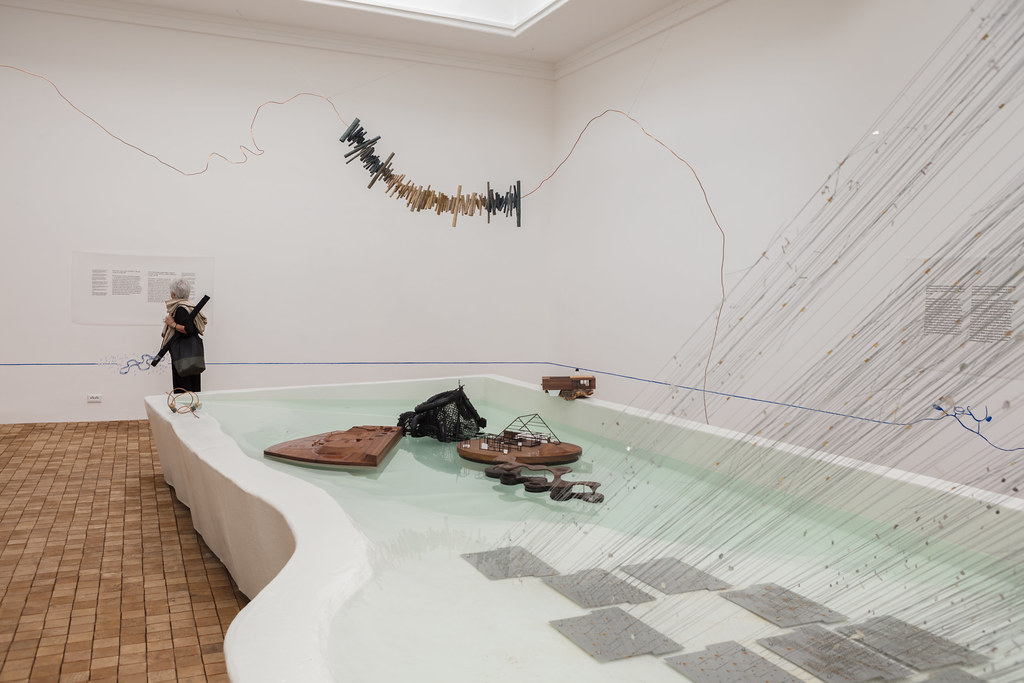 |
| The Polish Pavilion is called "Ampllifying Nature", and is curated by Anna Ptak, and was designed by CENTRALA (Małgorzata Kuciewicz, Simone De Iacobis) in collaboration with Jacek Damięcki and Iza Tarasewicz. The project uses iconic post-war Modernist architecture in Poland to demonstrate how architecture can enhance, or amplify, nature . Photo ©Darren Bradley |
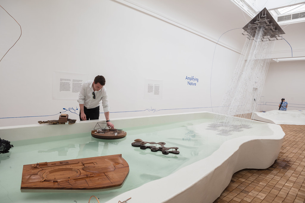 |
| Polish Pavilion, with beautifully designed wood models floating in a pool. Photo ©Darren Bradley |
Belgium's pavilion was also fascinating - a bit like a James Turrell installation with a minimalist interior that was all about experiencing color, light, and geometry in their space.
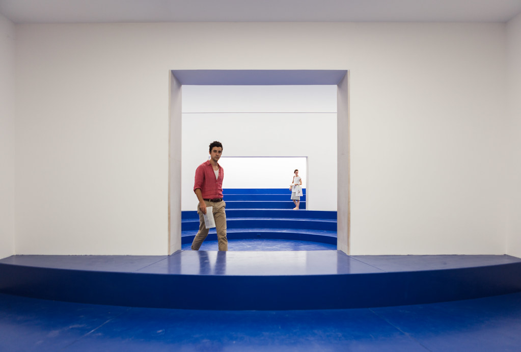 |
| Entrance portal to the Belgium Pavilion. This year's project, called "Eurotopia", is projectis being undertaken by four young architecture graduates active in Wallonia and Brussels, Roxane Le Grelle, Léone Drapeaud, Manuel León Fanjul and Johnny Leya, who are members of a multi-discipline team with Sébastien Lacomblez (artist, scenographer), Philippe Braquenier (photographer), Bruce Bégout (author) and Nicolas Dehove (logistician). Photo ©Darren Bradley |
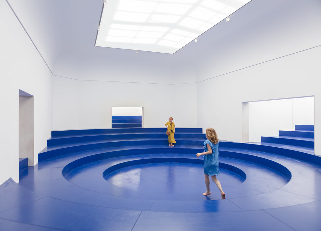 |
| "Eurotopia", the Belgian Pavilion, which reminded me of a sort of James Turrell installation. Photo ©Darren Bradley |
But Switzerland's exhibit took the prize (literally - it won the Golden Lion for best pavilion this year). Their exhibit showcased what, at first glance, appeared to be the empty interior of a bland, modern house interior without furniture. But each of the spaces was either shrunk or enlarged to play with perspective, space, and dimensions. Walking through the house, it felt like being in Alice in Wonderland. Even the door handles and light switches were enlarged or shrunk accordingly. It was fun and exactly the sort of experience I was craving.
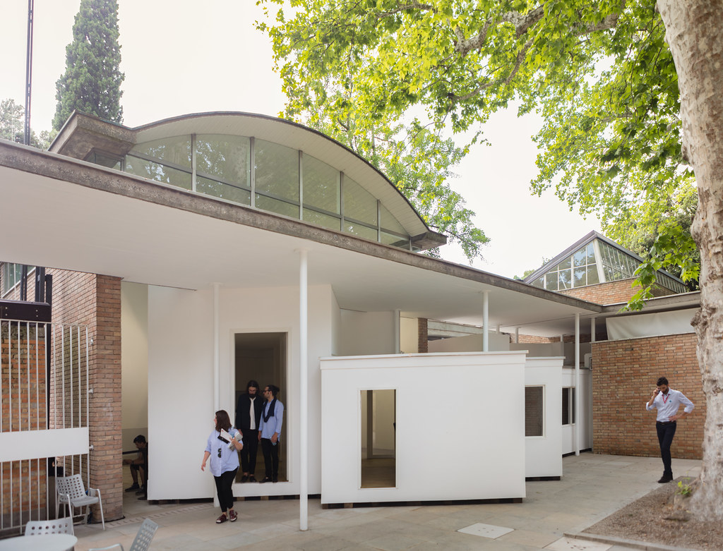 |
| Swiss Pavilion exterior courtyard. Photo @Darren Bradley |
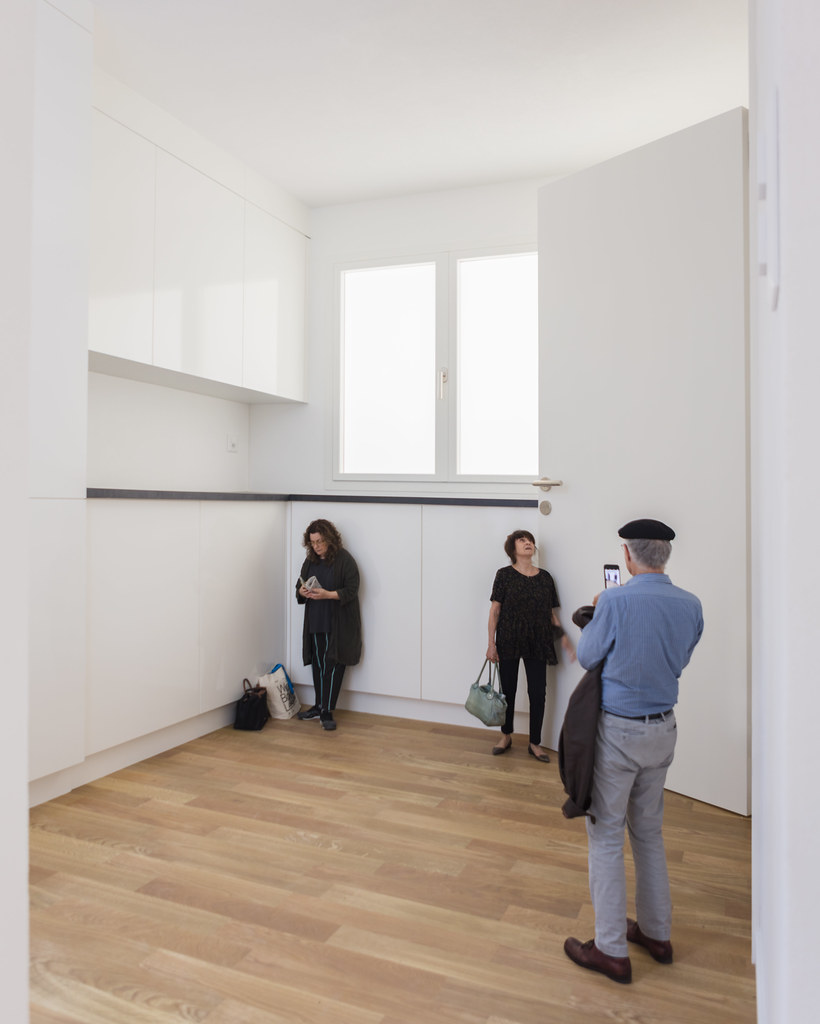 |
| The "kitchen" of the Swiss Pavilion model home... Notice it's a bit out of scale! Photo ©Darren Bradley |
The Aussies also opted for an experience. They created a grassy meadow in their pavilion to emphasize the relationship of architecture to nature (similar to Poland), with the underlying theme of repairing endangered grasslands.
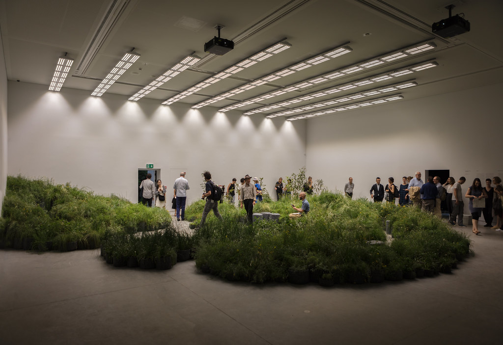 |
| Interior of the Australia Pavilion. Creative Directors Mauro Baracco and Louise Wright of Baracco+Wright Architects, in collaboration with artist Linda Tegg, have curated a multi-sensory living installation for the Pavilion, designed to disrupt the viewing conditions through which architecture is usually understood. Photo ©Darren Bradley |
I didn't go in the British Pavilion, but did go up on the rooftop terrace they built atop their pavilion...
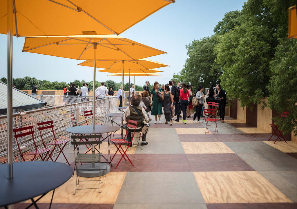 |
Rooftop terrace at Island, the Great Britain Pavilion. The view was nice, but there's not a lot of reason to spend time up there. Visits were limited to ten minutes, anyway.
Photo ©Darren Bradley |
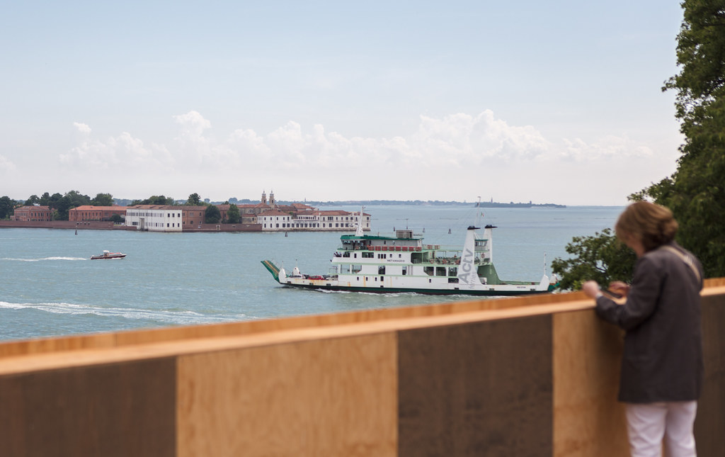 |
| The view from the rooftop terrace. Photo ©Darren Bradley |
Besides a few standout pavilions, the best experience at the Biennale turned out to be in the main pavilion, where there were many models and mock-ups to walk through, at various scales, included 1:1.
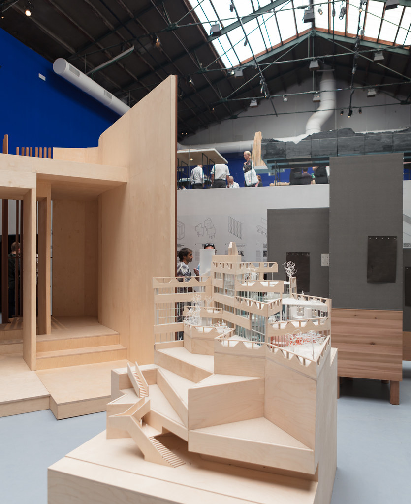 |
| Some of the models and mock-ups at the Biennale main pavilion. Photo ©Darren Bradley |
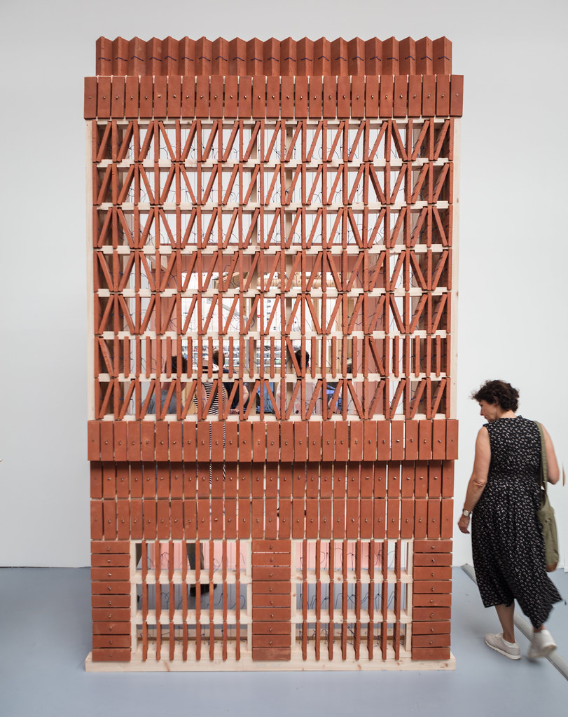 |
| Venice Biennale Main Pavilion full scale mock up of interesting brick work. Photo ©Darren Bradley |
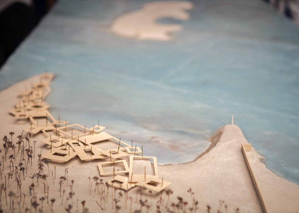
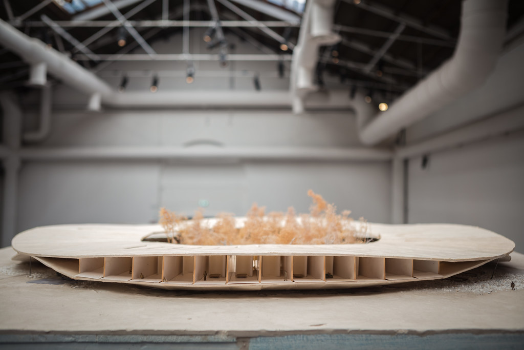
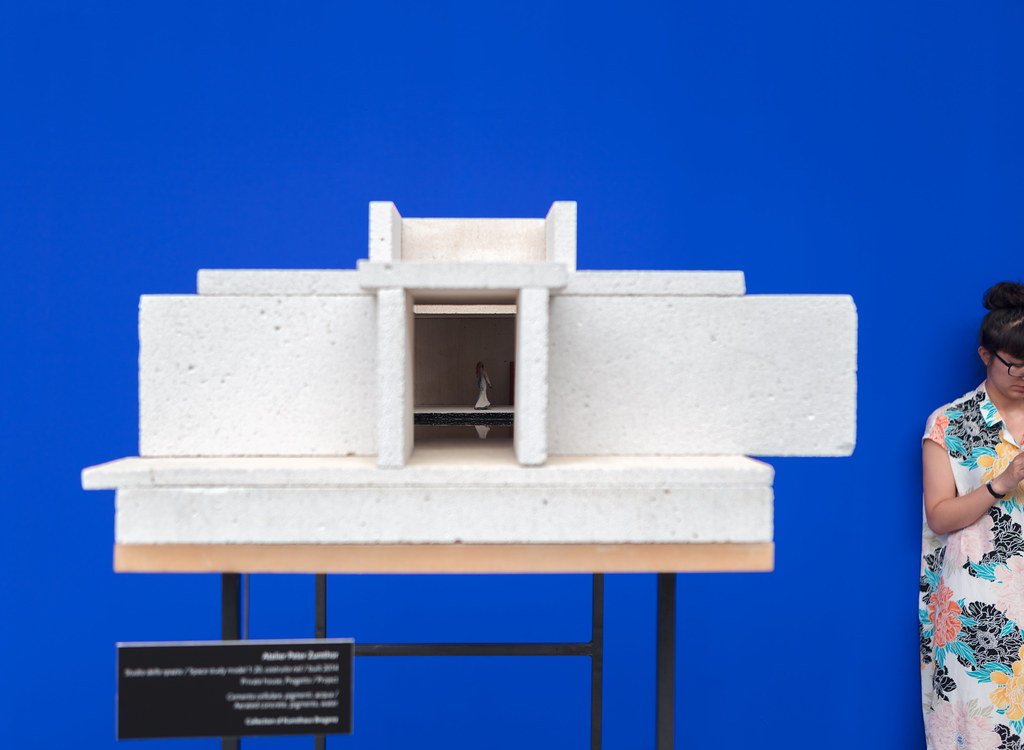
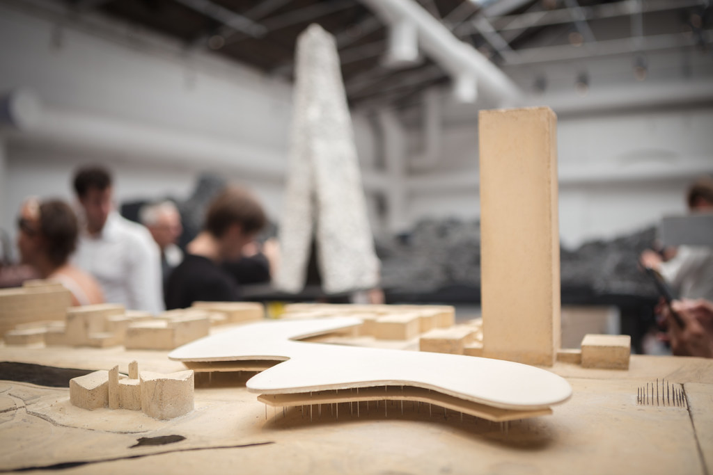
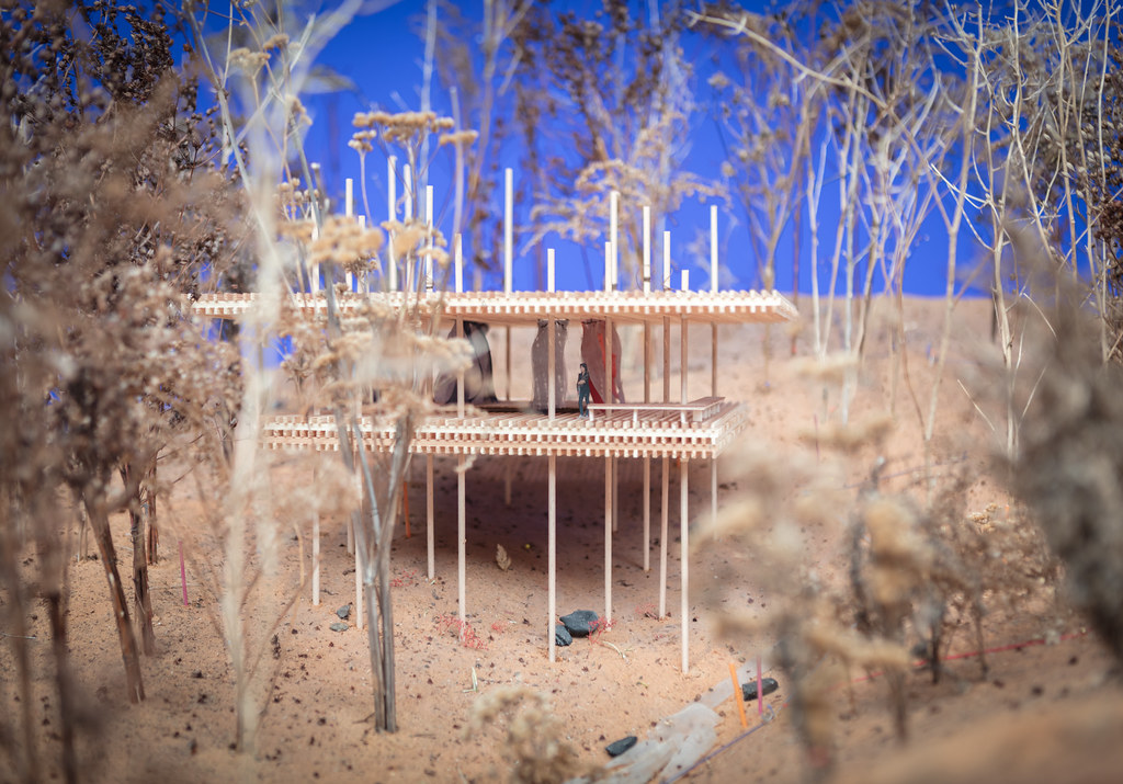
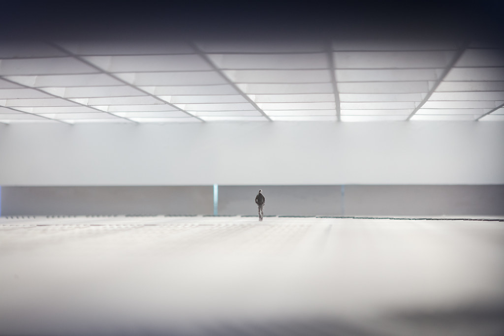
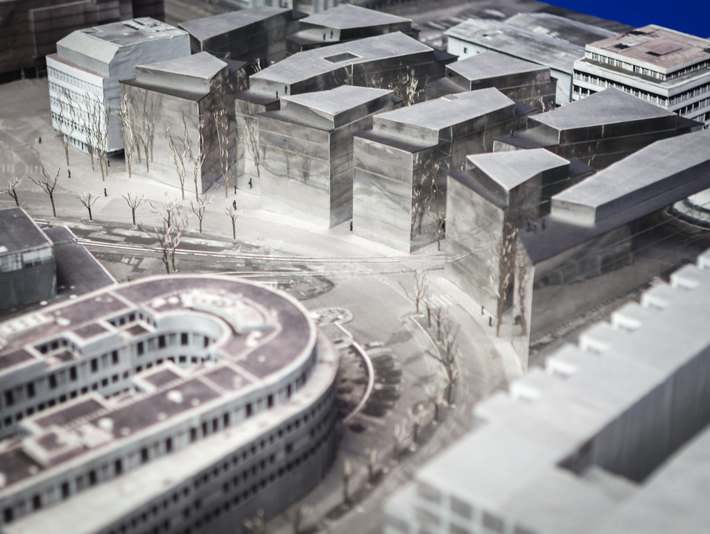
The mezzanine showcased the work of Swiss architect Peter Zumthor, and included some of the most beautiful models I've ever seen.
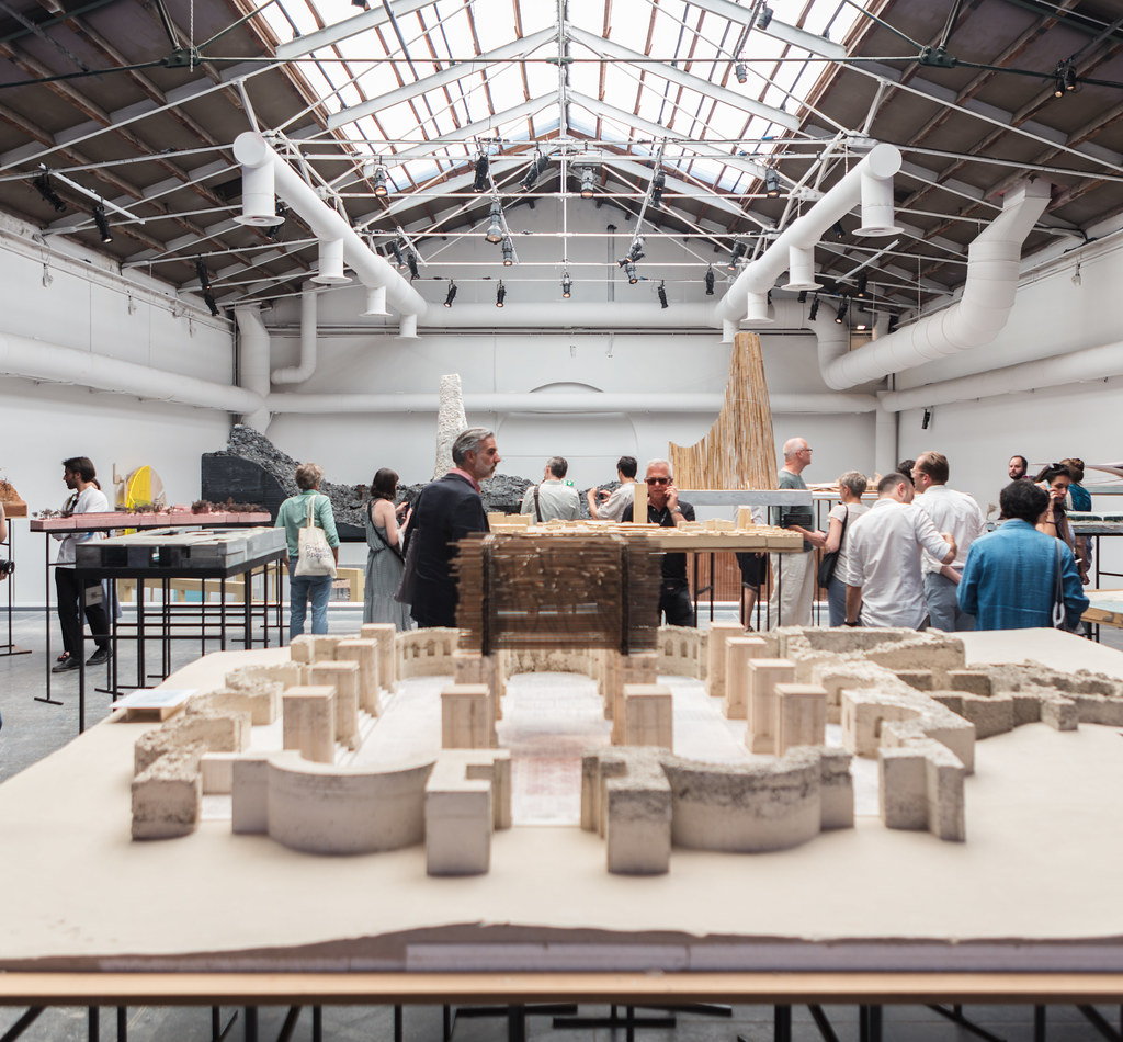 |
| Peter Zumthor model. Photo ©Darren Bradley |
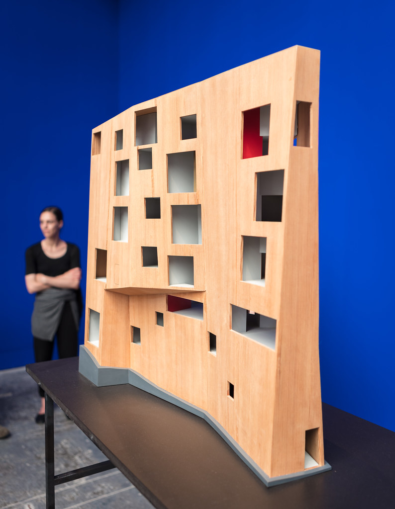 |
| Peter Zumthor model. Photo ©Darren Bradley |
|
 |
| Peter Zumthor model. Photo ©Darren Bradley |
|
 |
| Peter Zumthor model. Photo ©Darren Bradley |
|
 |
| Peter Zumthor model. Photo ©Darren Bradley |
|
 |
| Peter Zumthor model. Photo ©Darren Bradley |
|
 |
| Peter Zumthor model. Photo ©Darren Bradley |
|
 |
| Peter Zumthor model. Photo ©Darren Bradley |
|
 |
| Peter Zumthor model. Photo ©Darren Bradley |
|
My own exhibit, entitled "Yesterday's Vision of Tomorrow", is currently at the Palazzo Bembo on the Grand Canal, through November. It's a small exhibit located in a large building full of many other artists and architects, in a rabbit warren of rooms. As the title suggests, it's about Modernist architecture that has faded from interest and even relevancy. It's intended to provoke thought about what makes architecture relevant or obsolete, as so many of these buildings featured were once considered innovative and are now threatened with demolition.
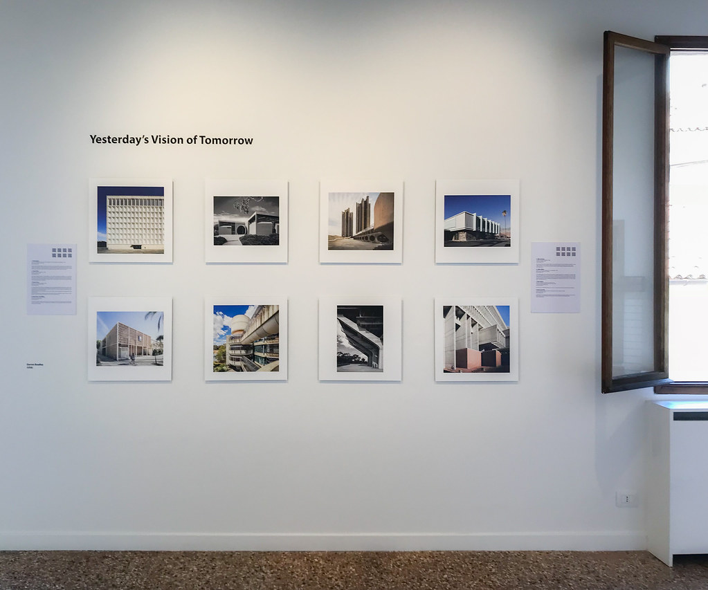 |
| My little exhibit, "Yesterday's Vision of Tomorrow", is at the Palazzo Mora through November. Photo ©Darren Bradley |
Overall, I had a fantastic experience at the Biennale, nonetheless. It's just a bit disappointing that so many of the participants didn't come up with more creative ways to use the spotlight of this unique event, to create more of an experience... Would I return? Ummm, maybe. But only for a specific reason, depending on what was being shown. And in any case, I'd adjust my expectations.
Oh, I should probably also share a few photos of the I great apartment I had in Venice. It was designed by Carlo Scarpa's protégés in the 1960s, and included lots of the same features found in the Olivetti showroom...
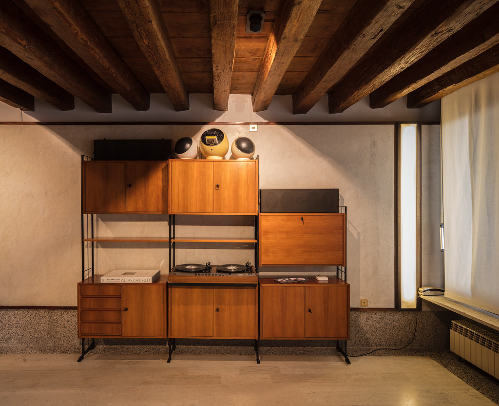 |
| My apartment in Venice, designed by several students of Carlo Scarpa in the early 1960s. Photo ©Darren Bradley |
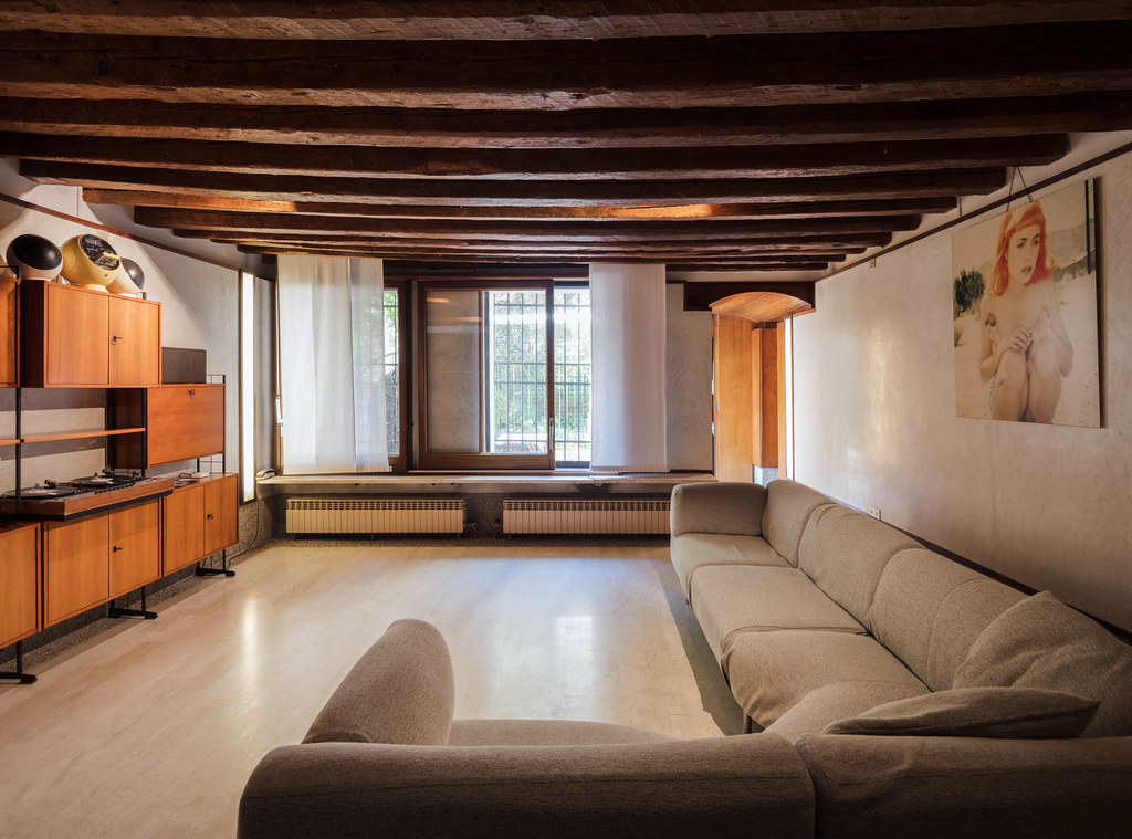 |
| Living area of my apartment in Venice, designed by several students of Carlo Scarpa in the early 1960s. Photo ©Darren Bradley |
|
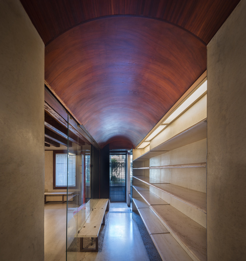 |
| Corridor leading to the kitchen in my apartment in Venice, designed by several students of Carlo Scarpa in the early 1960s. Photo ©Darren Bradley |
|
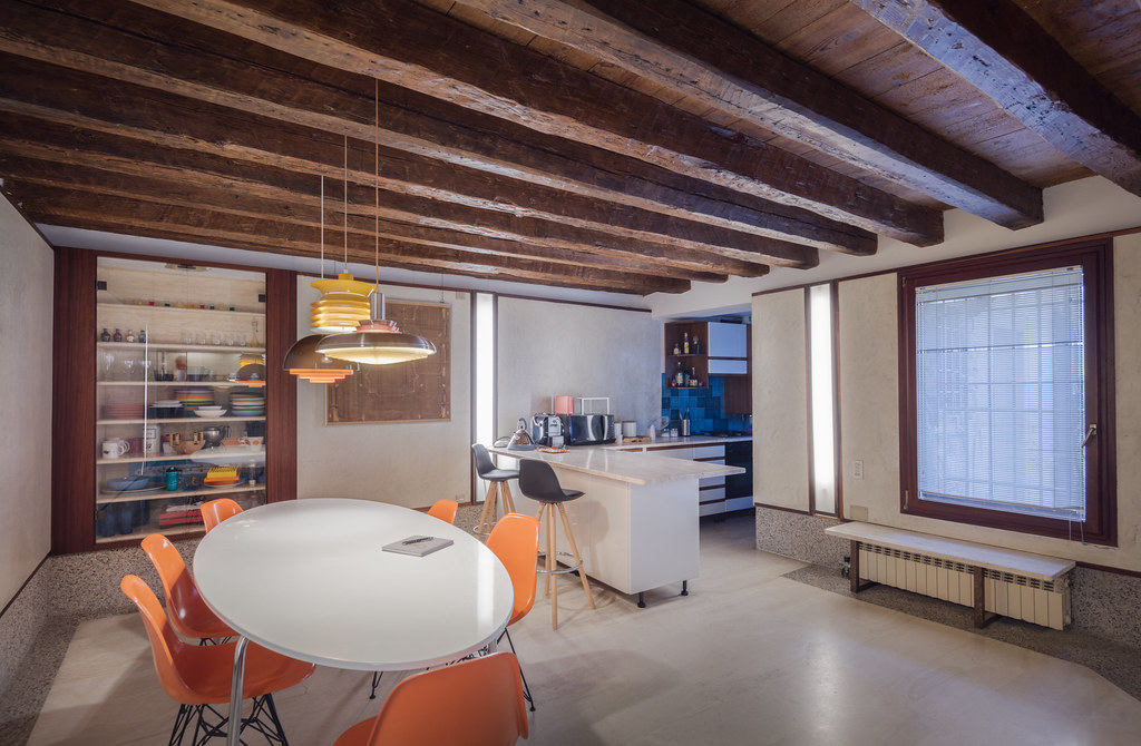 |
| My apartment in Venice, designed by several students of Carlo Scarpa in the early 1960s. Photo ©Darren Bradley |
|
I also got a chance to catch up with a lot of great friends, and also to meet many new ones. Special thanks to my friend Tim Ross and the Australian delegation, who welcomed me as one of their own. I spent a lot of my time there hanging out with that great crew. Also a huge thanks to journalist Kasia Olechowska and the team at the Polish pavilion for their warm hospitality. And finally, huge thanks also to author, architect, and historian Pierluigi Serraino for a wonderful dinner and some great conversation!
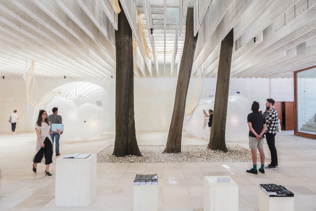 |
| I'll close the same way I opened this post - with a view of the beautiful Nordic Pavilion by Sverre Fehn. This year, the exhibit was curated by Finnish architect Lundén Architecture Company, and also addressed the relationship of architecture to nature. Photo ©Darren Bradley |
Thank you also to the GAA Foundation and the European Cultural Centre for all of your help in putting together my exhibit at Palazzo Mora, and to Sabine at Grieger for the beautiful prints. It looks great!


55 comments:
This is the first review I have read for the 2018 Biennale and it was not what I was expecting at all. As someone who is studying architecture my immediate thought when I looked through the internal images Darren had taken was it looked like an architecture school’s final exhibition with student’s projects on display only with a higher budget and arguably better quality of work, or at least more consistent. This method of communication amongst architects and architect students is successful but can anyone off the street understand the underlying concepts / challenges without experiencing it?
I agree with Darren that people do not want to go to the Biennale only to read large sections of text and plans posted on the walls. I think a major problem architects have is that the general public does not understand the way in which their work is presented. This is evident in the image taken by Darren of Carlo Scarpa’s Sculpture Garden. There is no way even architects would grasp the spatial qualities of this space through text and plans. This notion of communication is rather ironic as architecture is for the general public more often than not. Regardless if you are interested in architecture at an intellectual level or not, people need to be able to understand it spatially and if not, people should be able to recognize how they feel in that space for example, you may not understand why the hallway has a lowered ceiling, but you do know that you want to move through this space and not resonate. It seems odd the Biennale (and once again, a little bit ironic) has chosen a method of display of architectural ideas that people struggle to understand spatially, in a sense of scale or even a feeling.
Where I disagree with Darren and maybe the ideals of modernism; I do think that architecture is right moving away from ‘starchitects’ and focusing on social and political change however, without the ‘wow’ factor from starchitects work architects need to push a lot harder for not only people to understand it but to sell it.
Hmmm....interesting review, Darren. They same situation you describe here has been a conundrum in the art world for a while now. The emphasis has moved so far into the "hyper-message" realm, it has almost exclusively become an intellectual exercise with very little to truly enjoy on a visceral level.
In regards to your observations on the relevance of Mid-Century Modern architecture (and the demise of its most gorgeous examples), every design movement eventually integrates into the collective whole as the world moves forward. That being said, it is fun to look back and enjoy/appreciate all the separate components from the past :)
-VitricArt
Interesting review. I think you are very honest on writing your thoughts and I appreciate that. This is something that students should take into study. I lik how you present the ideas and thoughts. Philippine Architects will definitely learn from you. Highly recommended.
Hello, an amazing Information dude. Thanks for sharing this nice information with us. Interior Designers Sydney
Nice piece of information, I am glad that you have shared this information, now we would like to introduce Key Vendors, which is one of the biggest home service portal in India offering Interior designing, Plumbing services, Ac service and repair, Waterproofing services, Architecture, electrician, painting and hardware, Carpenter etc.
Mais um trabalho que nós favorece em todos os projetos de nossa empresa de pintura
pintura residencial
If you want to hire best Architecture, Construction and Interior Design Services in Islamabad Pakistan Then Visit Arco Desk construction companies in islamabad
Nice content
Thanks for the shharing
Consulting in India
I am very impressed with your information, Its a really very impressive blog. I really got some another very nice information, so thanks for sharing these tips.
best and affordable interior designer in delhi
Hi there, I just wanted to say thanks for this informative post, can you please allow me to post it on my blog?
click here
CPM Systems is well named organization also knows as office furniture manufacturers in Delhi, Noida, Gurgaon and Ghaziabad. We provide unique and sleek design modular office furniture, toilet cubicles and urinal partitions. You can find several types of designs and choose any design according to your match. For more details, you can call us on +91-9292928080 or visit our website: www.cpmsystems.in
This blog is very informative and interesting, the way you described the good thing of your blog and other cities Moreover, the details you give about the 2 BHK flat in Kolar road, 3 BHK flats in Hoshangabad road, 4 BHK flats in Hoshangabad road and 2 BHK flat in Kolar road along with a description of bungalows in Hoshanngabad road, duplex in Hoshangabad road and flats in Hoshangabad road. Moving towards Kolar road which where you mention that it is the best location to own flats in Kolar road and duplex in Kolar road espically 2 BHK flat in kolar road, 3 BHK flats in Kolar road and 4 BHK flats in Kolar road
[Thiết Kế Nhà] It's clear that architecture school has conditioned everyone because they all resorted to that same format to communicate their ideas - the giant posterboard printed with a few color computer renderings and an accompanying explanation of the program and how they've resolved it with their design
Nice blog with Amazing information .. love to read about this.
Awaiting for your new post
We at Fullassignment.com bring to you the most significant Information Security assignment help writing service at the best cost. With long stretches of understanding we are prepared to give assignment help online over the globe.You will be guided here with a portion of the information of Information Security assignment which could assist you in deciding writing a Information Security assignment. Nonetheless, we unequivocally prescribe you to benefit Inter Process Communication Assignment Help from our specialist to find out about marketing and its scope.We also provide Operating systems Assignment Help from our experts.
https://fullassignment.com/
I always wanted to design my home using my own ideas. That's why I hired a building designer to design my house. I hired building designers because they always design their client's buildings according to their requirements. Building designer Gold Coast
Your blog is very informative, meaningful, and to the point.
Keep it up with your meaningful blog writing.
student accommodation galway
Very interesting, good job, and thanks for sharing such a good blog.
your article is so convincing that I never stop myself to say something about it.
You’re doing a great job. Keep it up
unilodge-park-central
Really great very nice blog post, Thanks for sharing this interesting and very informative content. Always keep sharing.
student accommodation liverpool
3D rendering is a technology that gives form or life to everything that can be given in time, from the product to the architecture, which produces optimal results thanks to 3D rendering when choosing Team designs, Australia
3D Architectural rendering
3D Rendering
I read your content, what amazing content this! Thanks for sharing this informative content. Here some additional tips- Civil Engineering Home provides informational resources to Civil Engineers on subjects such as concrete, Building Tips, construction. On this website concrete installation, you know about concrete how to prepare it by materials, also known some properties.
Architectural Consultants in Dubai
Architecture Firms in Dubai
Top Architecture Firms in Dubai
Interior Design Services in Dubai
Interior Design Company in Dubai
Keywords:
Free Submission Sites List 2021
Introduction to SEO
On Page Optimization SEO Guide
Keyword Research in SEO
Its a really very impressive blog.Thank you for sharing.
Best Astrologer in Vijayanaga Visit here to know your Future
Really great very nice blog post, Thanks for sharing this interesting and very informative content. Always keep sharing.
best engineering consultants in dubai
contracting companies in dubai
This is exactly what I was looking for. Thank you for sharing. It will be really helpful for me.
trakhees approval
itc abu dhabi
Nice Post. Informative post about Architecture Elements. Modern Architects in Chennai.
This blog is very helpful for me. Thanks for sharing this information with us. Visit our website for Best Kitchen Interior Designers in Delhi, Modular Wordrobe Design,and Modular Furniture Design in Delhi NCR.
Nice blog. I was looking for this type of information and enjoyed reading this onevilla Design in Dubai
Good article and personal experiences. By reading this article i got a clarity thank you man, I would also like to recommend you go with Restaurant Fitout in Dubai
Very informative contact i really like. If you are interested to visit best places visit my website Famous Places in Karachi
Thanks a bunch for sharing this with all people you actually recognise what you’re speaking approximately! Bookmarked.
메이저사이트
경마
온라인경마
After study a few of the blog posts on your website now, and I truly like your way of blogging. I bookmarked it to my bookmark website list and will be checking back soon. Pls check out my web site as well and let me know what you think.
majortotositepro1
racesitepro1
oncasinositenet1
totopickpro1
useful link dior dolabuy look at these guys dolabuy hermes click to read 7a replica bags wholesale
https://www.experienceowndot com/
How to make money online
https://www.experienceown.com/> Make money online
e3b01n7e72 q4s45x1x72 s7m54j8h69 o3r50s8i41 l6r89l1p38 c8j16k4j73
هل تريد تجهيز شركتك او مكتبك وتاريد الحصول علي افكار وخامات عالية الجودة لابد ان تتعامل مع شركة ستار وود افضل شركة اثاث مكتبي في مصر
Thanks for this your article on Venice Architecture Biennale. It was very nice. Please share more updates on this Now it's time to avail Workwear Trousers for more information.
Such an excellent blog. It looks you spend a lot of time or effort in this blog. I will shear with my friends. Now it's time to avail HALFCASTE CREAM SET for more information.
This is an amazing architecture. I like all the pictures, these are also very good and clear. It is such an interesting view. Now its time to avail Limo service West Palm Beach for more information.
It is very enjoyable place to visit. The architecture is very good. It is very nice article. Hope so you shared more articles in future with us. Thankyou for share. Now its time to avail Car Services in Orlando for more information.
Honestly I am suprised to see how good the photos are, seeing them from the eyes of an architect is nice. Now it's time to avail Black Car Service in Fort Myers for more information.
Thanks to_________________________________ robinsonbucler@gmail com..
My heart is so filled with joy.
I am free from herpes
Sure herbal Treatment!!
Get Your Ex Boyfriend/Girlfriend Back!
Contact him for help...
Thanks for sharing the information. If you are frustrated with water leakage in your basement then don't worry and take services from exterior waterproofing services, they have basement waterproofing specialists who can do the job efficiently.
Your reflections on Venice are both insightful and thought-provoking. The juxtaposition of modernist architecture in such a historically rich city indeed raises questions about preservation and progress.
https://www.frugalishness.com/jobs-for-10-years-olds/
"Happy anniversary! Your blog has consistently delivered high-quality, engaging content over the past year. Here's to many more years of informative and entertaining posts!"
https://savingcentstogether.com/promotions/pre-school-smiles-promo
"Happy first anniversary! Your blog has been a beacon of knowledge and inspiration over the past year. Your dedication to providing valuable insights and fostering a sense of community is truly commendable. Looking forward to more!"
https://justamazingdiscounts.com/brand/summerstone-nursery-coupon-code/
"Congratulations on your blog's one-year milestone! Your ability to connect with your audience through insightful and relatable content has set your platform apart. Wishing you continued success and many more years of shared knowledge!"
https://couponsjournal.com/lowes-coupon-generator
Intriguing reflections on the Venice Architecture Biennale, capturing the complexities of the experience. The blog's thoughtful analysis adds depth to the discussion. While contemplating cultural events, explore exclusive opportunities—consider accessing insightful content with #UsePromos for added value on your cultural explorations.
رقم 1 في تصليح كراسي المكتب
I’ve heard plenty about spells but have never attempted it and the one time I did, it was successful for me. LORD MEDUZA performed a spell for me and provided the winning number that allowed my husband and I to win the Lotto. I returned home from the hospital where my baby was born and asked my husband to buy a Lotto Max ticket after seeing on social media that the Jackpot was at $70 million, mentioning that I’d found someone who could assist us in winning it and we proceeded exactly as LORD MEDUZA directed with the ticket. The next morning, I used my phone to check the ticket and heard a winning tone. I was in disbelief and unable to comprehend what was occurring, I looked at the ticket once more and I saw the same thing. That’s when I phoned my husband to tell him we had won. Thus, anyone seeking assistance can reach out to LORD MEDUZA, as his work embodies what I term perfection. He can be contacted via
WHATSAPP: +1 807 907 2687
EMAIL: lordmeduzatemple@hotmail.com
Mixed feelings about the Venice Architecture Biennale often stem from its bold blend of innovation and abstraction—challenging the line between visionary design and conceptual overreach.
11xplay is an online gaming platform offering sports betting, live casino, and slots with secure access and instant play.
Thank you for sharing your experience at the Venice Architecture Biennale—this was a truly fascinating read! Your perspective as an architectural photographer adds a unique depth to the way the event is described, especially the balance between admiration and “mixed feelings.”
I really enjoyed your insights on iconic spaces like the Nordic Pavilion by Sverre Fehn and Carlo Scarpa’s sculpture garden. The way you captured both the visual beauty and the atmosphere of the Biennale makes the reader feel connected to the experience.
Events like these not only celebrate creativity but also inspire professionals and learners across different fields to think innovatively and expand their perspectives.
In today’s creative and digital era, combining artistic vision with digital skills can open many opportunities. For those interested in building practical and career-oriented digital marketing skills, I would recommend exploring
Pune Digital Marketing Course
which offers industry-focused training and hands-on learning.
Thanks again for sharing such an insightful and visually rich experience—looking forward to more of your work!
Post a Comment