 |
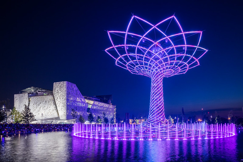
| For the 1889 World's Fair, Paris got the Eiffel Tower. For the 1958 World's Fair, Brussels got the Atomium. For the 1962 World's Fair, Seattle got the Space Needle. And for the 2015 World's Fair, Milan got... This. The Tree of Life, as it's called, is intended as the symbol of the Milan International Exposition. Not sure it will have the same broad impact or longevity as the some of the other symbols, but it's certainly in keeping with Milan's more low key approach. Photo ©Darren Bradley |
It's hard to believe that it's already been five years since Expo 2010 in Shanghai. I was lucky enough to be able to attend that event, and it completely blew me away. The sights, the sounds, the architecture, the people, the city... It was sensory overload, and I loved every second of it. So I was very excited when I learned that the next Expo would be in Milan in 2015 (International Expos are held every five years, with smaller events held in the interim, on occasion). I immediately began making plans to attend, which I did at the beginning of July this year.
But what I found in Milan was something completely different than what I'd seen in Shanghai - both in scale and style.
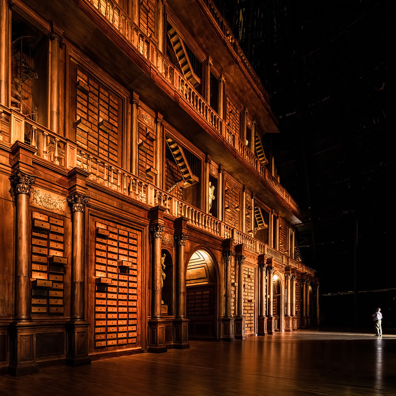 |
Visitors to Milan's Pavilion Zero are greeted with this massive library when entering, and pass under the arches to enter the fair.
Photo ©Darren Bradley |
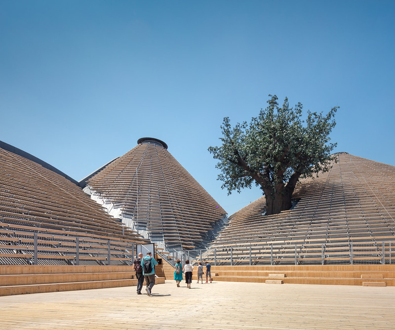 |
Pavilion Zero was designed by Michele de Lucchi, one of the fathers of the post-modern Memphis design movement. Visitors would pass across the roof of the pavilion here. Note the "Tree of Life", which is the theme and symbol of the fair.
Photo ©Darren Bradley |
It's probably not fair to compare the Expos in Shanghai and Milan. After all, the two cities (and countries) are completely different - both their cultures and their resources and means.
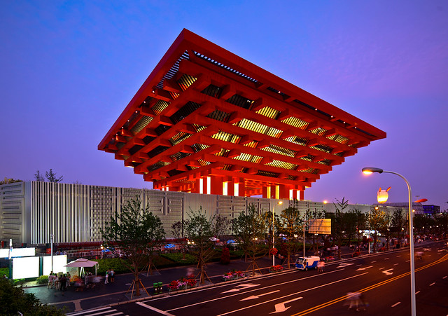 |
| The China Pavilion in Shanghai was simply massive, and also served as the primary symbol of the event. Photo ©Darren Bradley |
When China held the Expo in 2010, it used the event as a means to show the world just how wealthy and powerful the country had become, and how modern.
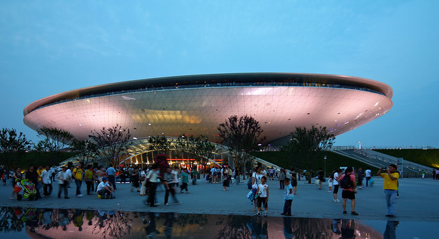 |
| Shanghai used the Expo as a catalyst for building lots of new infrastructure in the city, such as this brand new stadium arena in the form of a flying saucer. Photo ©Darren Bradley |
The Expo was absolutely huge - five times as large as the Milan expo site - and even small countries put up enormous, extravagant pavilions seemingly trying to one-up each other.
 |
| The Danish Pavilion at Shanghai, with its cantilevered concentric ramps and bicycles to ride up and down them, was a stand-out crowd favorite. It was designed by Bjarke Ingels. Denmark did not even participate in Milan's Expo. Photo ©Darren Bradley |
It seemed as if nearly every "starchitect" on the planet had designed something. In fact, Jacques Herzog of Herzog & De Meuron said of Shanghai that "you were blinded by the amount of design..." I personally didn't think that was a bad thing, but Herzog didn't mean that in a good way.
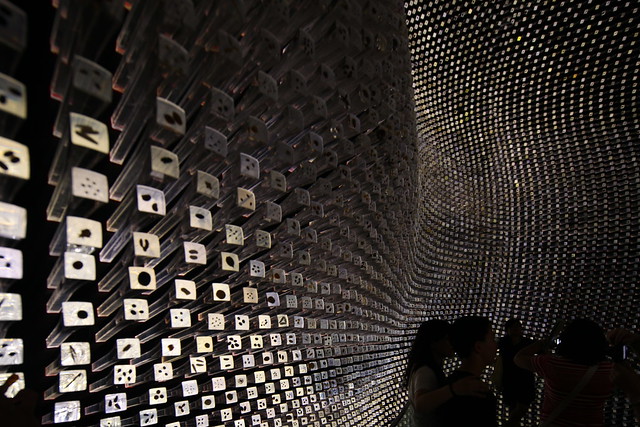 |
| Heatherwick's design for the UK pavilion at Shanghai was my favorite. A stunning, minimalist design for a "seed cathedral" that incorporated large perspex rods that pierced the walls of the pavilion, carrying in light. At the end of each rod was a single variety of seed, encased in the perspex. Photo ©Darren Bradley. |
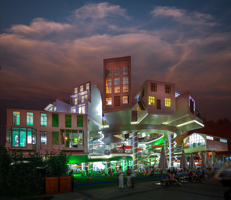 |
| Holland's pavilion at Shanghai was an entire village cantilevered over a series of spiral ramps, suspended over the fairgrounds. It was quite mad, and brilliant. Like a fun house. Photo ©Darren Bradley |
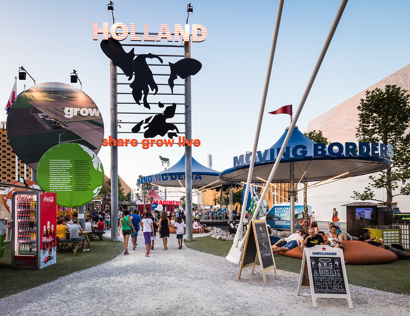 |
| For Milan, Holland took a much more scaled down approach, but the carnival party atmosphere continues. Photo ©Darren Bradley |
For Milan, the theme was about food and feeding the planet in a sustainable way. So the planning team (which included Herzog & de Meuron) were intentionally seeking a more low-key approach that was less about design and more about sustainability and legacy (i.e. how will the site be used after the expo).
 |
| Herzog & de Meuron's concept for the Milan Expo included extensive use of canals, referencing Milan's historic character as a canal city. About US$70M was invested in building canals at the site until engineers realized that there was not sufficient water pressure to sustain them, and the plan was abandoned. There are a few canals at the site, but they are not used. |
The end result is a fair that is much smaller, and more human-scaled. The grandiose national pavilions with bleeding-edge architectural innovations that Herzog & de Meuron and the Expo organizers discouraged are minimized This was a disappointment to me, because it has always been my favorite part of attending Expos (I've attended several over the years).
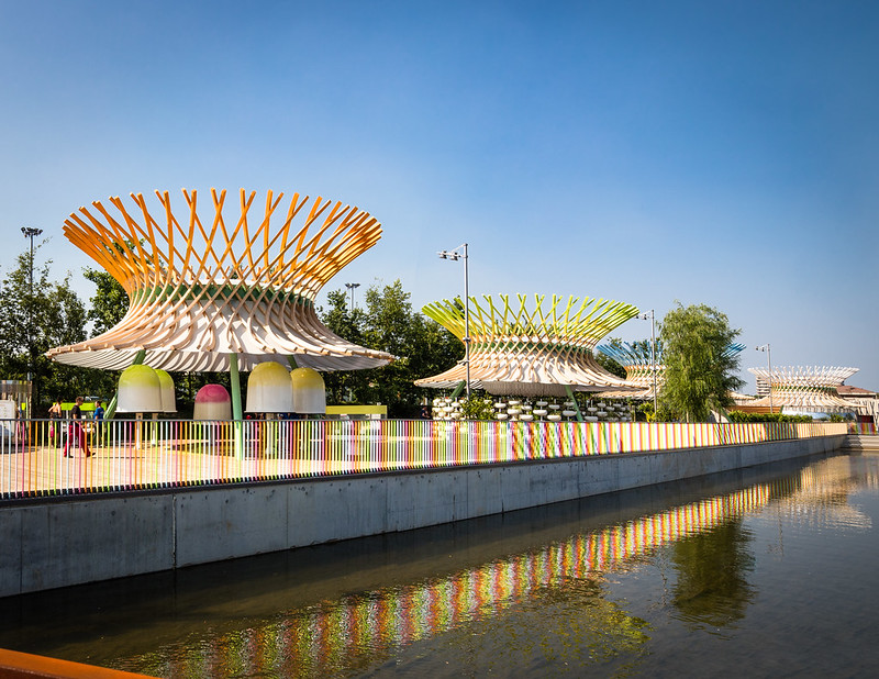 |
| View of the Children's pavilions, set alongside some of the now abandoned canals. These were off the main strip, and not well frequented. I didn't actually see any children present at them - or anyone else save a few bored employees. Photo ©Darren Bradley |
But gone also were the huge crowds and eternal, slow-moving lines of people snaking all over the place. The Chinese attended the Shanghai Expo by the tens of millions. Even the most insignificant and boring pavilion - such as a pavilion by the Chinese state oil company - would have a five-hour line to get in. Attendees were paying people to stand in lines for them, and vendors selling little portable stools were doing a brisk business. It meant that after two days in Shanghai, I had only seen the interiors of about a half-dozen pavilions.
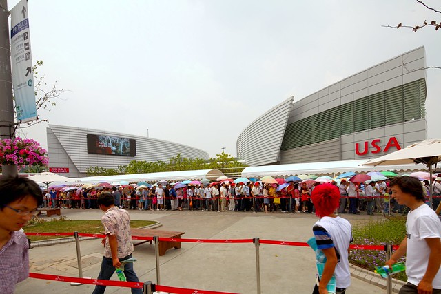 |
| View of the long lines snaking around the USA Pavilion in Shanghai. Photo ©Darren Bradley |
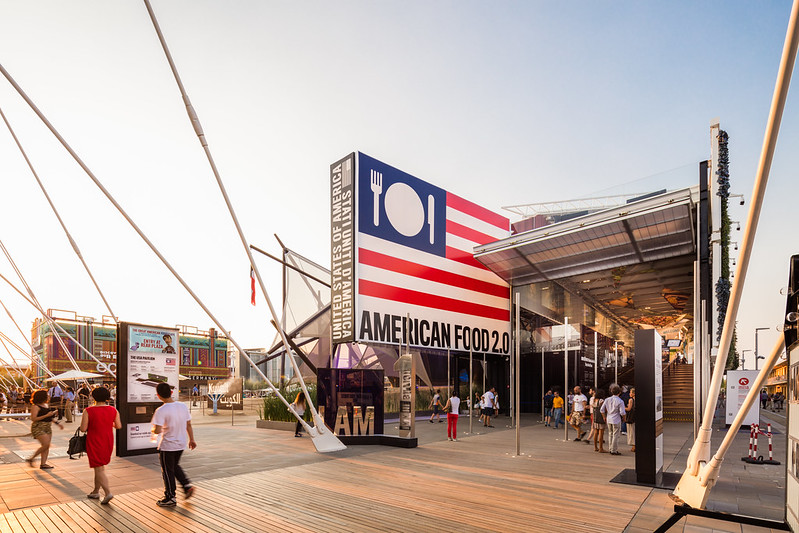 |
| In Milan, no waiting for USA Pavilion (or any other pavilion). Note the size difference of the pavilions, as well. The USA Pavilion in Shanghai was much larger. Biber Architects. Photo ©Darren Bradley |
In Milan, the Italians in the city had warned me about huge crowds and misery. But Italians clearly have a different idea about what a huge crowd is. In fact, the place was not crowded at all during the day, and we were free to wander in and out of nearly every pavilion at our leisure, without any lines at all.
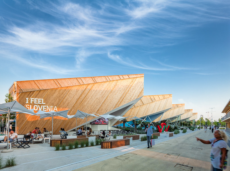 |
| Slovenia has one of the more interesting designs for its pavilion, and has a DJ blasting Slovenian rock and pop songs out front all afternoon, which made for a lively ambiance. They were also giving out stickers that said "I FEEL sLOVEnia", which are plastered everywhere, making them the winner of the guerrilla marketing award. Architects: SoNo Arhitekti. Photo ©Darren Bradley |
In the evenings, the place would get more crowded as the locals would show up for dinner and see a few pavilions, but it was still easy to get around. Alas, in the evenings, the mosquitos also came out in force...
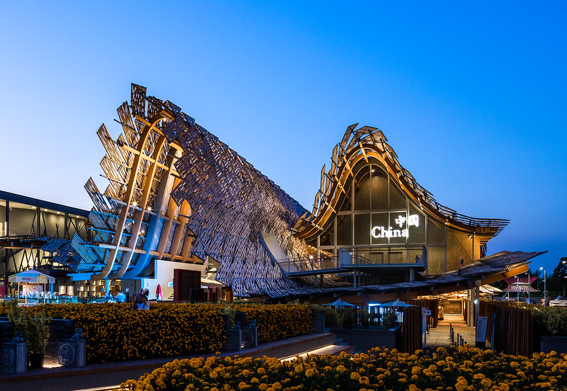 |
| China's pavilion at the Milan expo seems to have taken a page from what Spain had designed for the Shanghai Expo, using woven sticks and wood beams as the principal structure. Architects: Tsinghua University and Studio Link-Arc. Photo ©Darren Bradley |
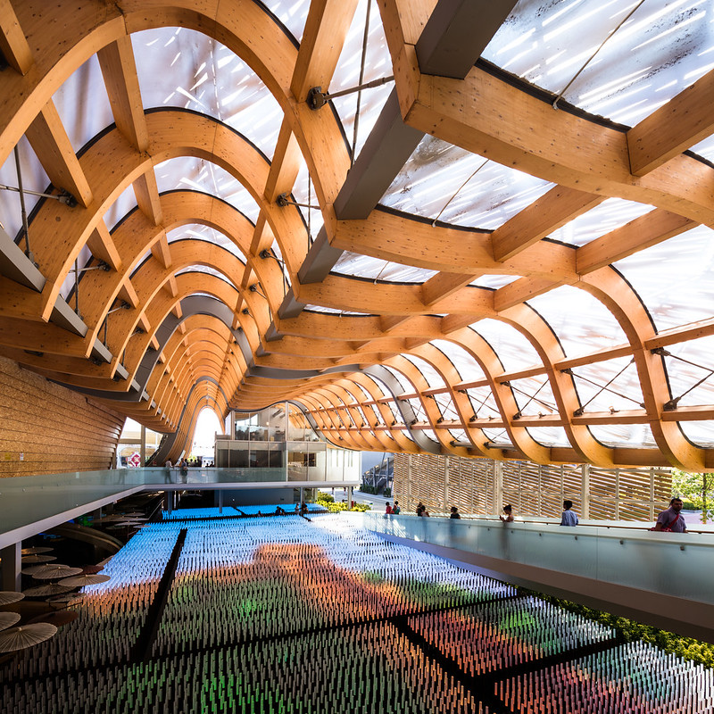 |
| Interior of China's pavilion at Milan Expo this year, with LED light rods that form images on the ground, similar to what they'd done for the opening ceremony at the Beijing Olympics. Photo ©Darren Bradley |
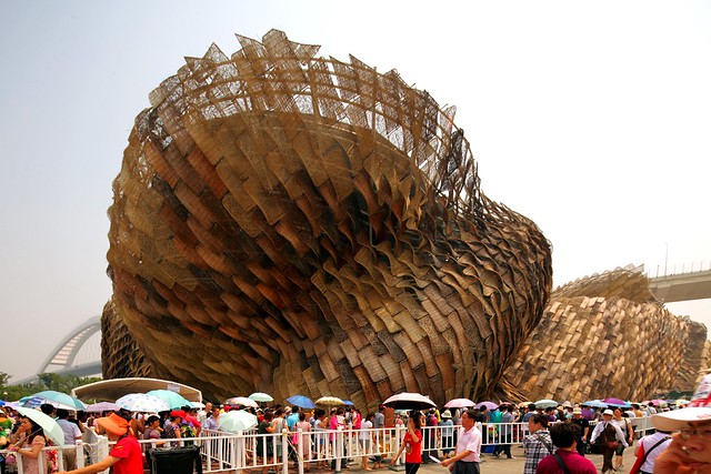 |
| Spain's pavilion at Shanghai Expo in 2010. Note the similarities with China's design for Milan in 2015. Also, note the huge crowd waiting to get in. There were no lines in Milan. Photo ©Darren Bradley |
We were also worried about the extreme heat at the fairgrounds. In Shanghai, there was a covered central walkway. But most of the pavilions were not along this walkway, and the whole event was more spread out. That meant that to get to each of the pavilions, you needed to walk in direct sun, and wait in lines in direct sun - for hours. I thought I was going to die of heat exhaustion, and my feet were killing me by the end of the day.
In Milan, all of the pavilions were arranged along the central walkway, which was covered by canopies along the entire one-kilometer passage. So there was hardly a time when you were in the sun, and we were always comfortable, despite the 90-degree weather and high-humidity.
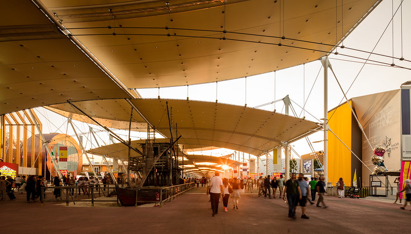 |
| Nearly all of the pavilions in Milan are arranged along a central avenue with this canopy. In the original Herzog & de Meuron concept, there were communal tables arranged along the center where the pavilions would place fresh produce grown at each pavilion for the crowds to taste, like a communal dining table. That was scrapped in favor of static displays representing various agricultural industries (farming, livestock, fishing, etc.). Photo ©Darren Bradley |
The downside to Milan is that the pillars and supports for the canopy system create obstructions for photographing the pavilions. So finding angles to get a nice, clean shot where it wasn't an issue was challenging and sometimes impossible. In Shanghai, the pavilions were presented and sited in a way that they were meant to be photographed. In Milan, they clearly were not. This drove me a bit mad at times.
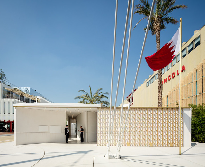 |
| The Bahrain pavilion has a mid-century modern feel to it that I really liked. Note the presence of the canopy supports blocking my view. I didn't have the patience to try to clone them out in Photoshop. Architect: Studio Anne Holtrop. Photo ©Darren Bradley |
As far as the pavilions, they were more subdued than in Shanghai, or other expos I'd attended. Some kept with traditional architecture...
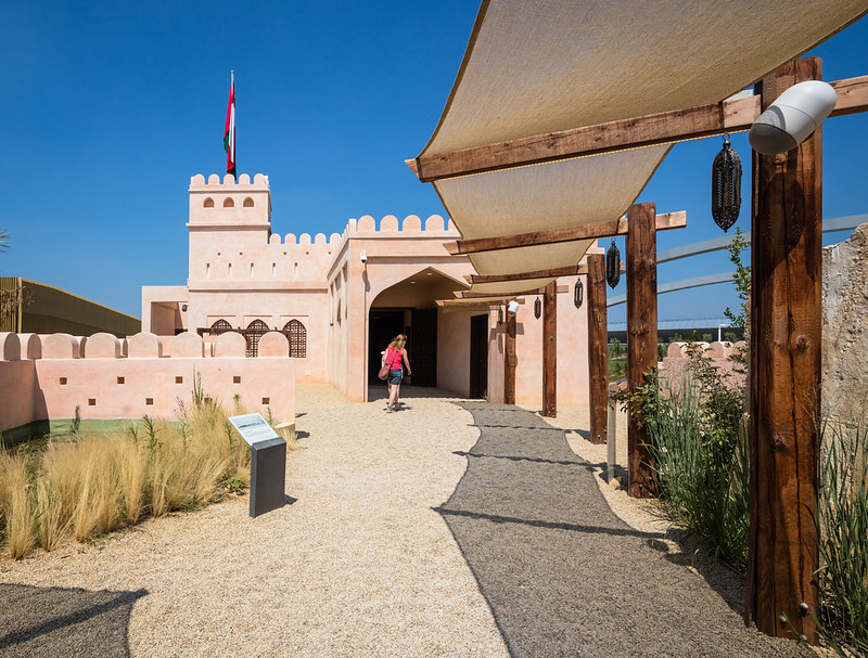 |
| The Omanis took a traditional cue for their pavilion. Photo ©Darren Bradley |
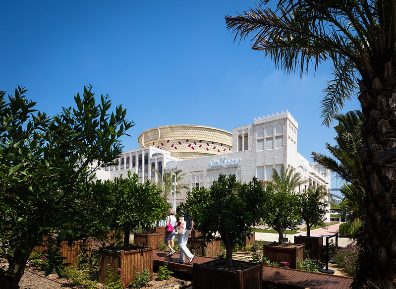 |
| Qatar also went traditional, with a castle and market bazaar, and a giant woven basket in the middle. Inside the basket was a spiral ramp with a laser show. Photo ©Darren Bradley |
While others went modern, while evoking tradition.
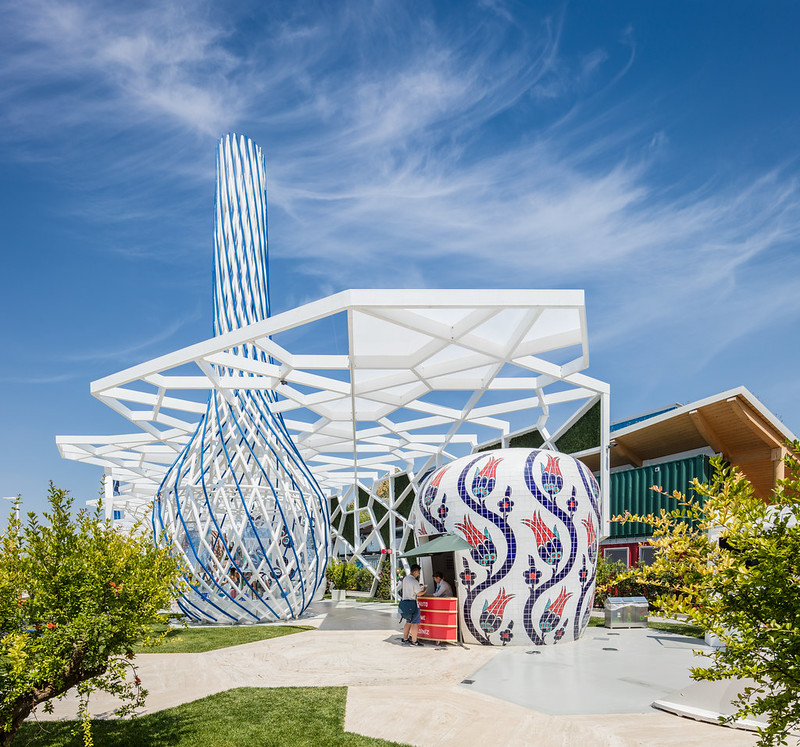 |
| The hazelnuts were really good at the Turkey Pavilion. Photo ©Darren Bradley |
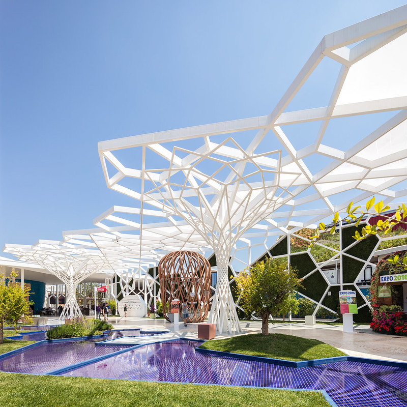 |
| Turkey Pavilion. Photo ©Darren Bradley |
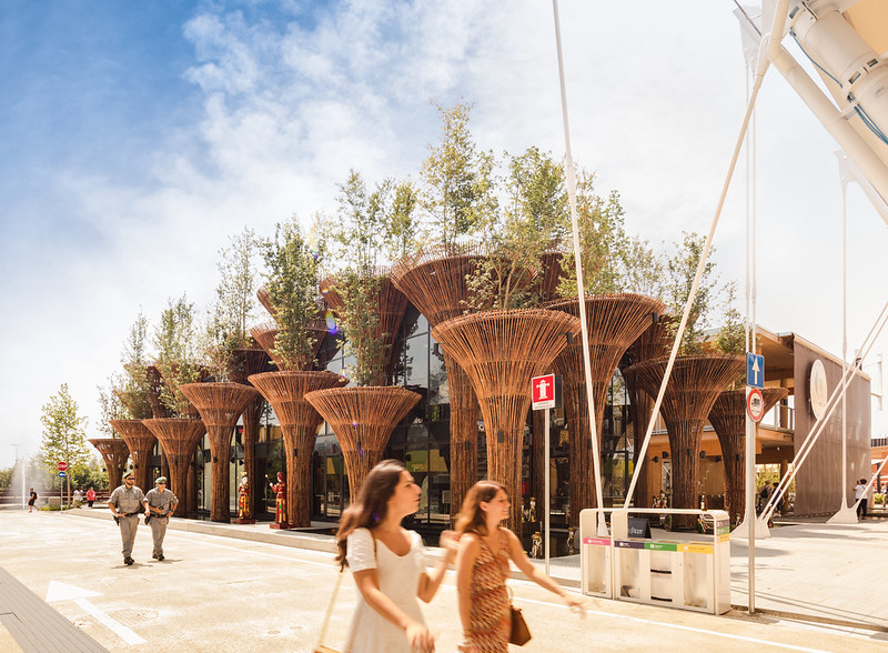 |
| Vietnam Pavilion. Architects: Vo Trong Nghia. Photo ©Darren Bradley |
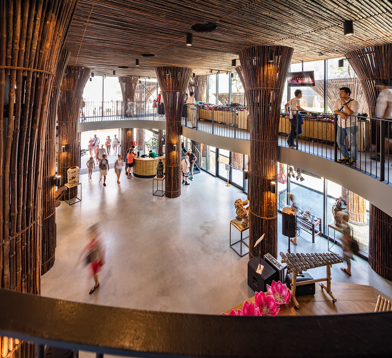 |
| Vietnam Pavilion. Photo ©Darren Bradley |
And others went very modern and minimalist.
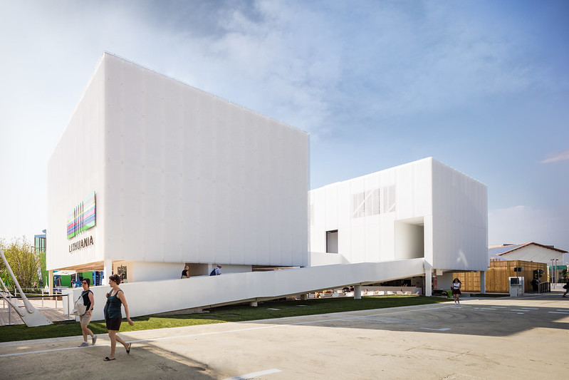 |
| Lithuania Pavilion. Photo ©Darren Bradley |
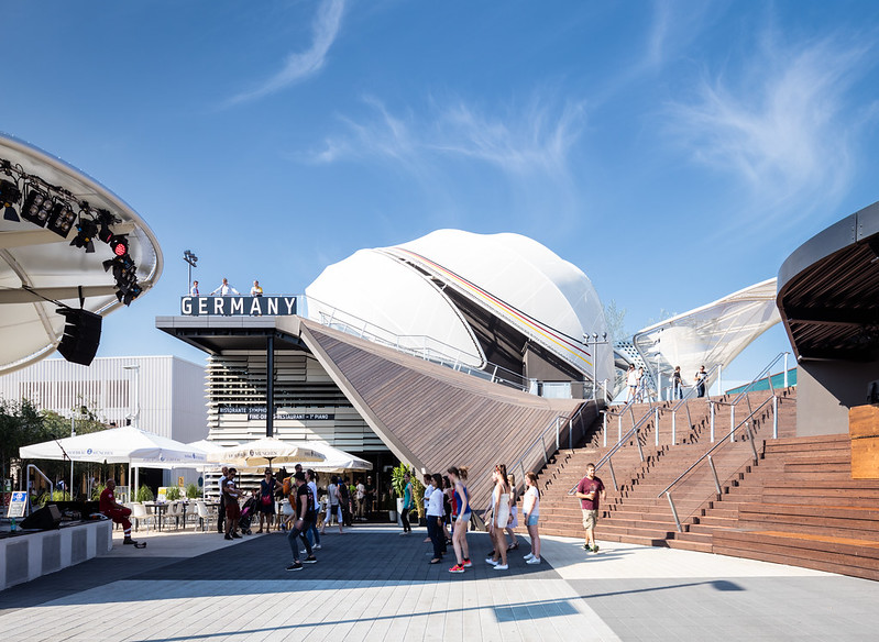 |
| Doing the Hokey Pokey at the Germany Pavilion. Architects: SCHMIDHUBER + Milla & Partner + Nüssli. Photo ©Darren Bradley |
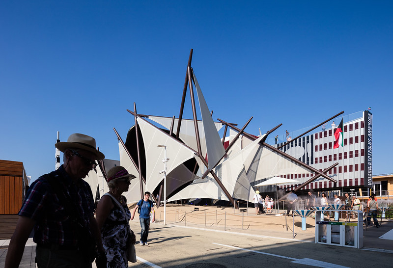 |
| The Kuwait Pavilion evoked sails of a ship. Many of the pavilions used inexpensive sails or canopies in their designs. Architects: Studio Italo Rota. Photo ©Darren Bradley |
 |
| Chile Pavilion. Architect: Cristián Undurraga. Photo ©Darren Bradley |
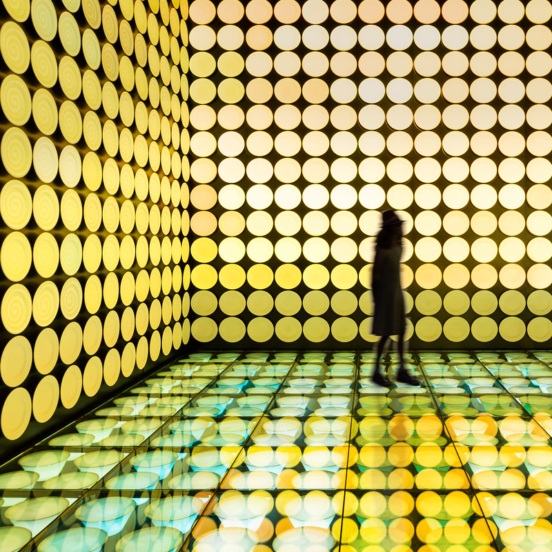 |
| Spain Pavilion. Architects: b720 Designs. Photo ©Darren Bradley |
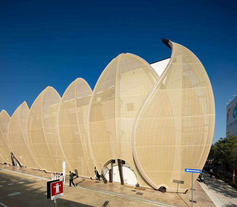 |
| Mexico Pavilion. Photo ©Darren Bradley |
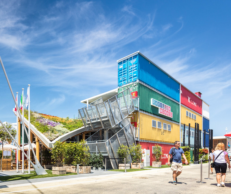 |
| Monaco is somewhat out of character with their grunge, post-industrial pavilion. Architect: Enrico Pollini. Photo ©Darren Bradley |
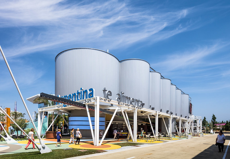 |
| Argentina also went industrial. Photo ©Darren Bradley |
Many are little more than large boxes filled with information about the products made by that country - such as tractors, or vacuum cleaners, oriental rugs, or speedboats.
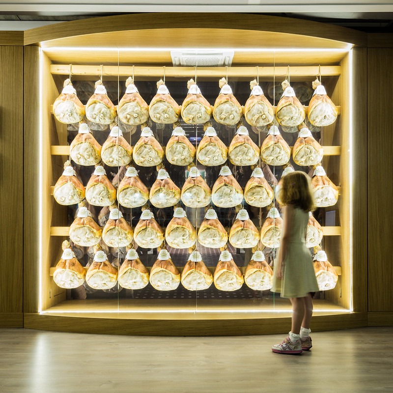 |
| Italy really wants you to buy more ham. Photo ©Darren Bradley |
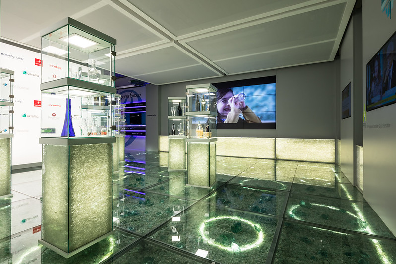 |
| Italy also wants you to know about their innovative glass industry. Photo ©Darren Bradley |
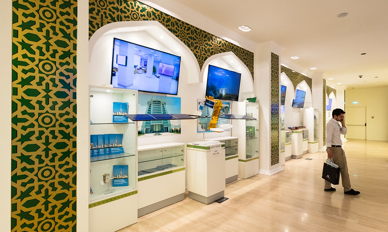 |
| Turkmenistan wants you to know about their new communications satellite that they built and launched recently. What they didn't mention was that they've also recently banned all satellite dishes in the country. Photo ©Darren Bradley |
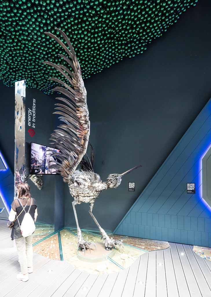 |
You never know what kind of random shit you're going to find inside these pavilions. In Slovakia's pavilion, there was this giant bird sculpture made of knives and spoons that looked like something out of Game of Thrones, and a giant painted egg. There were also naked female mannequins on which people were encouraged to write messages of good will.
Photo ©Darren Bradley |
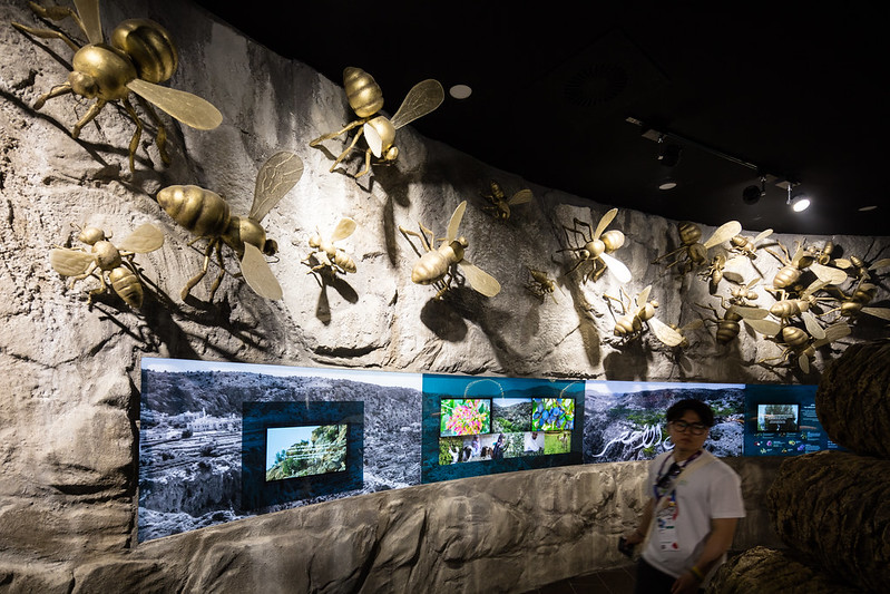 |
| I was very pleased to see several countries emphasize apiculture and the importance of bees to our environment. This was in the Oman pavilion. Photo ©Darren Bradley |
But some of them decided to create more artistic statements, or at least more entertaining, despite the guidance from Expo organizers to tone down the designs. Here is Brazil...
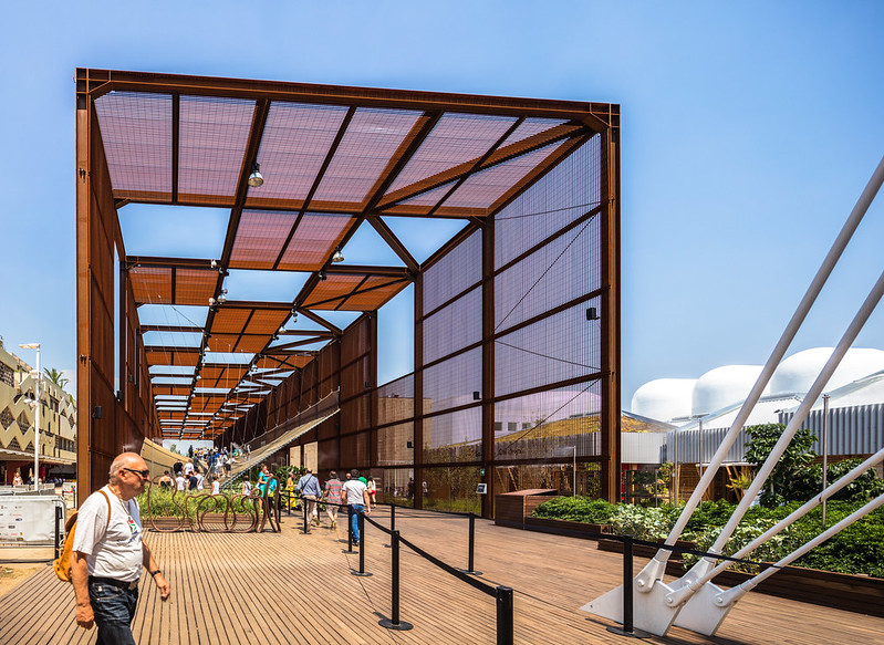 |
| Architect Arthur Casas and Studio Marko Brajovic turned Brazil's pavilion into a jungle gym, with a large net suspended over a greenhouse, that visitors are encouraged to climb (but not jump or run!). Photo ©Darren Bradley |
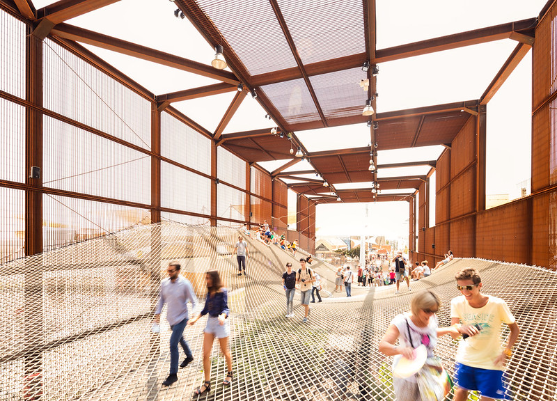 |
| Scaling the net of the Brazil pavilion. Photo ©Darren Bradley |
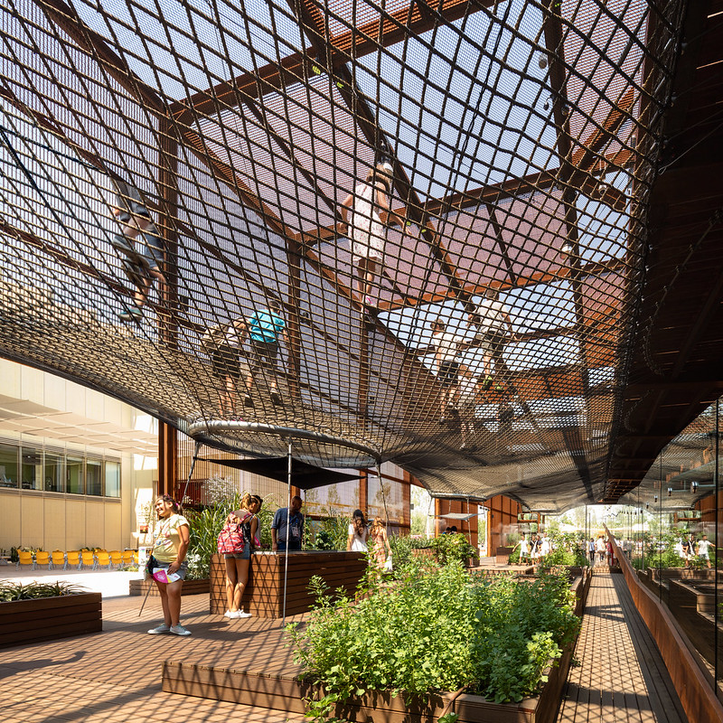 |
| View from under the net at the Brazil Pavilion. Photo ©Darren Bradley |
And France...
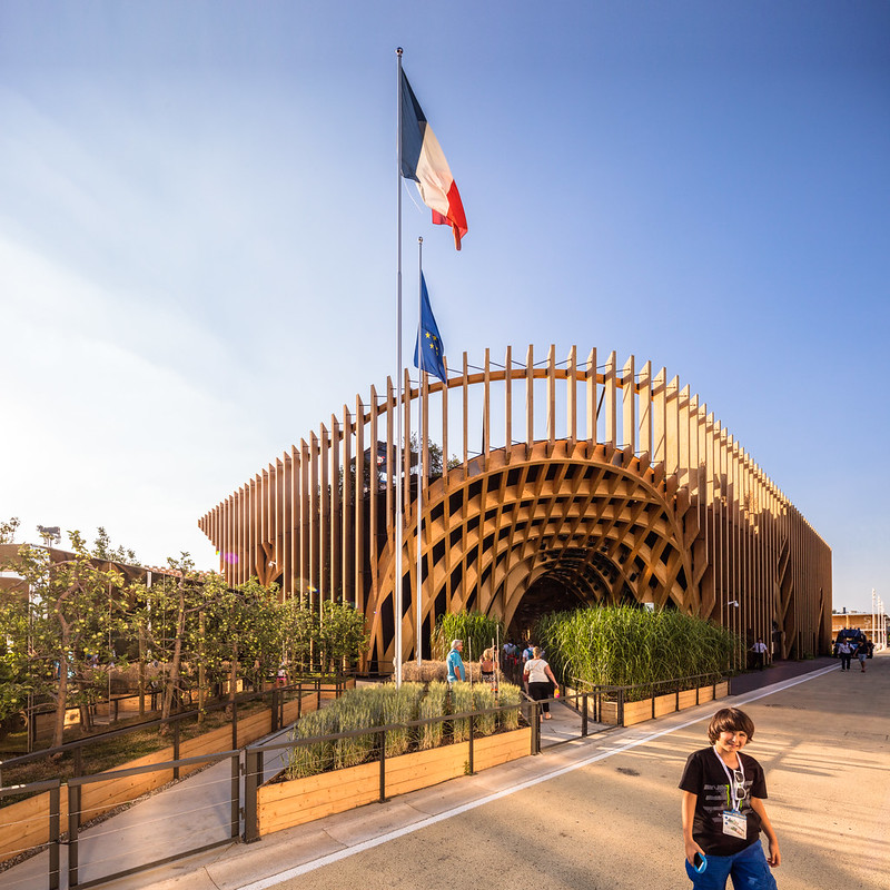 |
Photobombing kid in front of the France Pavilion. Architects: Anouk Legendre and Nicolas Desmazieres.
Photo ©Darren Bradley |
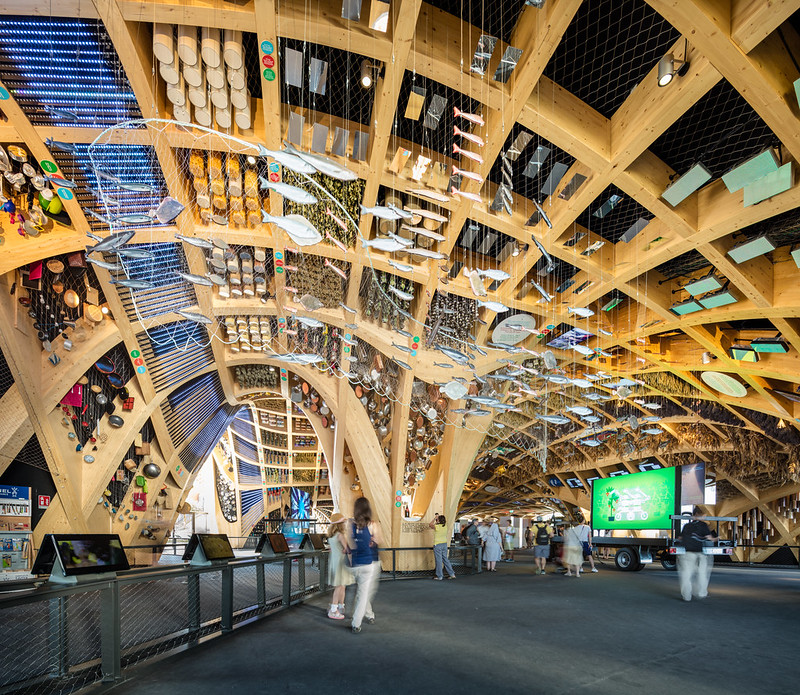 |
| All of the products of French agriculture were represented inside. Photo ©Darren Bradley |
And Russia, with their over-the-top design...
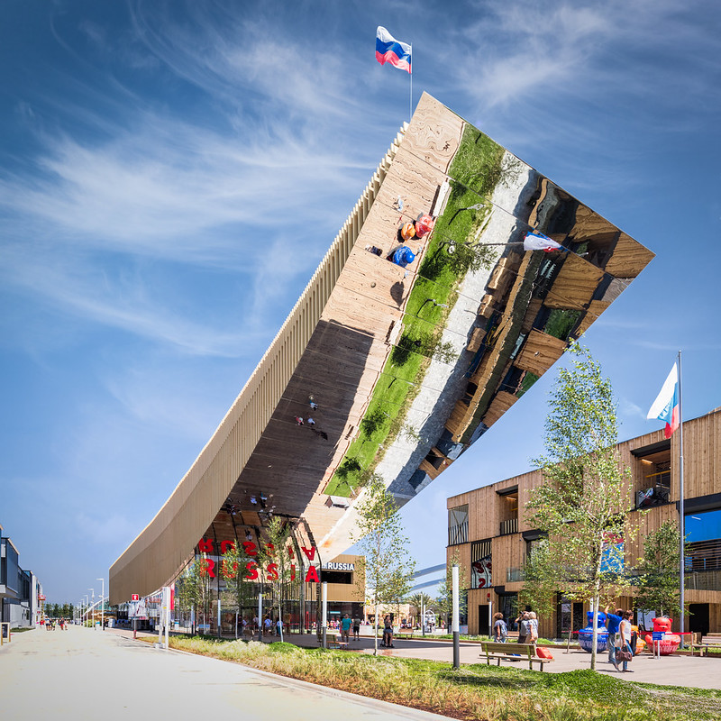 |
| My cantilever is bigger than your cantilever. Architects: SPEECH. Photo ©Darren Bradley |
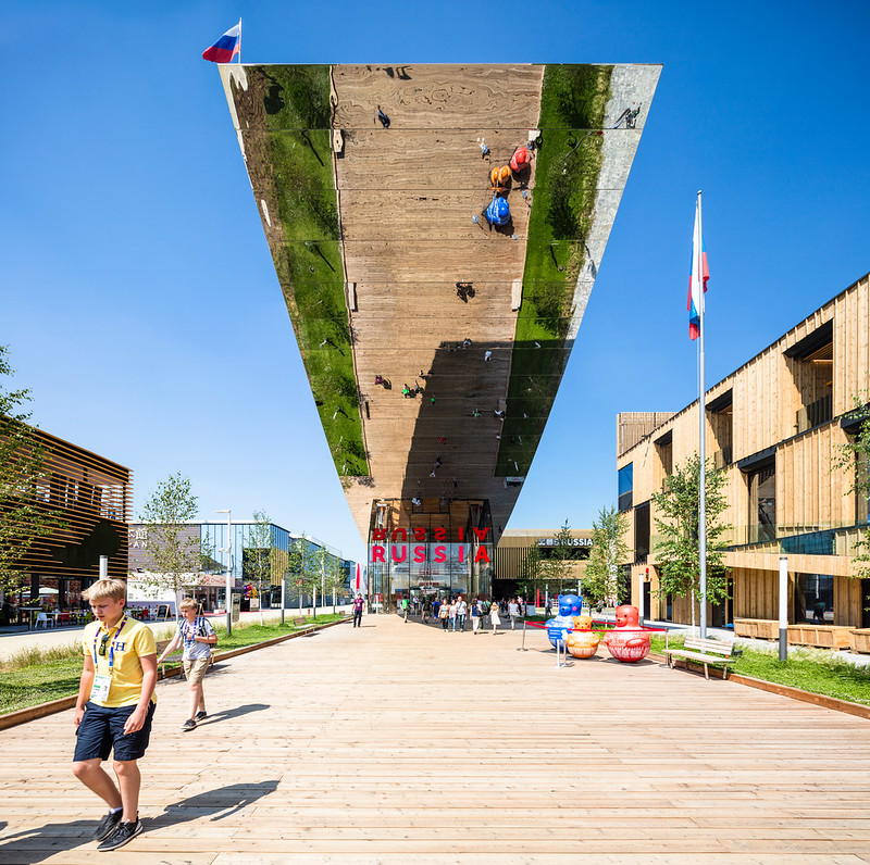 |
| Yes, you can see yourself if you look up. Photo ©Darren Bradley |
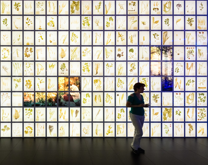 |
| Russian plants. Photo ©Darren Bradley |
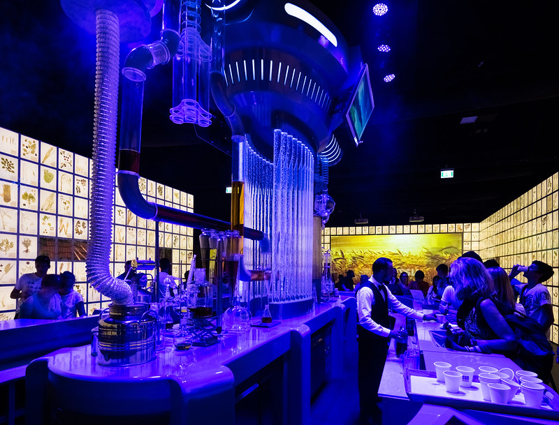 |
| Mad scientists mixing craft cocktails at the Russia Pavilion. Photo ©Darren Bradley |
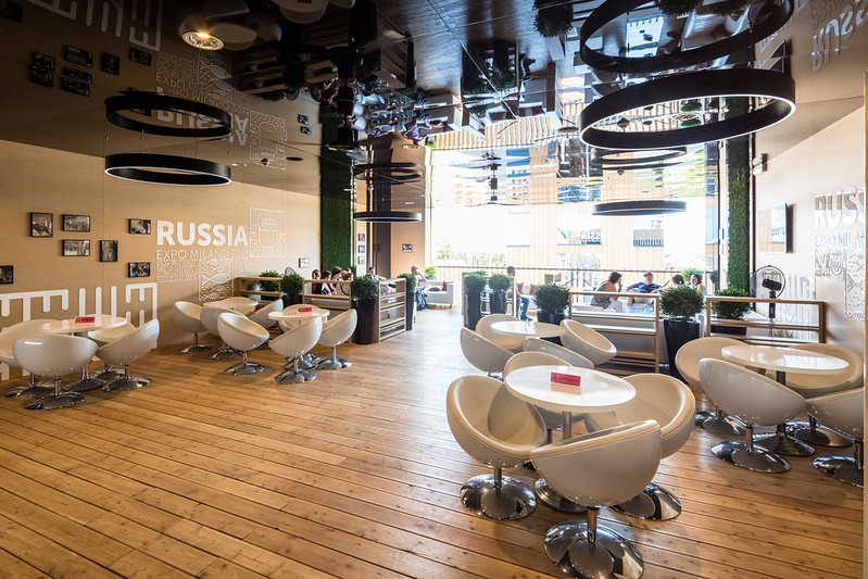 |
| The ideal spot to plot world domination. Russia Pavilion. Photo ©Darren Bradley |
And many others...
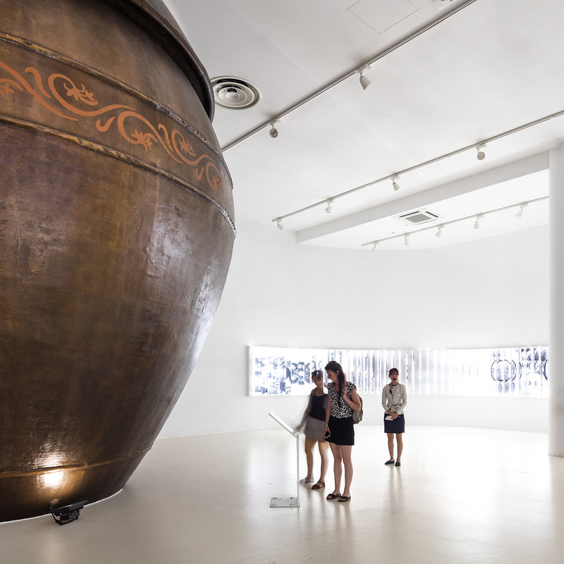 |
South Korea focused on fermentation, with a giant pot of kimchi, and a narrative about how kimchi would save the world.
Photo ©Darren Bradley |
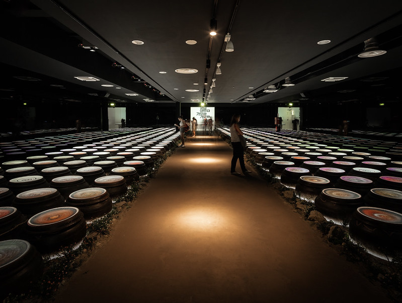 |
| Swirling pots of kimchi as you exit the Korea Pavilion. Photo ©Darren Bradley |
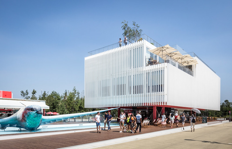 |
| The Czech Paviliion was fairly minimalist, save for the strange half-bird, half-car fountain thing in the front. Architects: Chybik + Kristof. Photo ©Darren Bradley |
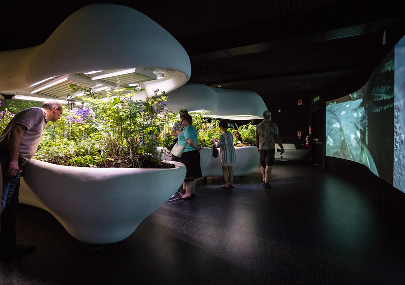 |
| Inside the Czech Pavilion is a representation of a miniature Czech forest, with high-powered video cameras that display - in real time - photosynthesis of the plants. Photo ©Darren Bradley |
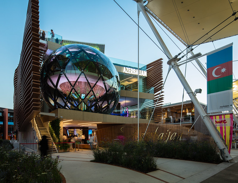 |
Azerbaijan's bubbles reminded me of mini versions of the California Academy of Sciences. Architects: Simmetrico Network.
Photo ©Darren Bradley |
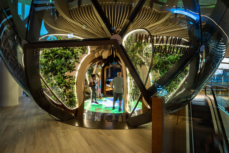 |
| More of Azerbaijan's bubbles. Photo ©Darren Bradley |
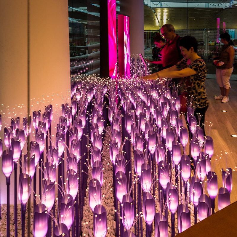 |
| Inside Azerbaijan's pavilion. These LED tulip things were everywhere, and would illuminate when you passed your hands over the top of them. Photo ©Darren Bradley |
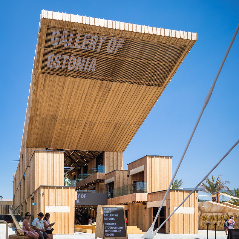 |
| Estonia is competing with Russia (whose pavilion is next door) for largest cantilever. Architects: Kardarik & Tüür. Photo ©Darren Bradley |
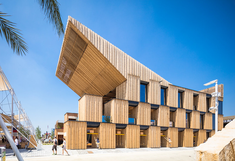 |
| Estonia's design incorporates wooden swings on the ground level. Photo ©Darren Bradley |
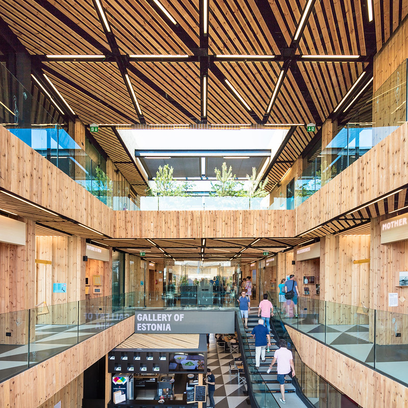 |
| A plethora of pine inside the interior courtyard of the Estonia Pavilion. Photo ©Darren Bradley |
 |
| The giant eggs of the Malaysian Pavilion. Photo ©Darren Bradley |
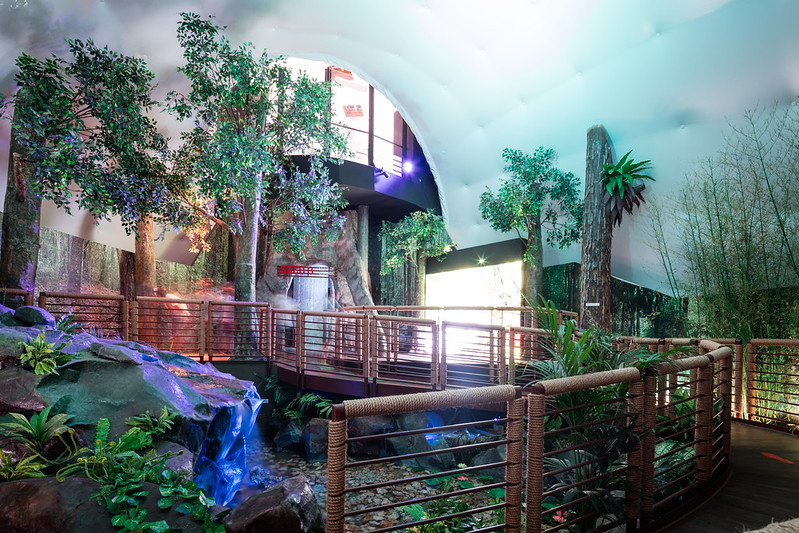 |
| The psychedelic rainforest inside the Malaysian Pavilion. Photo ©Darren Bradley |
The Polish Pavilion was a nice surprise. They used what looked like apple crates for the facade, and took you up a long staircase that made you enter through the roof. Around the corner was a rooftop forest with mirrors all around the walls that looked like a typical polish landscape.
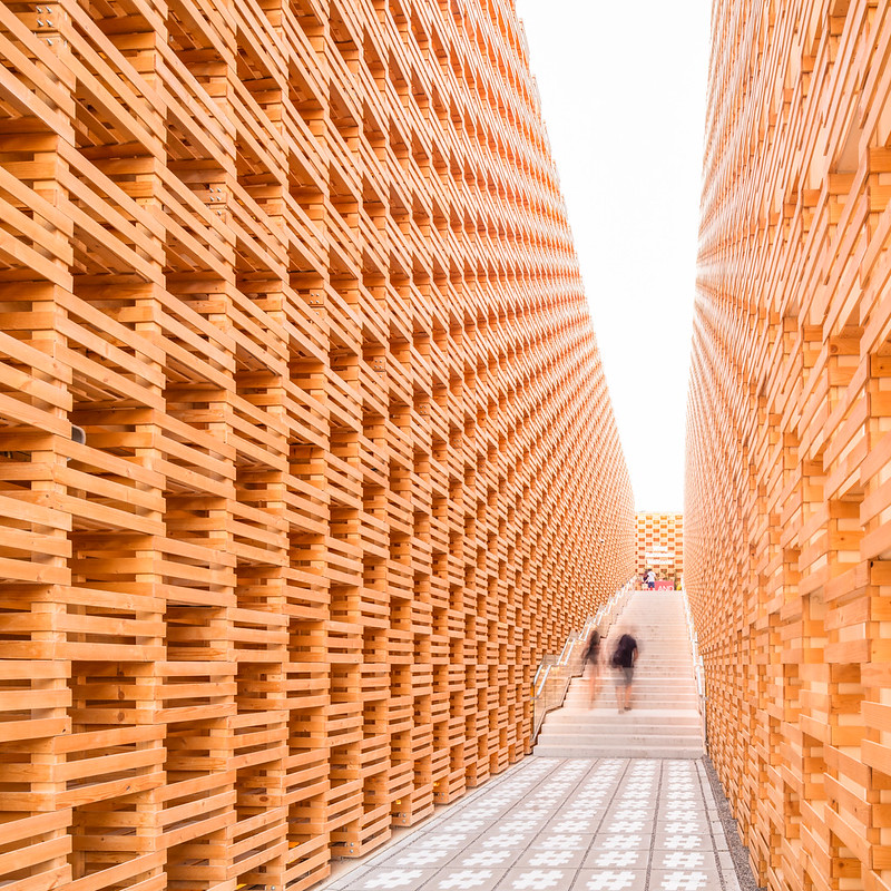 |
| Entrance to the Poland Pavilion. Architect: Studio 2PM. Photo ©Darren Bradley |
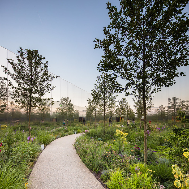 |
| Surprise Polish landscape. Photo ©Darren Bradley |
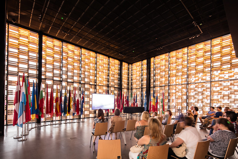 |
| The theater below is showing a very good, interesting, but also rather depressing animated film on the history of Poland, which includes many of the times they've been screwed over by neighboring countries throughout their history. Photo ©Darren Bradley |
The Austrians had a similar concept with their theme, "Breathe", which took visitors on a meandering path through a courtyard filled with an Austrian forest.
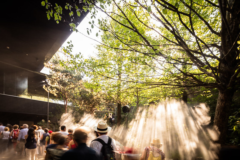 |
| Austrian forest by Team Breathe Austria. Photo ©Darren Bradley |
The UAE again opted for a pavilion that emulated the desert terrain of their country, and was also beautiful, and was a standout for design.
 |
| UAE Pavilion by Foster + Partners, emulating the sandstone and dunes of the country. Photo ©Darren Bradley |
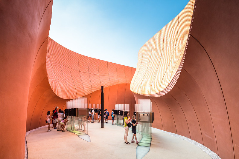 |
| UAE Pavilion included displays set up within little pocket canyons. Photo ©Darren Bradley |
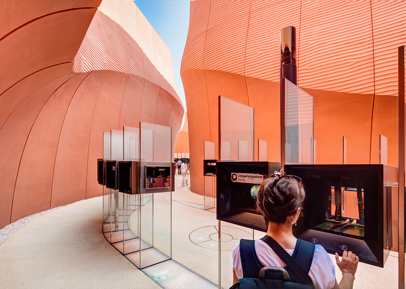 |
| UAE Pavilion. Photo ©Darren Bradley |
 |
| UAE Pavilion in Shanghai in 2010 took on a similar theme of desert landscape. Photo ©Darren Bradley |
To my eye, the best design was the UK pavilion - just like in Shanghai. Rather than being literal, they made a stunningly beautiful artistic statement that was also an important message about the importance of bees in our society. Minimalism wins the day.
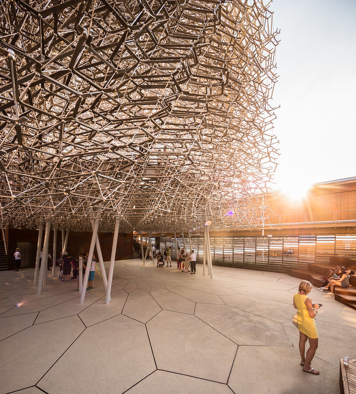 |
Abstract metal sculpture representing a bee hive for the UK Pavilion. Architect/Artist: Wolfgang Buttress.
Photo ©Darren Bradley |
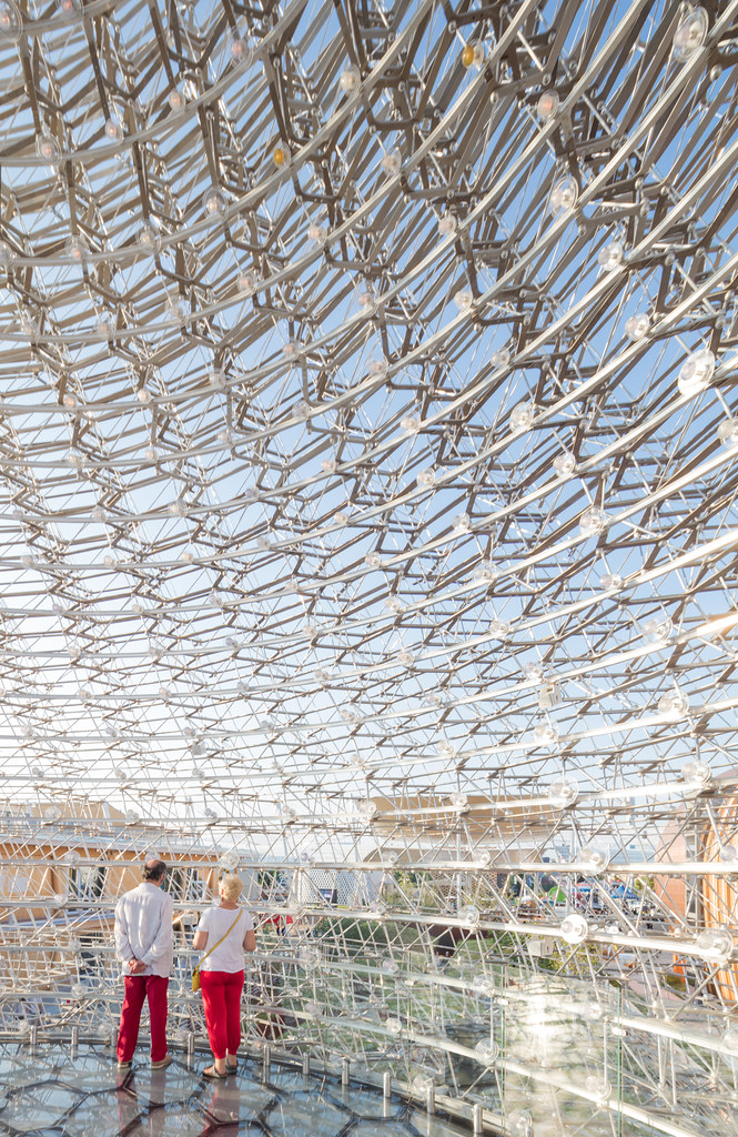 |
| UK Pavilion, inside the hive. Photo ©Darren Bradley |
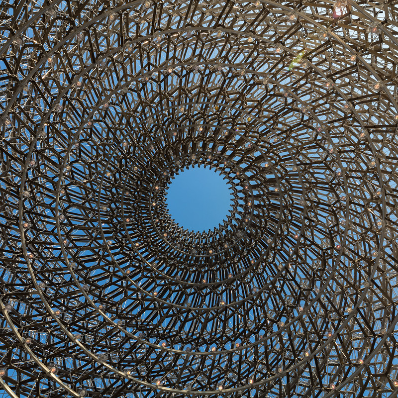 |
| Looking up, from inside the hive. UK Pavilion. Photo ©Darren Bradley |
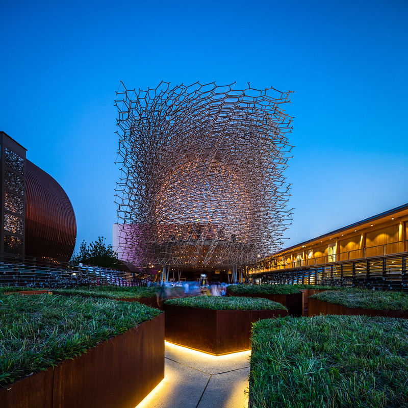 |
At night, the hive of the UK Pavilion can be more clearly seen by the blinking lights, which are linked to a real hive in Nottingham.
Photo ©Darren Bradley |
But Japan probably put the most effort of any country into the presentations and messaging of their pavilion. Rather than allowing visitors to roam freely about the pavilion, looking at tiny scale models of products made in that country or whatever, they created a guided tour through a series of rooms with various artistic films and light shows, that started with a subdued short film about disappearing birds using traditional Japanese calligraphy, and culminating with an Iron Chef-like culinary extravaganza in a sort of kitchen stadium "Restaurant of the Future".
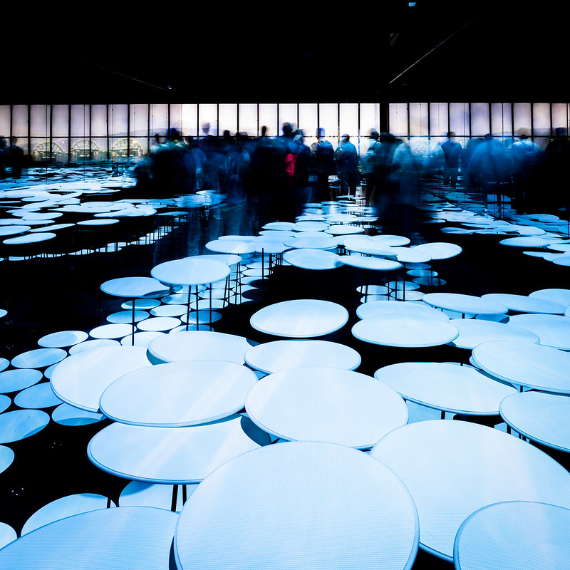 |
| Lily pads at the Japan Pavilion. Photo ©Darren Bradley |
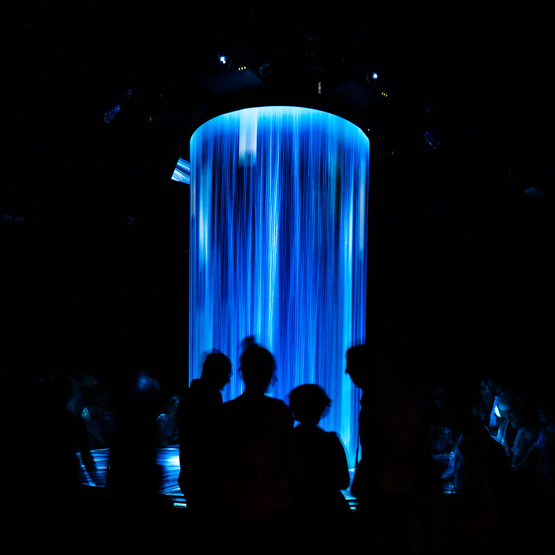 |
| The Fountain of Knowledge. Japan Pavilion. Photo ©Darren Bradley |
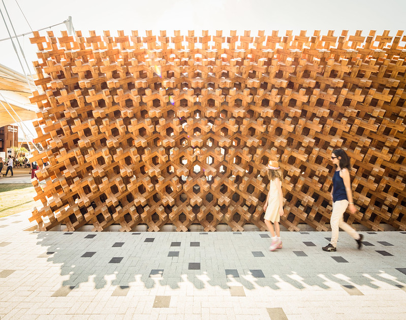 |
| Intricate wood lattice work outside the Japan Pavilion. Photo ©Darren Bradley |
One thing about International Expositions is that pretty much every country can participate, regardless of their international status. In Shanghai, the Axis of Evil had their own section.
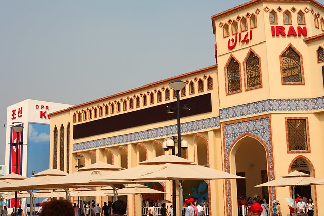 |
| Pavilions were arranged in alphabetical order, more or less, which left Iran and North Korea as appropriate neighbors in Shanghai. Photo ©Darren Bradley |
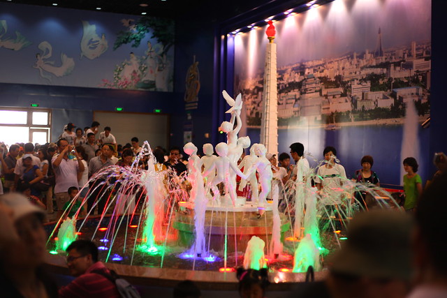 |
| North Korea's pavilion in Shanghai included sculptures of naked dancing children around a fountain, a large phallic pillar, and lots of plastic plants. There was also an inscription on the wall which read "PARADISE OF THE PEOPLE". Photo ©Darren Bradley |
In Milan, Iran was present with a sophisticated pavilion, but North Korea was relegated to a tiny little shared stand way in the back, selling a few trinkets.
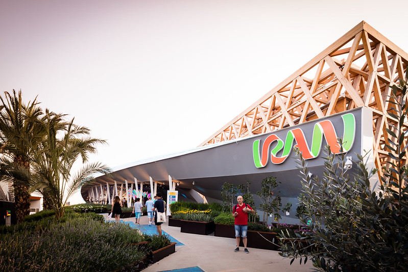 |
| Iran's pavilion at Milan Expo is quite nice. Architects: NJP, LAD. Photo ©Darren Bradley |
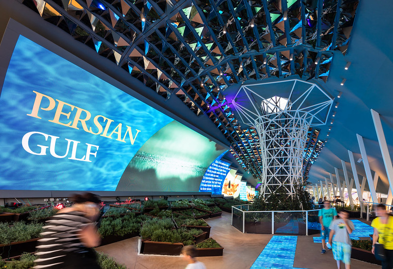 |
| Iran's pavilion focused on Kish Island, which is a major resort in the Islamic Republic. It's also the location from which American Bob Levinson (suspected to have been a US intelligence agent) disappeared in 2007. Photo ©Darren Bradley |
But Turkmenistan was also present to ensure the dictatorship contingent was well represented.
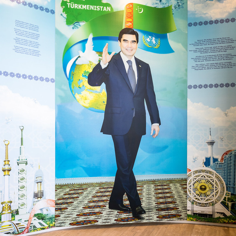 |
Turkmenistan's President-for-Life, Gurbanguly Berdimuhamedow, orders you to have a wonderful time at his pavilion.
Photo ©Darren Bradley |
Turkmenistan is the country whose leader had previously changed the names of the days of the week to himself and his family members. He died and his successor promised moderation, and changed them back. He also took down the giant gold statue of the previous dictator, but soon put up a new one with himself on horseback, instead.
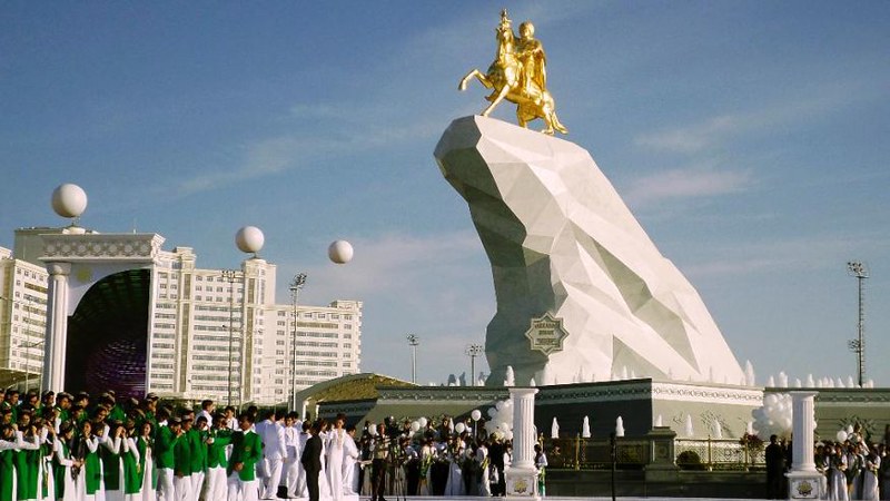 |
| Turkmenistan's President-for-Life is honored by his adoring public with a giant statue of himself on horseback, dressed in traditional warrior garb. Photo by Reuters. |
In addition to the pavilions by individual countries, there were corporate pavilions, representing food industry, real estate developers, power companies, etc.
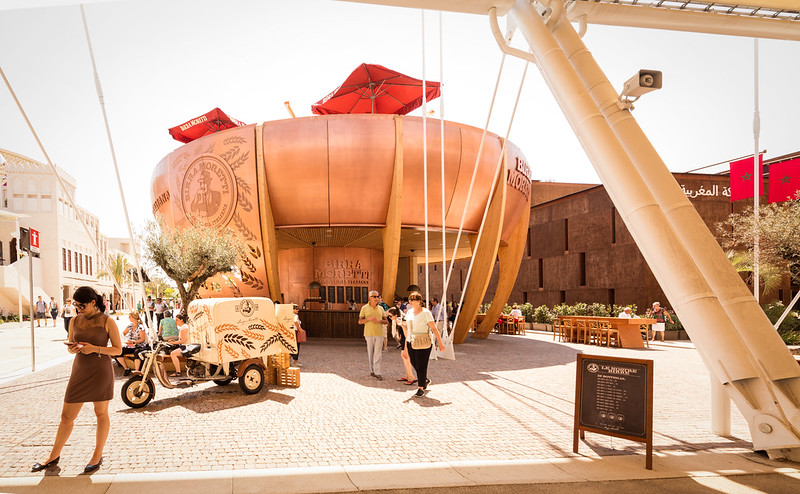 |
| Moretti beer was one of the sponsors. Photo ©Darren Bradley |
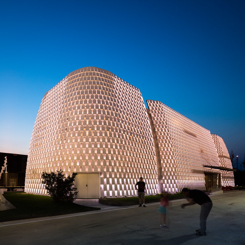 |
| Intesa San Paolo, one of Italy's largest banks, put up their own pavilion. Architect: Michele de Lucchi. Photo ©Darren Bradley |
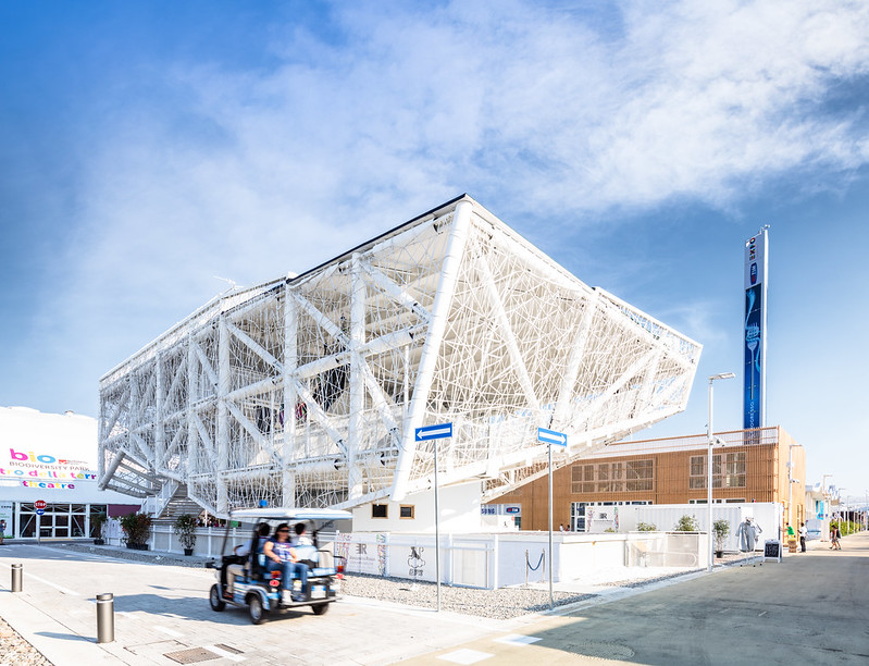 |
| The Alessandro Rosso Group does building operation and management, and were contracted by many countries to build and operate their pavilions. Their own pavilion was a dance club of sorts. Architect: Simone Micheli. Photo ©Darren Bradley |
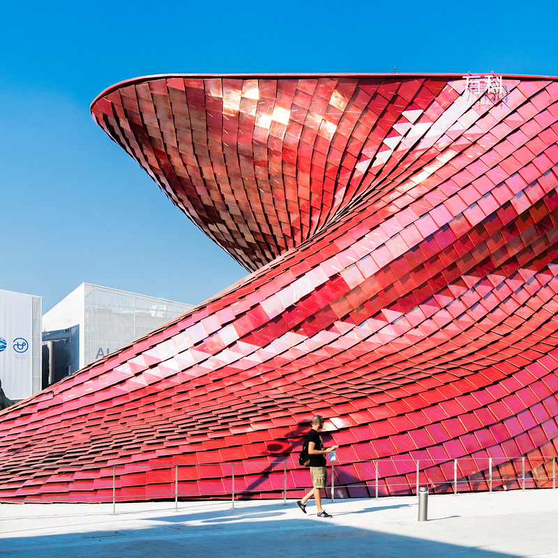 |
| Vanke is a real estate development group in China. Why they have a pavilion at Milan isn't quite clear. But they asked architect Daniel Libeskind to design it. Photo ©Darren Bradley |
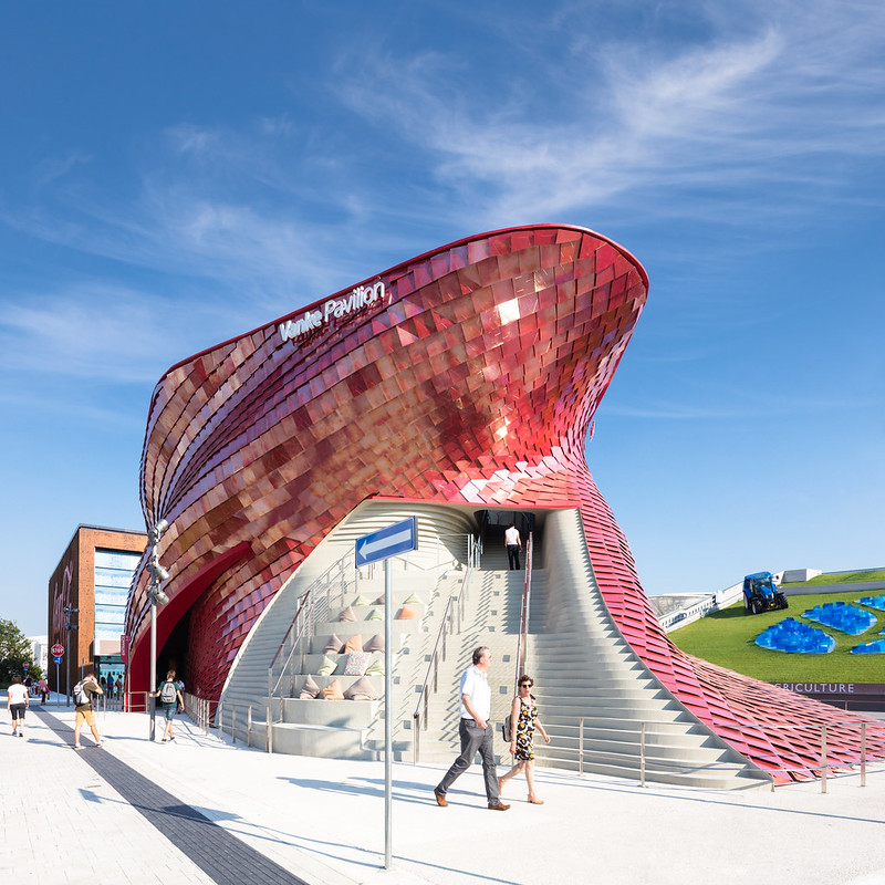 |
| Vanke Pavilion. Photo ©Darren Bradley |
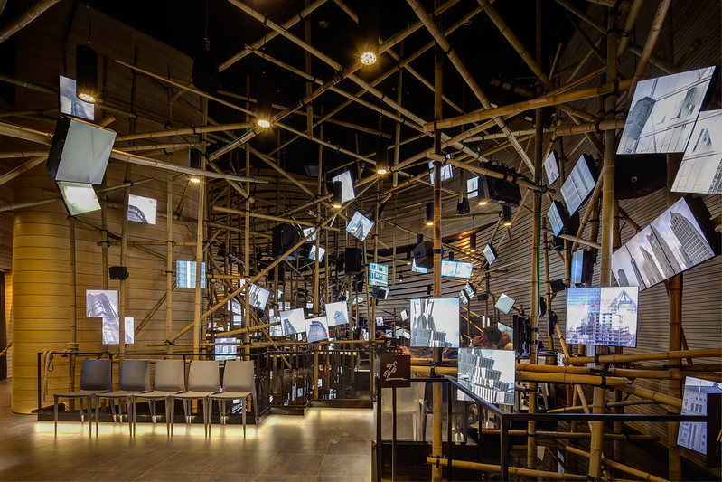 |
| Inside the Vanke Pavilion, with bamboo scaffolding that evokes the system used to build in China still today. Photo ©Darren Bradley |
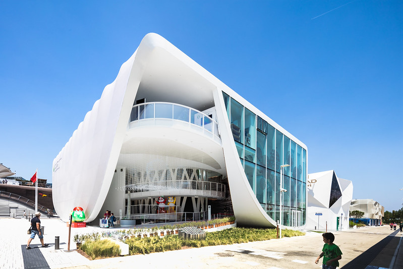 |
| China is well represented in Milan. This is a corporate pavilion for Chinese Industry. Photo ©Darren Bradley |
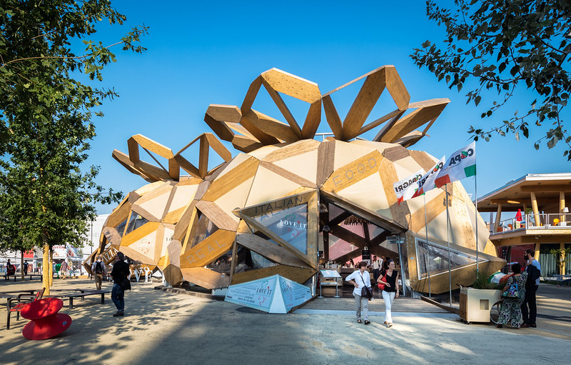 |
| COPAGRI Pavilion for Italian Food, by EMBT Architects. Photo ©Darren Bradley |
Overall, I have to say that I thoroughly enjoyed Milan - both the city and the Expo. They've done a tremendous job and should be proud of their efforts. My family, who accompanied me (all of these photos were really just taken by me on the fly, as I followed them around the Expo grounds), had not visited previous Expos, and had nothing to compare it to. But they loved the experience. It was a great way for my daughter to learn a lot about foreign countries and their cultures and customs, too.
The next International Expo is planned for Dubai in 2020. I fully expect it to be a return to the over-the-top design orgy that represented Shanghai in 2010, rather than the more subdued, laid-back version that Milan has put together. Check in to my blog in five years to find out! I'll be there.
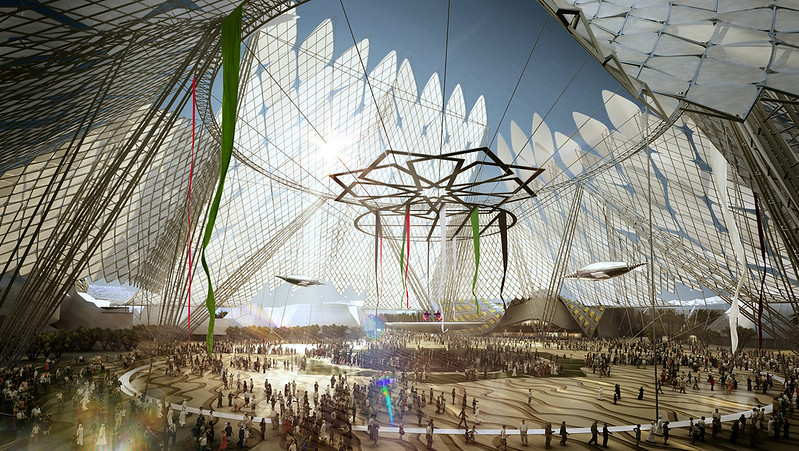 |
| Artist's rendering of the centerpiece of the planned Dubai World's Fair in 2020. |


So much wood ! Assume it was / will all be recycled appropriately.
ReplyDeleteThank you, maestro, for the tour. Even reading this and taking in the photos was overwhelming. Indeed, your cantilever is bigger.
ReplyDelete;-)
The Expo continues through October, but I'm sure the wood will be recycled.
ReplyDeleteThank you, Boris. I was almost dreading putting this post together, because of the amount of work involved in processing all the photos and putting my thoughts into some sort of semi-coherent narrative. I'm glad you enjoyed the tour.
ReplyDeleteReally fantastic photos. Enjoyed reading your comments- and spotting the girls in some of the pictures!
ReplyDeleteThanks, Heidi! Sorry we missed you guys in France. Would love to catch up sometime soon over the summer.
ReplyDeleteRe cantilevers.
ReplyDeleteI kept thinking I have seen this cantilever before. Just now, I saw Archdaily posted an excellent collection of photos of Russian architect Melnikov, at http://www.archdaily.com/770492/the-architecture-of-konstantin-melnikov-in-pictures
Is it possible the "Rusakov Workers' Club" gave an idea to this ... structure?
I know that some of the same ideas were incorporated from Russia's pavilion at the Venice Biennale, and I believe it was the same architect for both. As for Melnikov as inspiration, I hadn't thought of that but it's certainly plausible!
ReplyDeleteThanks Darren, that was fun. Did you do all of this in a day? The pictures for "on the fly" are excellent.
ReplyDeleteThank you, Billy! I actually spent two days at Expo, but was with my family both days. But yes, all of the photos are taken while just walking around with them, as a tourist. They are in many of the shots, if you look closely.
ReplyDeleteHi Mr Darren Bradley,
ReplyDeleteI'm Architect from Iran. First of all, I want to say thank you for your complete tour of expo Milan. I'm going to expo in October, now I'm publishing a book about expo. I found your photos interesting to share in this book. If it is possible for you, we can do it.
fazadstudio@gmail.com
this is my email address. thanks in advance.
Hi, I would like to make a gift for Christmas with Expo 2015 Milan photos.
ReplyDeleteIs there a book I can buy with your beautiful pictures of Expo?
Thank you!
Camillo
So Beautiful designs . Thank you for sharing.
ReplyDeleteWe are leading exhibition stand designers and builders based in Bahrain. We are involved in designing the exhibition booth and marketing display stalls for running trade fairs, marketing campaigns, promotional events, presentations in various bahrain trade fairs.
ReplyDeleteexhibition stand builders
Expo Stand Services is one of the most reputable exhibition stand builders in Italy and one of the world's leading exhibition stand design company Italy. Our company's name has been included to the list of globally trusted stand design company Italy because of our local presence, capacity to satisfy our clients' expectations, and timely deliverables.
ReplyDeleteNice Post
ReplyDeleteYou provide good information and keep updating. We also have some information.
Exhibition stand building in Italy
System stand construction in Germany
Good information.
ReplyDelete---------------------------
I work in rv interior wall panels