 |
| The classic view of UCR's Carillon Bell Tower (by Jones & Emmons, 1966) and the brutalist arcades of the Tomás Rivera Main Library (by Latta & Denny, 1954). Photo ©Darren Bradley |
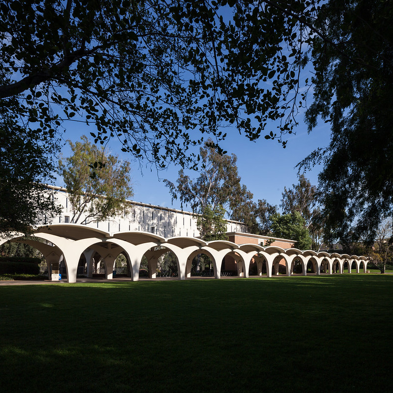 |
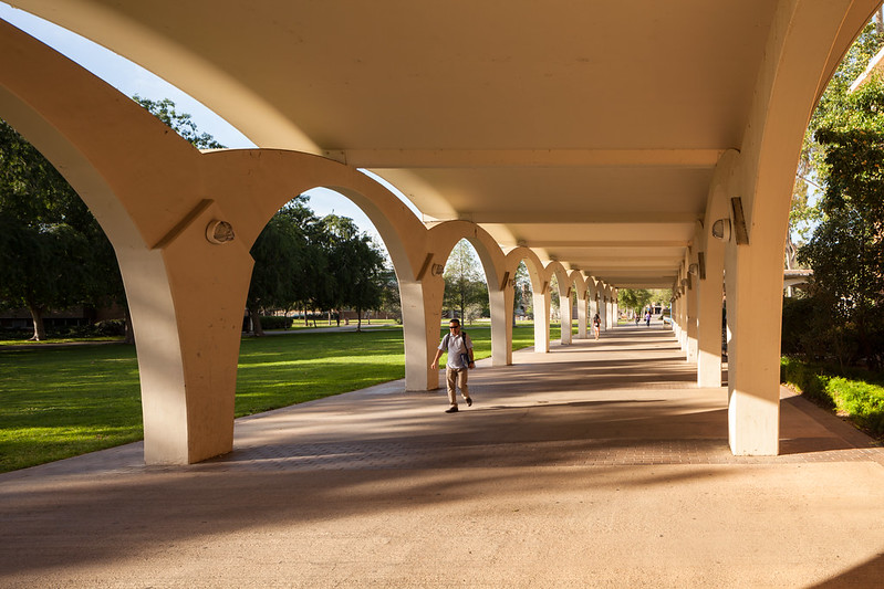
| Those covered arcades along the quad in front of the library are the signature feature of the UCR campus. Photo ©Darren Bradley |
The university's humble roots spring from its origins as a citrus research station for the University of California system in 1907, with little more than a barn and a small citrus grove, in the heart of southern California's Inland Empire. Like UC Davis, the school has always had a strong focus on agriculture, befitting of its location. It became a general university in the late 1950s, and grew quickly through the 1960s. Most of the buildings from its central core are from that time period.
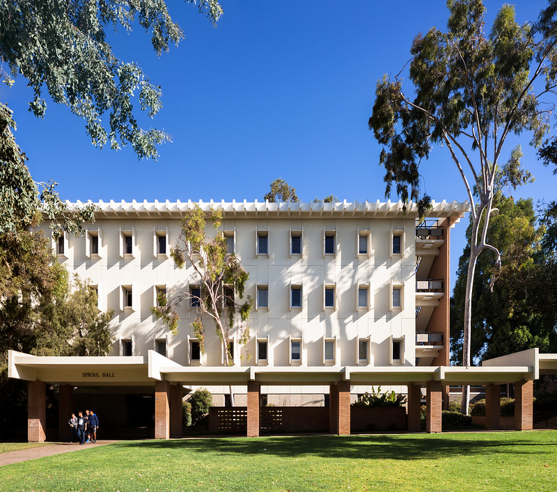 |
| Sproul Hall. Photo ©Darren Bradley |
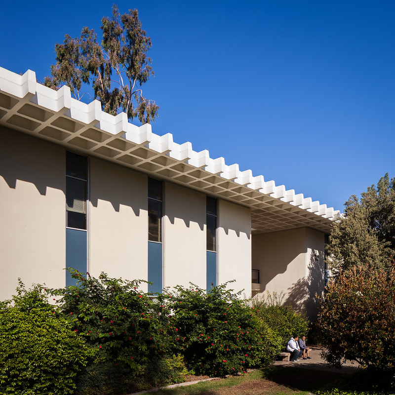 |
| Another view of Sproul Hall. Photo ©Darren Bradley |
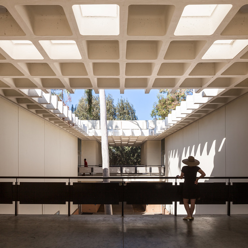 |
| Sproul Hall Interior Courtyard. Photo ©Darren Bradley |
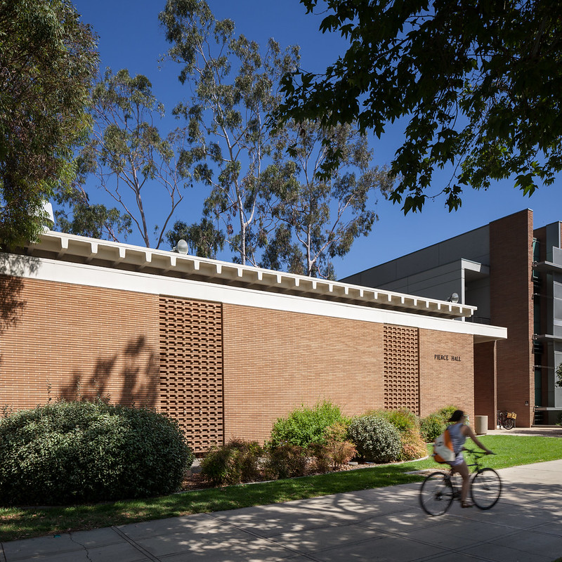 |
| Pierce Hall by A. Quincy Jones & Frederick Emmons (1966). Photo ©Darren Bradley |
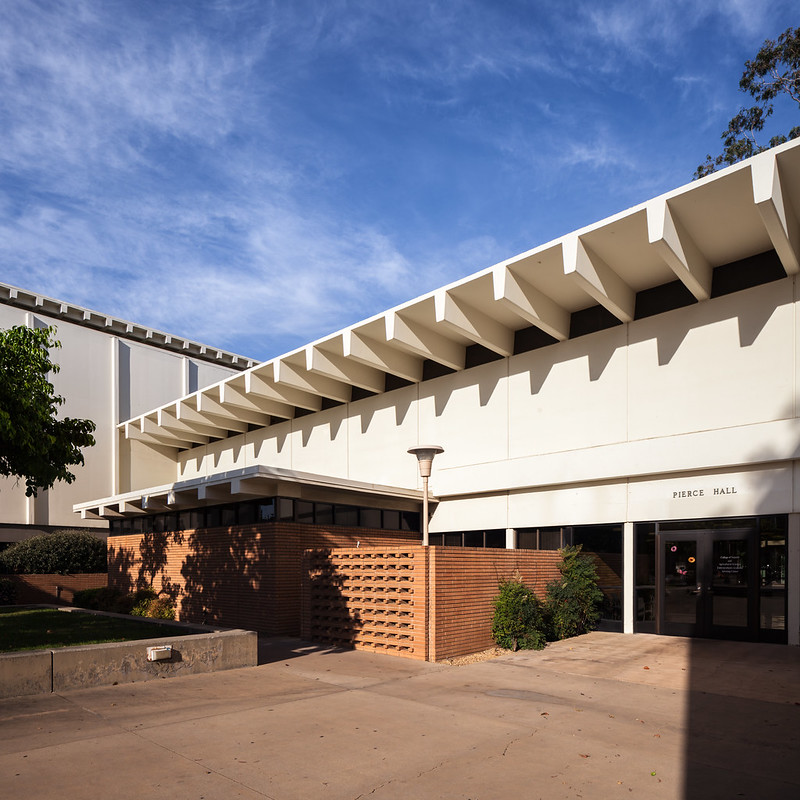 |
| Pierce Hall by Jones & Emmons (1966). Photo ©Darren Bradley |
I've often read that there's no discernible or cohesive theme or plan to the building style on the Riverside campus. But there was an original campus plan (the LA firm of Allison & Rible prepared a master plan in 1955), and it actually feels as if it has been more widely followed than most plans that I've seen from other campuses that I've visited (UC schools or otherwise).
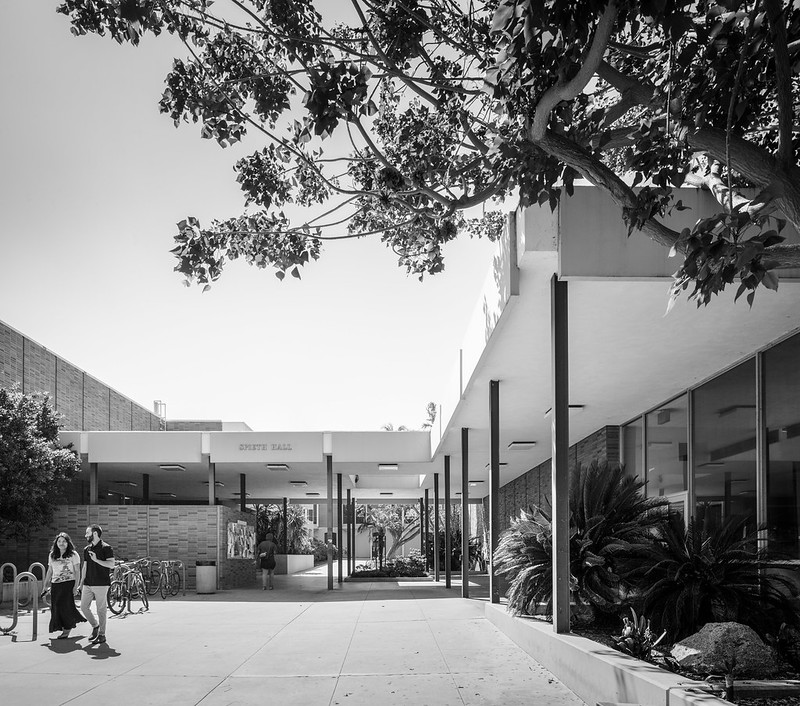 |
| Spieth Hall. Photo ©Darren Bradley |
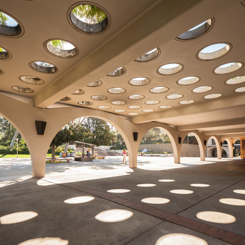 |
| Now I feel almost like I'm in Miami Beach. This is in front of University Theater. Photo ©Darren Bradley |
 |
| Here are those arches again, supporting the arts buildings of Olmsted Hall. Photo ©Darren Bradley |
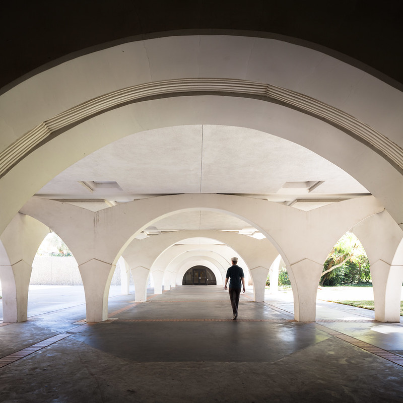 |
| Used to dramatic effect here at the drama department, Olmsted Hall. Photo ©Darren Bradley |
As near as I can tell, they appear to be a modernist, brutalist take on the 1928 Mission Revival-style Municipal Auditorium, which is a local landmark in Riverside and includes concrete reinforced arches in a similar style.
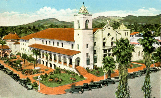 |
| It's hard to see from this vintage postcard, but there are free-standing concrete arches in the garden on the left side of the building which are very similar to those used throughout the UCR campus. |
In fact, much of the original campus feels like a modernist/brutalist take on Mission Revival style, and evokes almost walking through a Spanish or Mexican village, with clusters of buildings, narrow alleys and covered passageways leading to small, shaded courtyards and gardens.
 |
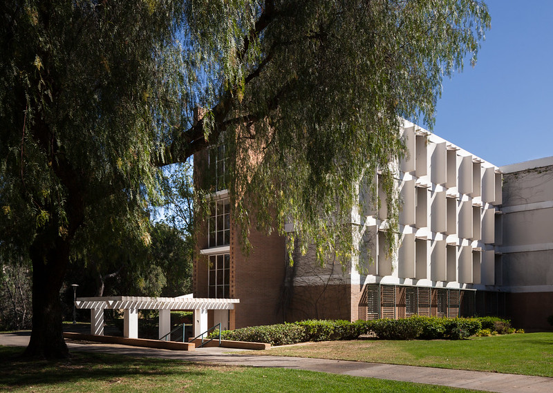
| Those concrete sunshades visible on the clerestory windows on the right are very reminiscent of Pereira's designs, but were done here by Maynard Lyndon (1965). Photo ©Darren Bradley |
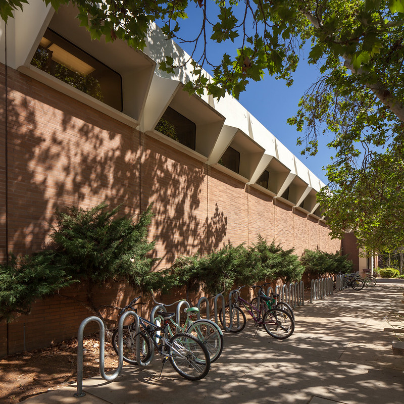 |
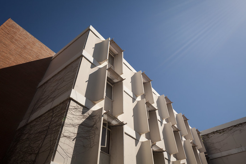
| Another view of those great sunshades on the clerestories of the Physics Building by Maynard Lyndon (1965). Photo ©Darren Bradley |
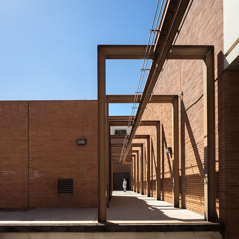 |
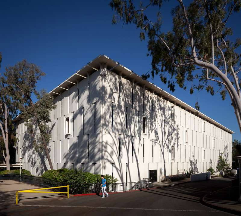
| Even the rear loading docks of the Physics Building are worth photographing. Photo ©Darren Bradley |
This is mostly a low-slung, modest campus (newer, flashier buildings not withstanding). A lot of architectural superstars of the post-war, mid-century modernist period designed buildings for the Riverside campus, including Albert Frey, A. Quincy Jones, and William Pereira. But it seems as if they toned down their styles for UCR.
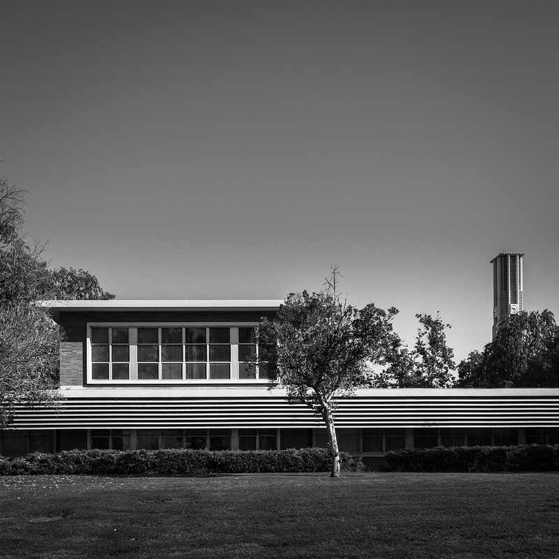 |
| Albert Frey, along with partner William Porter Clark, working his magic on Watkins Hall. This is one of the original buildings from 1953. Photo ©Darren Bradley |
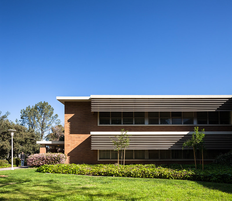 |
| Watkins Hall by Frey & Clark (1953). Photo ©Darren Bradley |
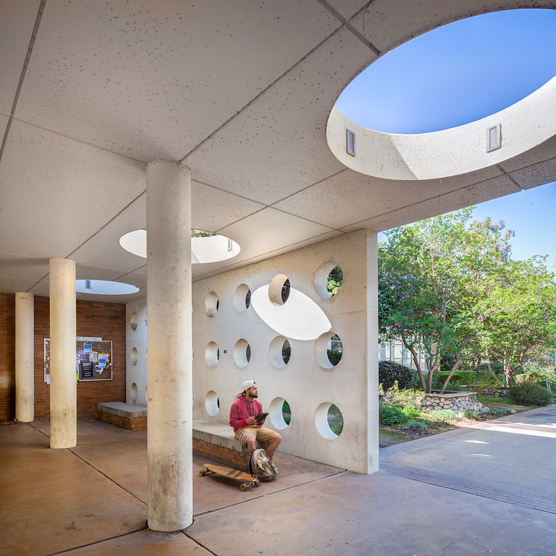 |
| The one area on Watkins Hall where Frey let loose a bit was on this little breezeway connecting two sections of the building. Photo ©Darren Bradley |
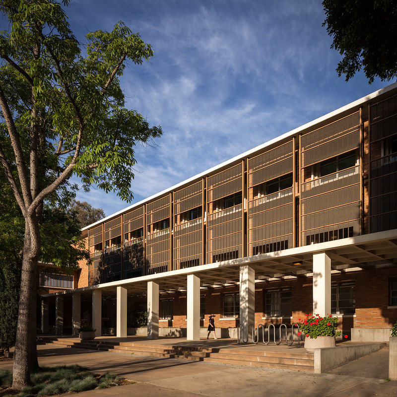 |
| Webber Hall by Clark & Frey (1954) was another of the original buildings on campus. Note again the use of sun screens and covered walkways. Photo ©Darren Bradley |
But that's not to say these more subdued buildings are not beautiful or functional. On the contrary, they are very elegant and they work well - both in their own right and as part of an ensemble. Those covered arcades and protected courtyards create lots of shade while channeling cool breezes through the campus. Overall, they impart a sense of calm, and there are lots of quiet, peaceful spots to rest and keep cool from the searing heat and sun.
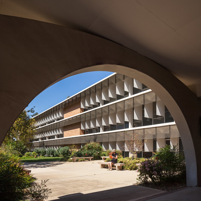 |
| Another view of Olmsted Hall from under the arches. Photo ©Darren Bradley |
But at least for UCR, there appears to have been a set of design guidelines that were more or less respected (including the use of brick, concrete, and sun shades).
Since UCR's student population actually declined in the 70s and there was little new construction until the 90s, that may have saved some of their original buildings and given them a chance to avoid some of the post-modernist silliness the other campuses have experienced.
Besides the Entomology Building, the main exception to everything I wrote above is the Fine Arts Building. This post-Modernist behemoth was designed by Frank Israel in the early 90s and nearly wasn't built due to funding shortfalls.
New York Times Architecture critic Herbert Muschamp praised Israel's design at the time (1994), calling it "an interpretive formal synthesis of desert terrain and the disjointed urbanism that has grown up there," and "a ziggurat for the year 2000." One has to wonder how much time Mr. Muschamp spent on the campus before coming to that conclusion.
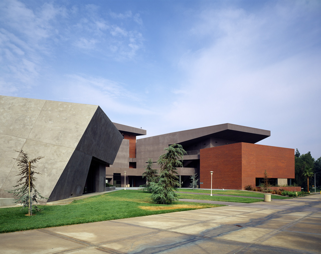 |
| UCR's ziggurat for the year 2000. Photograph © 2003 by Alan Nyiri, courtesy of the Atkinson Photographic Archive, UCHDA. |
It's a mishmash of stucco and jagged blocks at odd angles that has nothing to do with the rest of the campus, and appears to dwarf all else around it.
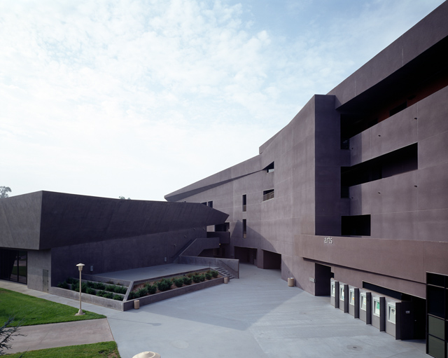 |
| Welcome to the Fine Arts Building. Photograph © 2003 by Alan Nyiri, courtesy of the Atkinson Photographic Archive, UCHDA. |
Overall, my impression of the architecture of UC Riverside is a campus that is thoughtfully designed and perfectly well suited to the climate and character of the surrounding community.
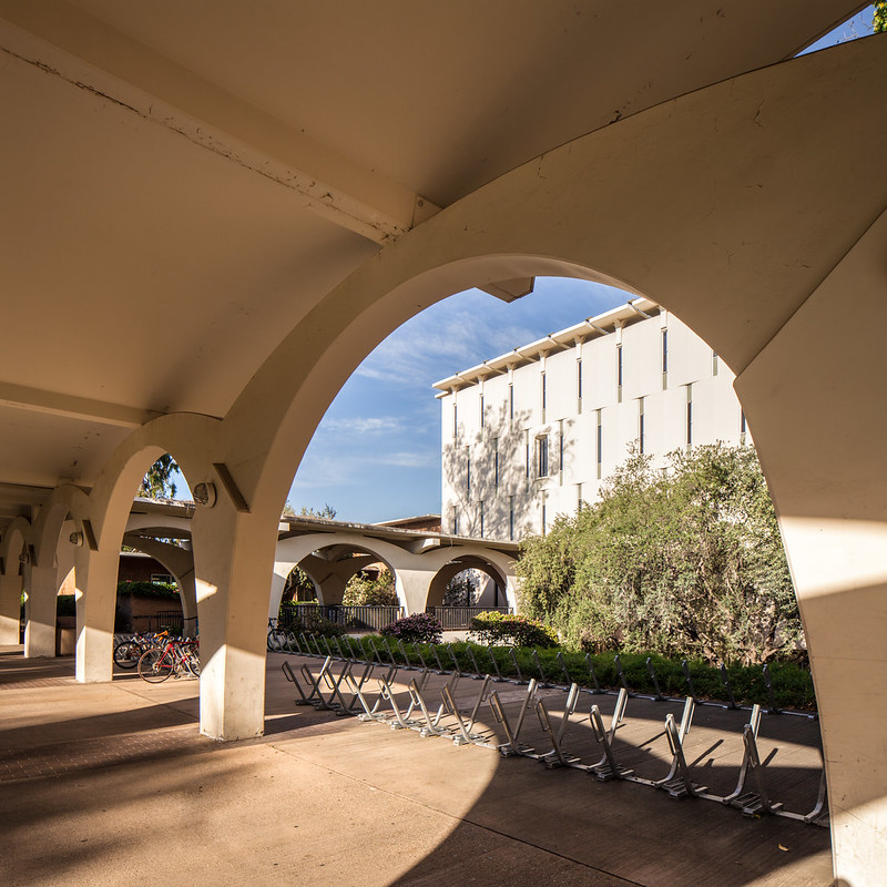 |
| Tomás Rivera Main Library. Photo ©Darren Bradley |
From what I heard while walking around there, and reading reviews online, many students and faculty consider these classic older buildings to be dated and obsolete. But hopefully, they will be preserved long enough to reach a point where the general population will start to recognize and appreciate the merits of their designs. One can only hope.
 |
| Until next time, Highlanders... Photo ©Darren Bradley |
For my blog post on UC Irvine, read here. For UC San Diego, read here.

Good site.
ReplyDeleteThank you for this blog.
ReplyDeleteI took an impromptu tour of UCR today when I met up with a fellow who graduated close to thirty years ago.
I was walking my dog deeper onto campus than I've eve been (I live close by)...he was wanting his picture taken by the bell tower. From there, the conversation turned to the amazing architecture all around.
I delight in 1950's and 60's California architecture...and he knew all the spots...and the next thing I knew, off I set on a guided tour.
I refused to take pictures...the angle of the sun was wrong, I only had my phone camera...and am thus so happy to find your shots here.
Your photography captured my day nicely.
With gratitude,
Nancy
Wow. Without question, this is some of the best architectural photography I've ever seen of the UC Riverside campus! Thanks for your efforts...
ReplyDeleteHi, Darrell. Would love to talk to you about possibly using this images for UCR's magazine! You can reach me at john.warren@ucr.edu.
ReplyDeleteThank you!
Over a fifth of students have to rely on borrowed money from family, friends or a partner to cover their accommodation costs, says the NUS survey.
ReplyDeleteInternational Foreign studentaccommodation in Sheffield
The University of California, Riverside is truly beautiful and an academic gem. It is a dream for many students to study here. I was so proud when I got admitted and enjoyed my time initially. However, the high competition in class made it tough to keep up. Thankfully, Assignment Assistance in London came to my rescue, helping me manage my workload and continue my studies smoothly.
ReplyDelete
ReplyDeleteI was looking for a phone repair service near me and found Mobile Fix 36 definitely the best choice! My phone had a cracked screen, and they fixed it fast. The team was friendly, professional, and really knowledgeable. They gave me a fair price and had my phone back to me in no time.
For those struggling with connectivity, Motor Home internet from Monthly Internet has been a game-changer. I can stream, work, and stay connected anywhere.
ReplyDelete