 |
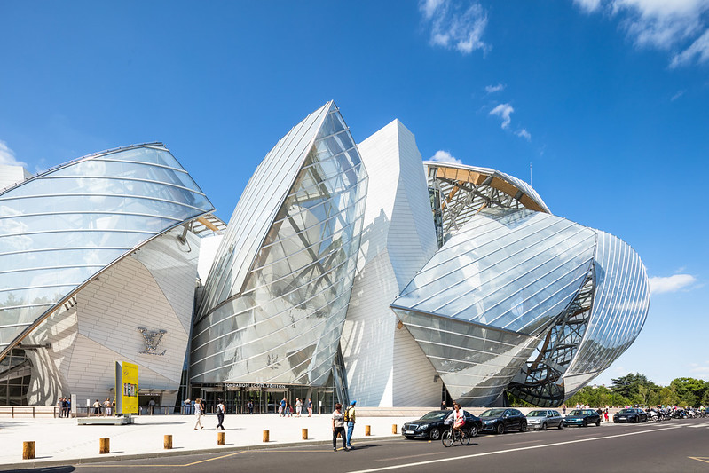
| Entrance to the Fondation Louis Vuitton by Frank Gehry. Photo ©Darren Bradley |
Gehry's new contribution to the Paris skyline has made quite an impact on the arts and architecture scene worldwide, as would be expected when one of the world's most celebrated architects designs a project of this scale in a city like Paris. And after visiting the project, it seems quite clear that making an impact was the primary goal of both the architect and the man who commissioned it - the Chairman of Louis Vuitton Moët Hennessy (LVMH), Bernard Arnault.
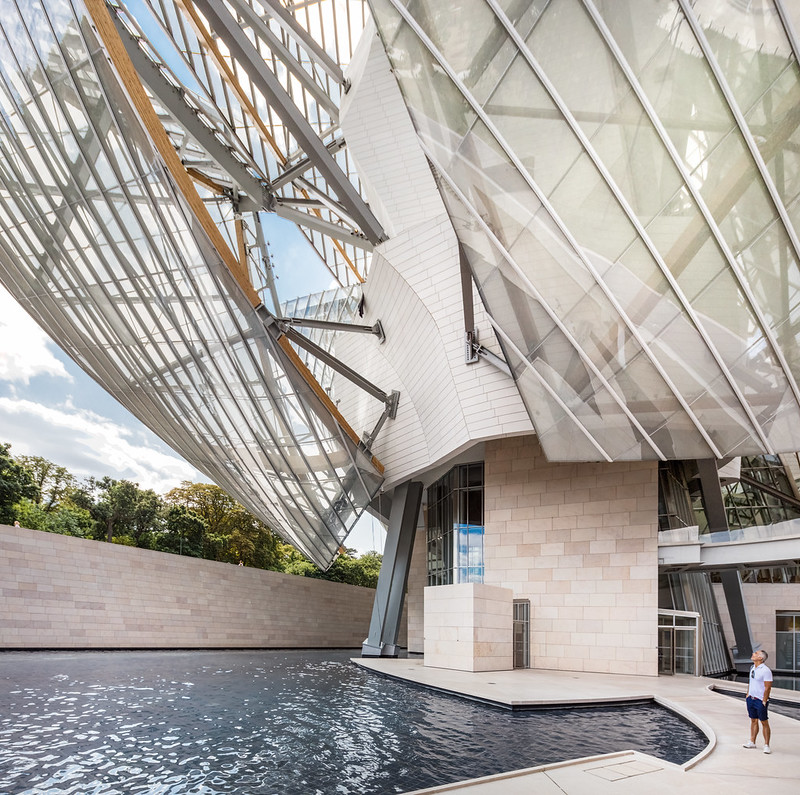 |
| Fondation Louis Vuitton. Photo ©Darren Bradley |
Many people don't realize that this is actually Gehry's second project in the City of Light. His first building was designed for the American Center on the other side of Paris, next to the Bercy stadium. I remember that building opening while I lived in Paris, in 1994. It was panned by some critics then as lacking the boldness they'd hoped from a Gehry design. In any case, the American Center was on shaky financial ground by the time the building opened (some attribute this to the construction costs of the building), and it closed just two years later. The building sat empty for years before becoming the Cinémathèque Française in 2005. I highly recommend a visit, as they always have great exhibits.
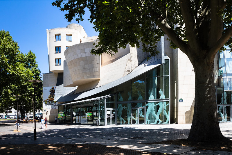 |
| The former American Center - now the Cinémathèque Française - designed by Frank Gehry in 1994. Photo ©Darren Bradley |
Anyway, Gehry got another bite at the apple when he met LVMH Chairman, Bernard Arnault, in 2001. It was at that meeting that a new building for the Fondation Louis Vuitton was first discussed. The building would be a gallery of sorts, to hold a portion of the foundation's contemporary art collection.
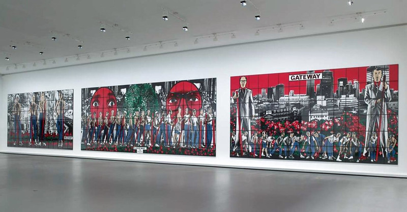 |
| Gilbert & George. Class War, Militant, Gateway. 1986. Artwork ©Gilbert & George |
Arnault's proposed site for the building was in one of the largest parks in Paris, the Bois de Boulogne, on the city's outskirts next to the wealthiest part of the city. It would be located adjacent to the
Jardin d'Acclimitation, which is one of the oldest theme parks in the world. (And is very low-key and quaint by today's standards).
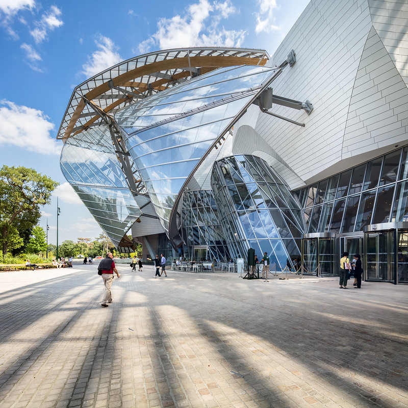 |
| View of the Fondation Louis Vuitton from the Jardin d'Acclim |
The proposed building met with huge resistance from many in Paris, the adjacent city of Neuilly, and the Jardin d'Acclimatation. Opponents even won a court case - successfully stopping the project for a time. But the Assemblée Nationale eventually pushed the project through in the original proposed site with a special law, overriding the court ruling. Officials explained that the project was in the country's national interest. They no doubt had in mind the positive economic effect that Gehry's Guggenheim museum had had on Bilbao back in 1997.
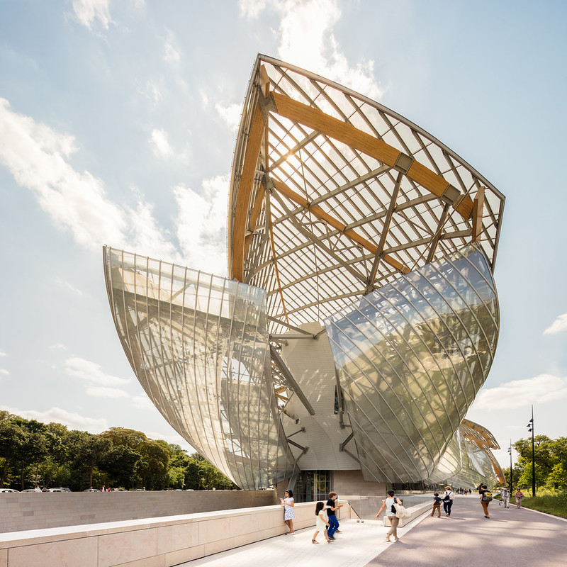 |
| Fondation Louis Vuitton. Photo ©Darren Bradley |
If anyone in Paris felt let down by Gehry's first attempt with the American Center, they are not likely to be disappointed by the Fondation Louis Vuitton. Bold, it certainly is.
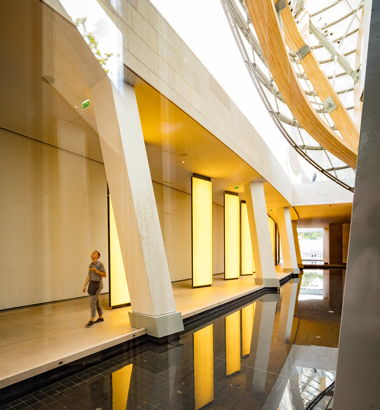 |
| View from the Grotto. Fondation Louis Vuitton. Photo ©Darren Bradley |
Gehry's office proudly states that much of the design was crowd-sourced. More than 400 people contributed design plans, engineering rules, and construction constraints to a shared Web-hosted 3D digital model. To be honest, the design does look a bit as if it were designed by a large group. I suppose the deconstructed chaos is the look that Gehry was trying to achieve, but I found my eye trying in vain to make some sense and order out of what I was seeing. And as a photographer, I had to resist the temptation to photograph only small details of the building, which would fail to convey the impression one gets by seeing the whole massive project.
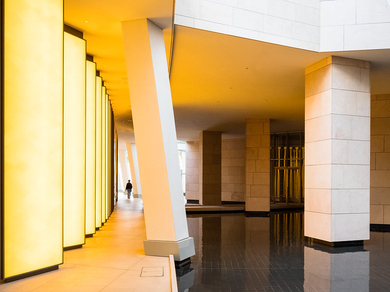 |
| More Grotto. Fondation Louis Vuitton. Photo ©Darren Bradley |
While there, I heard many people compare the forms to a ship - an image which is reinforced by the presence of so much water surrounding the structure.
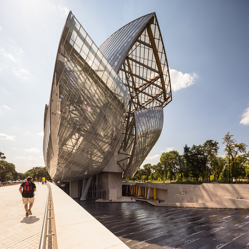 |
| The view most people will see first when approaching the Fondation Louis Vuitton. Photo ©Darren Bradley |
Gehry also apparently designed the fish lamps that hang above the restaurant that shares his name: "Le Frank". This reinforces the nautical theme, obviously.
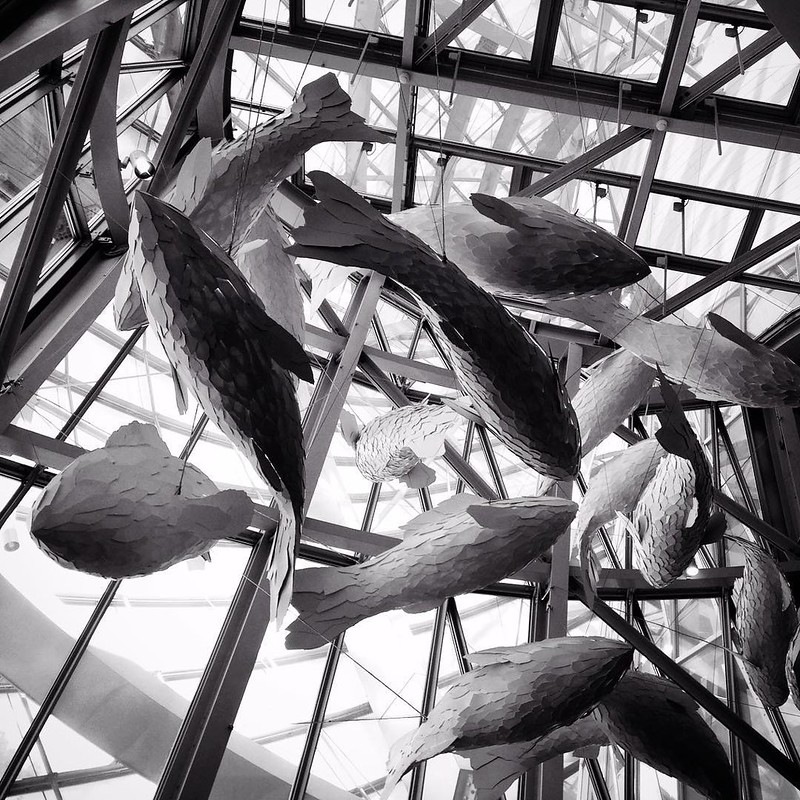 |
| Fish lamps designed by Frank Gehry, suspended over the restaurant that shares his name, "Le Frank". Photo ©Darren Bradley |
But curiously, in everything I've ever read about the project, Gehry instead cites as his inspiration the glass pavilions of the former World's Fair, the Grand Palais, as well as greenhouses in the park and the Jardin d'Acclimation.
I'm certainly no expert on contemporary art. Admittedly, I often fail to understand most of it (least of all its inflated value). So I'll refrain from commenting on the quality of the artwork in the Fondation. But I will say that it seemed as if the building was largely devoid of most artwork.
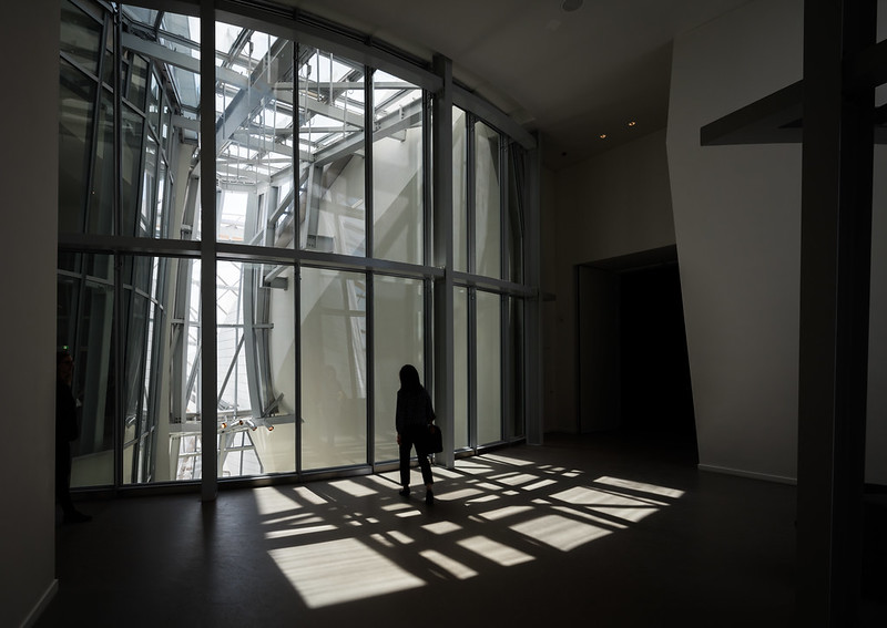 |
| Inside the Fondation. Photo ©Darren Bradley |
This left me to wonder if the whole point of the project was less about housing LVMH's art collection, as it was about having a large, marquee Gehry building in Paris.
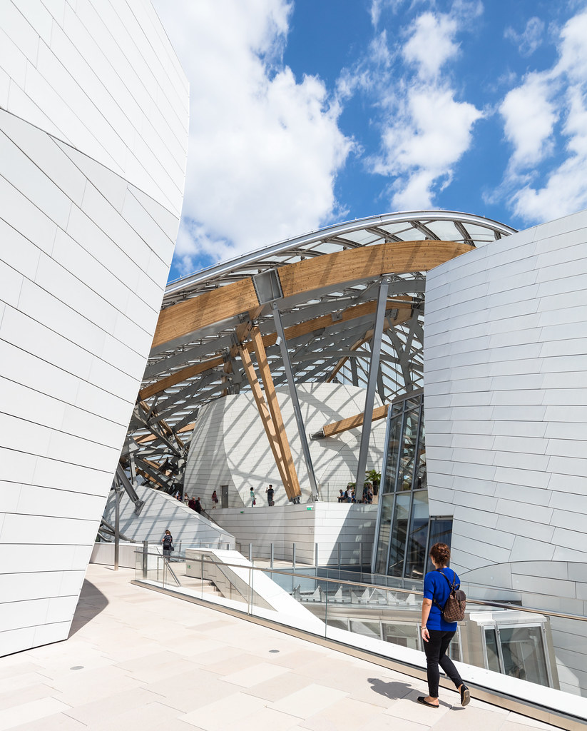 |
| Rooftop terraces at the Fondation Louis Vuitton. Photo ©Darren Bradley |
The new building is fun to wander around, with plenty of hidden and confusing passageways.
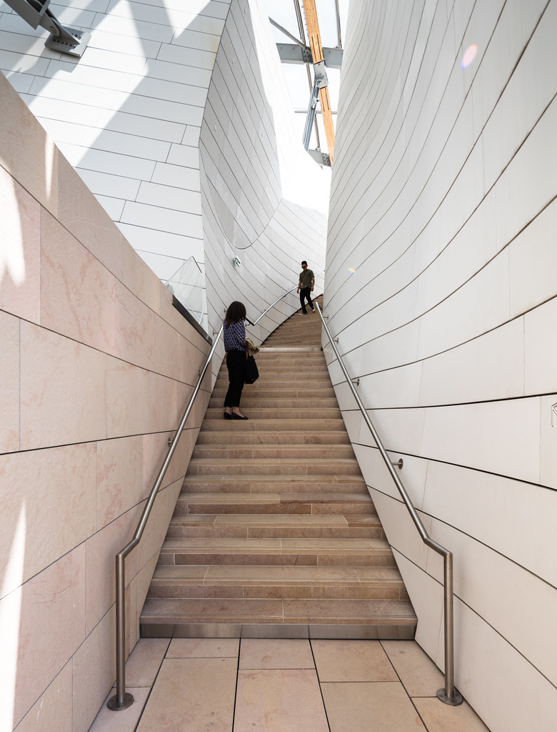 |
| Stairs on the rooftop terraces of the Fondation. Notice how they are curved to hide their destination. Photo ©Darren Bradley |
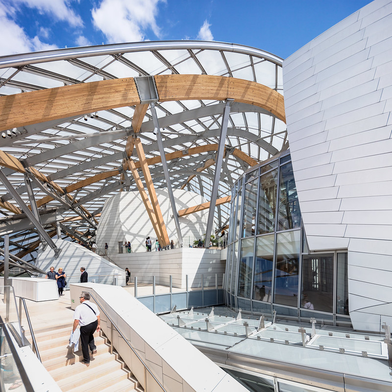
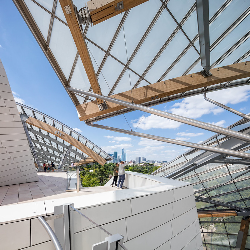
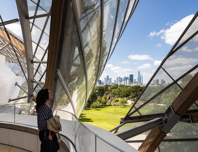
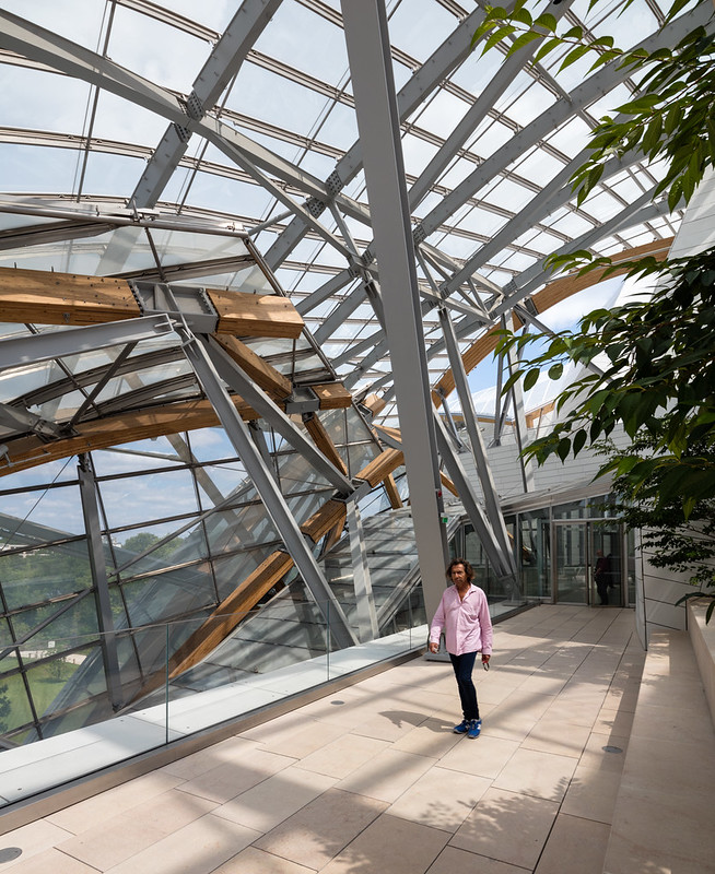
My favorite part was the series of rooftop terraces under the glass sails. The terraces include gardens and great views of the park and Paris in every direction.
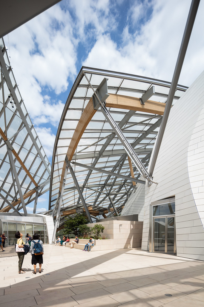 |
| Photo ©Darren Bradley |
The sails provide nice shade, as well as fascinating sculptural forms. Quite beautiful.
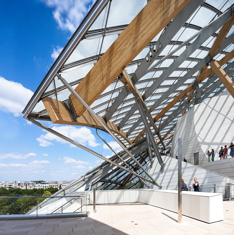 |
| Rooftop terraces at the Fondation Louis Vuitton. Photo ©Darren Bradley |
 |
| La Défense, as seen from the Fondation rooftop. Photo ©Darren Bradley |
Certainly, the building is an architectural and engineering marvel, and is now a must-see for anyone visiting Paris.
 |
| La Défense, as seen from the Fondation rooftop. Photo ©Darren Bradley |
And I will visit again, and try to take more time to really absorb the project and take the time to photograph it seriously (I was there with family, and no tripod, just taking snaps as I walked around). But for me, personally, I still prefer order, pattern, and even calmness in my architecture.
 |
| Photo ©Darren Bradley |


6 comments:
It reminded me of a galleon in full sail and it's certainly an arresting sight. But I think you're right - it's a vanity project but most buildings of this type are. If the earlier Paris building was Crumpletecture then this is certainly Tumbletecture...Like you, I reserve judgement.
very nice post thanks for sharing Best 4 Channel Amp
ggdb
kevin durant
kd shoes
off-white
bape
moncler
birkin bag
kd shoes
curry shoes
off white hoodie
Full Report the original source content replica bags online like this Dolabuy Louis Vuitton
Good information.
---------------------------
I work in rv interior wall panels
Post a Comment