 |
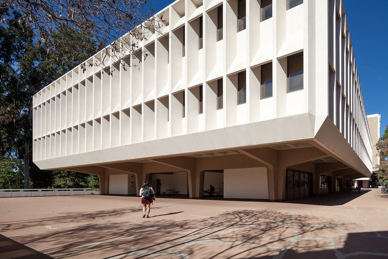
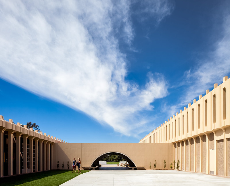
| Computer Science Building. Photo ©Darren Bradley |
Hell, he even made the cover of Time Magazine...

It was a bold plan at the time, and still is. Pereira wanted to create a sort of academic village in a wooded, hilly park. At the time, it was a barren hillside of treeless cow pastures. Instead of flattening the hilly terrain with bulldozers, he created floating white concrete platforms suspended over the ground on pedestals, that would support the buildings and present them like individual sculptures on display in a giant museum sculpture garden.
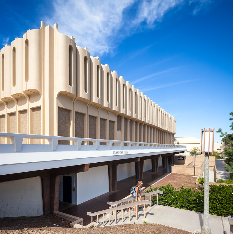 |
| Another view of Crawford Hall showing the platform it sits on. Photo ©Darren Bradley |
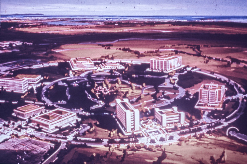 |
| Original 1963 rendering of UC Irvine by Pereira's office. You can see the ring concept, with Aldrich Park in the center. Rendering courtesy of UC Irvine Archives. |
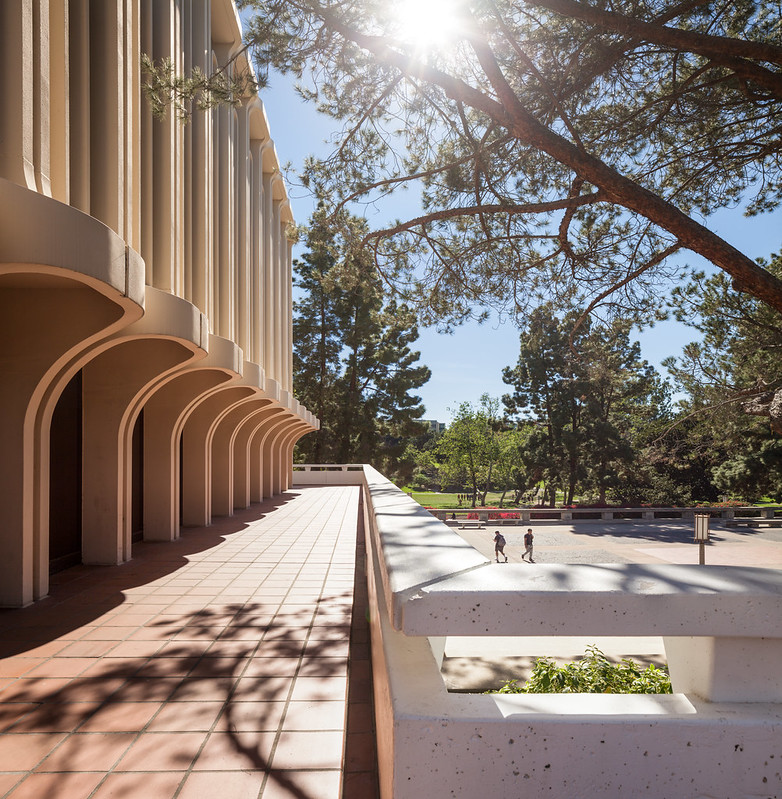 |
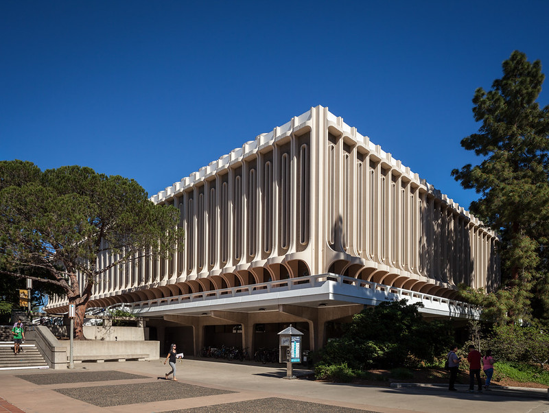
| Detail of the sun shades on the Langson Library. Photo ©Darren Bradley |
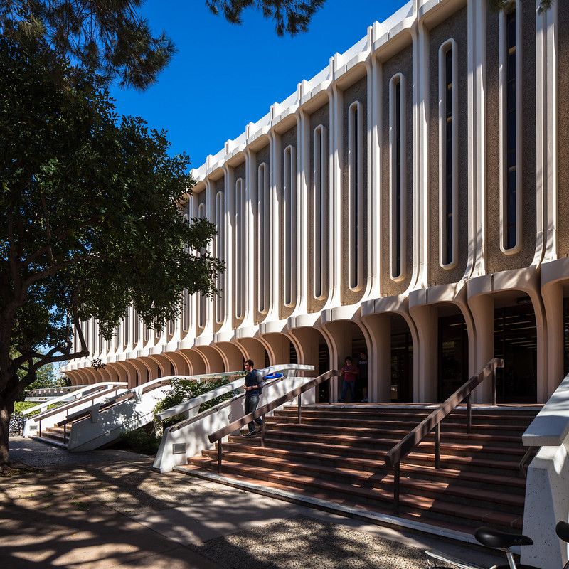 |
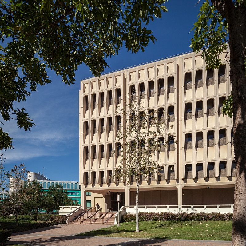
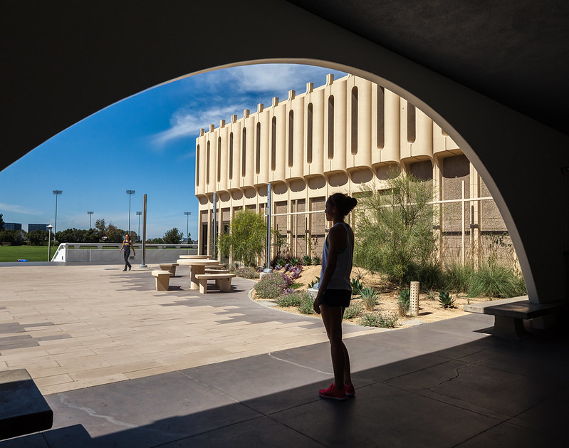
| The Langson Library by William Pereira Associates, with Jones & Emmons and Blurock Ellerbroek Associates (1963). Photo ©Darren Bradley |
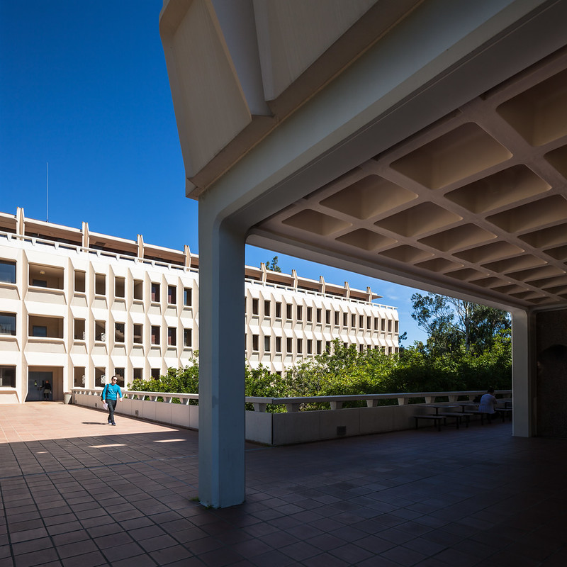 |
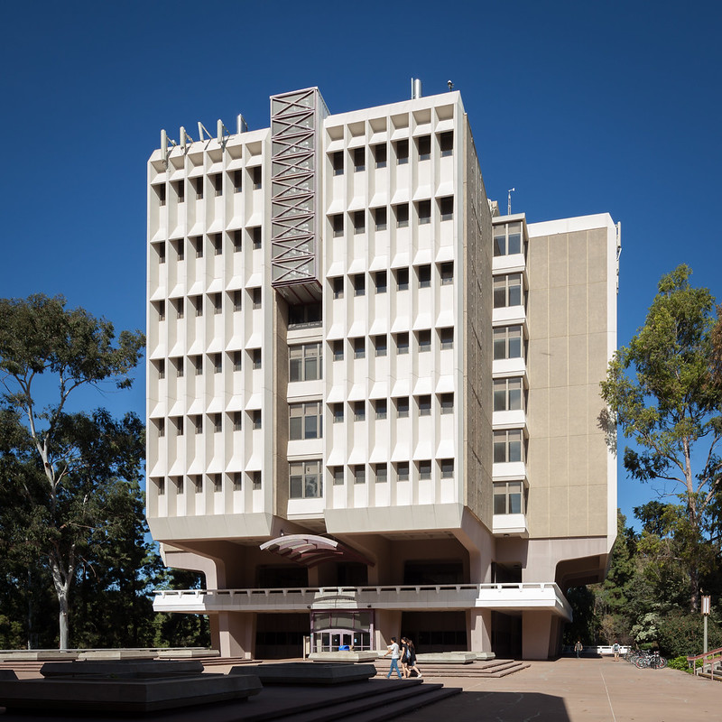
| Murray Krieger Hall was one of the buildings designed by Pereira personally, along with Jones & Emmons and Blurock Ellerbroek Associates (1963 - 1965). Photo ©Darren Bradley |
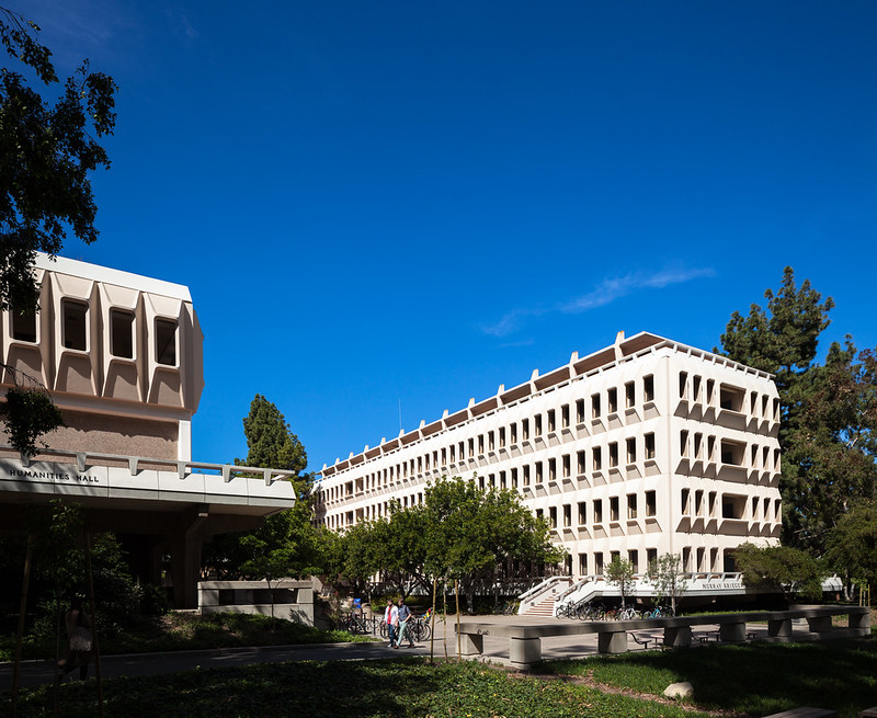 |
| Krieger Hall. Photo ©Darren Bradley |
It was a brilliant plan and the effect of these giant sculptures floating on the hillsides amongst the trees was - and remains - quite striking. Pereira's version of modernism - elegant, sculptural forms perched lightly within a natural landscape - was universally applauded and a huge success... until it wasn't.
By the early 70s, Modernism - and specifically Brutalism - was starting to be seen as a sort of dystopia rather than utopia. In fact, in 1972, the entire campus was used to represent an oppressive totalitarian state in the film "Conquest of the Planet of the Apes".
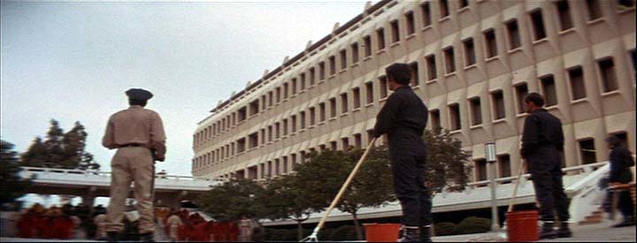 |
| Screen capture from the film "Conquest of the Planet of the Apes", with Krieger Hall in the background. |
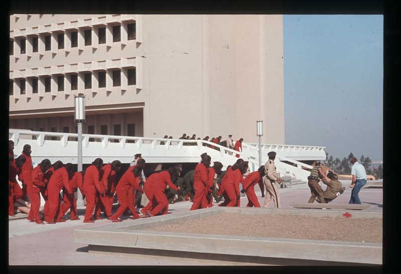 |
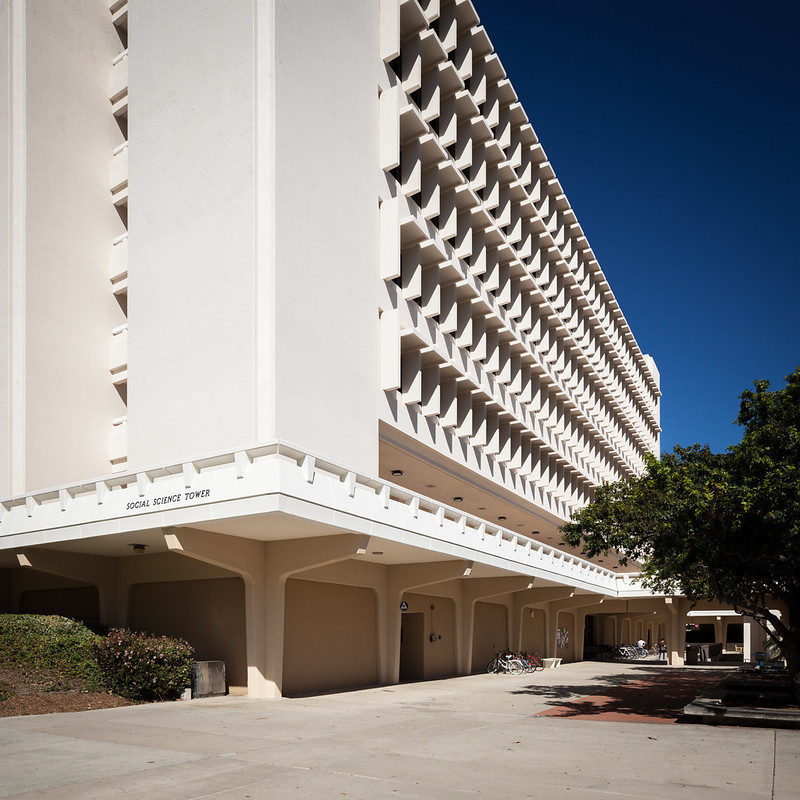
| Another screen capture from "Conquest of the Planet of the Apes. That's the Social Sciences Tower in the background, which was completed that same year and was probably not yet even occupied yet. |
In 1977, Pereira was replaced as campus architect by David Neuman, who immediately announced that he was throwing out Pereira's careful plan and that the campus was "growing up". By this, he meant that he was abandoning the pastural setting to create a more urban campus that no longer respected the circular design. Neuman invited post-modern architects like Charles Moore, Venturi & Brown, and Robert A.M. Stern to design new buildings on campus. Gone were the modernist patterns and details, as well as the concrete pedestals floating over the landscape. The bulldozers had arrived.
Charles Moore (a post-modern architect who has done some beautiful work, such as Sea Ranch, but who also designed one of my personal least favorite projects ever, the Piazza d'Italia in New Orleans), said of the UCI campus and Pereira's work that it "suffered from the failed optimism of the 1960s." Here's how Mr. Moore decided to improve the built environment on campus...
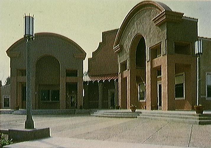 |
| Moore's University Extension Program building on the UC Irvine campus. I think my local strip mall borrowed this design for their Marshall's store. Photo courtesy of UC Irvine Archives. |
Leon Whiteson, architecture critic for the LA Times, wrote in a December 1988 article that Pereira's buildings were "over-scaled and boringly detailed."
I have a somewhat personal connection to UCI. In 1990-1992, my best friend at the time was a student here and I used to to stay with him in the dorms quite a bit. I remember already how interesting I thought the architecture was around the quad, but how he was telling me that everyone referred to the old buildings as giant cheese graters.
 |
| Another view of Krieger Hall by Pereira, with Jones & Emmons, and Blurock Ellerbroek (1963). Photo ©Darren Bradley |
As I was wandering around campus yesterday afternoon, I came up to Steinhaus Hall, which is one of the original buildings designed by Pereira in 1963. It originally looked like this:
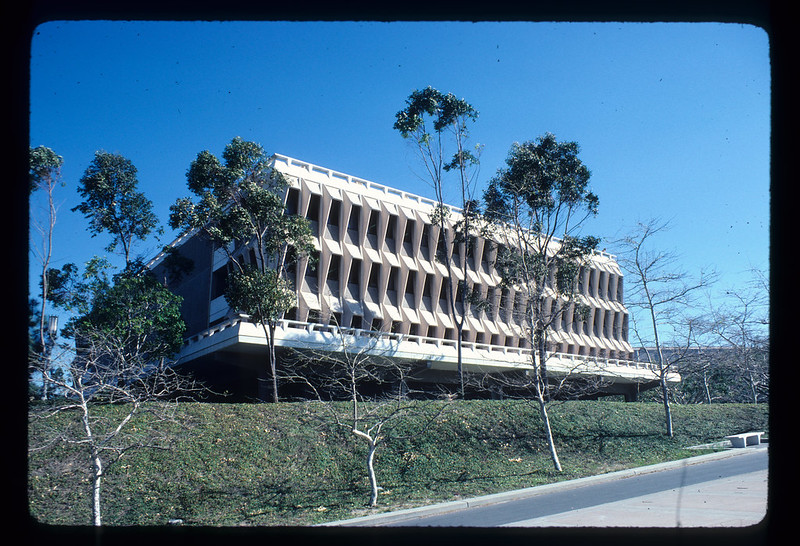 |
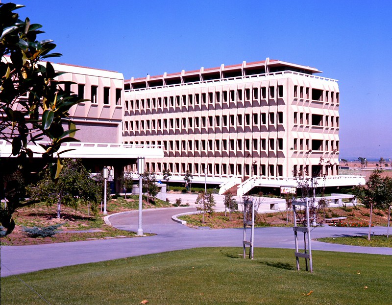
| Steinhaus Hall by William Pereira Associates (1963). Photo courtesy of UCI Archives. |
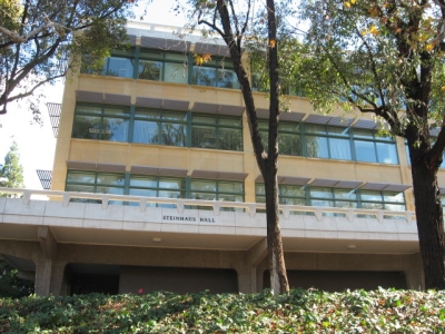 |
| I couldn't bring myself to photograph it. This is from UCI's website. |
For more information on another University of California campus that was (and continues to be) defined by its modernist/brutalist heritage, please check out my posts on UC San Diego here, here and here.
12 comments:
Beautiful images of a now somewhat dated vision of the perfect future.
Sadly, with brutalism, the baby has been thrown out with the bath water.
There is so much sophisticated thinking, rich form making and fine detailing to be found within brutalism but they've been discarded along with the worst failures of the 'style' by the general public AND most of the architectural profession.
Nice post. Thanks mate
Thanks for your comment, and great points. It is indeed a shame that so many people have dismissed the entire category of brutalism based on some of the worst designs. But it does feel like it's due for reconsideration and redemption. And it's nice to see some architects, such as Ando, who never abandoned it.
Seidler stuck with his love of off form concrete to the very end too.
This unknown person commenting is Rory :)
I was wondering if it might be you!
So beautiful. I need to get up there and walk around!
Terrific post! Thank you.
Check out my album of UCI Brutalism pics on Flickr at bit.ly/UCIbrutalism
Good post.
There is a new tool which can help you to get the perfect architectural shape of your future building. 3D laser scanner Houston, Texas can help to get the accurate and precise measurements of the geometrical shapes.
Got my ba from uci. The langston library and other like buildings are some of the ugliest forms of architecture I have ever had the unfortunate experience of seeing and using. Clearly, low cost student buildings was the idea, not utopia. The newer buildings such as the science library live up to the idealistic architecture I would expect from such an institution.
I was an undergraduate at UCI from 1979 through 1981. I was actually very happy there, but that was in spite of the horrible architecture. The Brutalist style is well-named--there wasn't a single classroom on campus with a window. The entrances to all the buildings were nondescript and well-hidden, and usually not at ground level. At the beginning of each quarter you'd see new students wandering around, looking lost, knowing their class was in there somewhere but unable to find the way in. All that beige and gray concrete, unrelieved by anything soft or warm or inviting...I never knew a student who liked it.
And, while I can't blame the Brutalist style, or maybe even the architect--the university might have wanted it that way--we can't forget the original Engineering building. It had eight floors, administrative offices on the first floor, classrooms and labs and faculty offices on the rest. The only women's restroom was on the first floor. The upper floors had just one restroom each, with urinals. All the secretaries worked downstairs, so who would ever need a women's room above that level? ��
I've been back to visit recently, and I could hardly find a building I recognized. I was a little sad, but on the whole, it's not a bad thing they've made the campus more visually diverse and welcoming.
Faculty at UCI reporting. These make me cry (in a good way). UCI is a forward leaning, perhaps slightly naively utopianistic place and the architecture fits it.
Many of the buildings still evoke strong feelings for me.
Post a Comment