 |
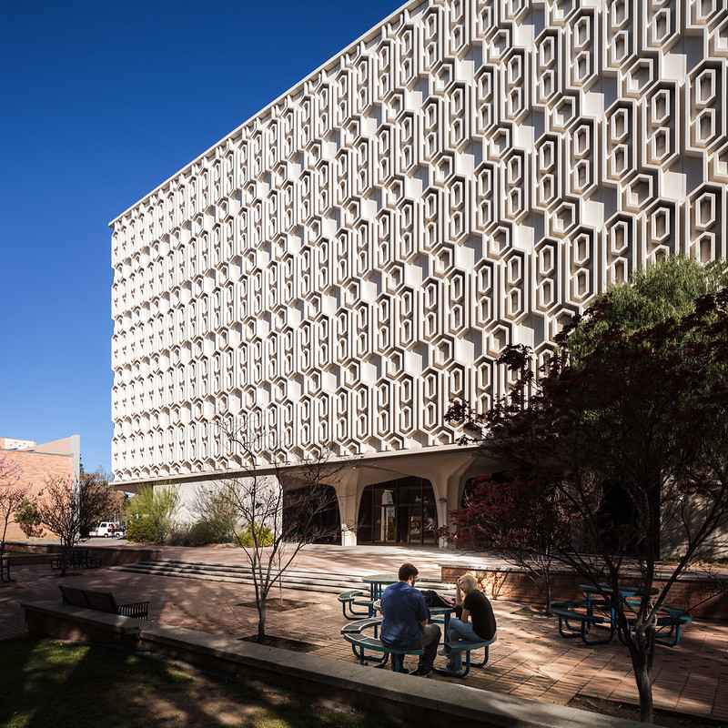
| Pollak Library at CSU Fullerton. Photo ©Darren Bradley |
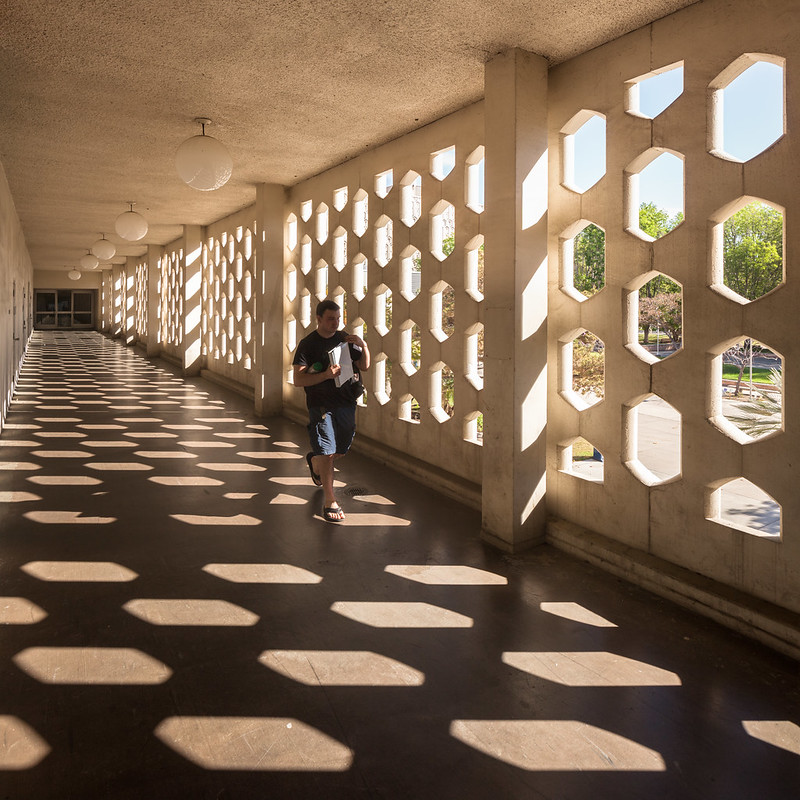 |
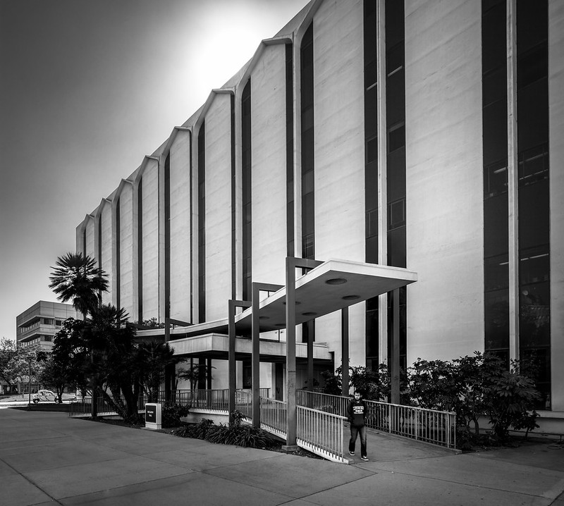
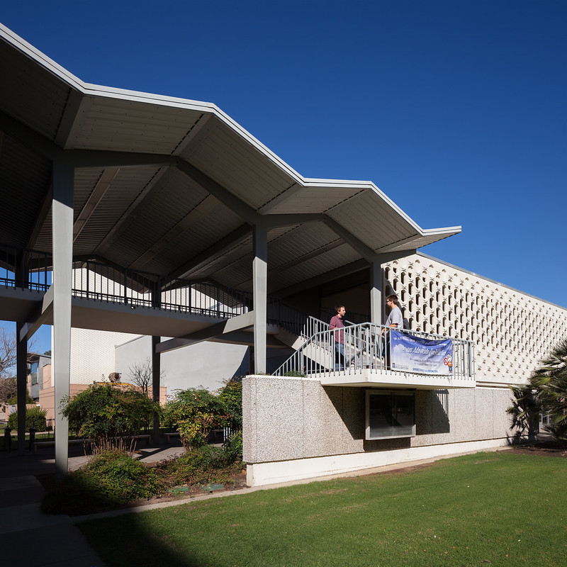
| Breezeway of the Joseph Clark Performing Arts Center. Photo ©Darren Bradley |
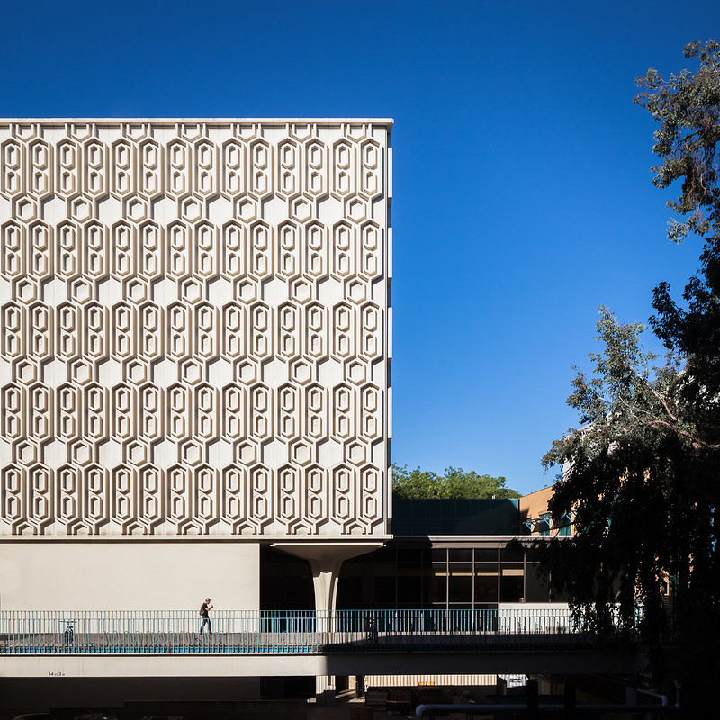 |
| Another shot of the Pollak Library. Photo ©Darren Bradley |
CSU Fullerton was primarily planned and designed by artist and architect Howard B. van Heuklyn, right about the same time that William Pereira was designing the University of California, Irvine. Van Heuklyn designed many buildings around Southern California and beyond in the 50s through the 80s, including academic buildings at Scripps Institute of Oceanography, UCLA, and this one, CSUF. In fact, van Heuklyn designed most of the buildings around the central core of the Fullerton campus.
That would explain why there is definitely a cohesive design theme present.
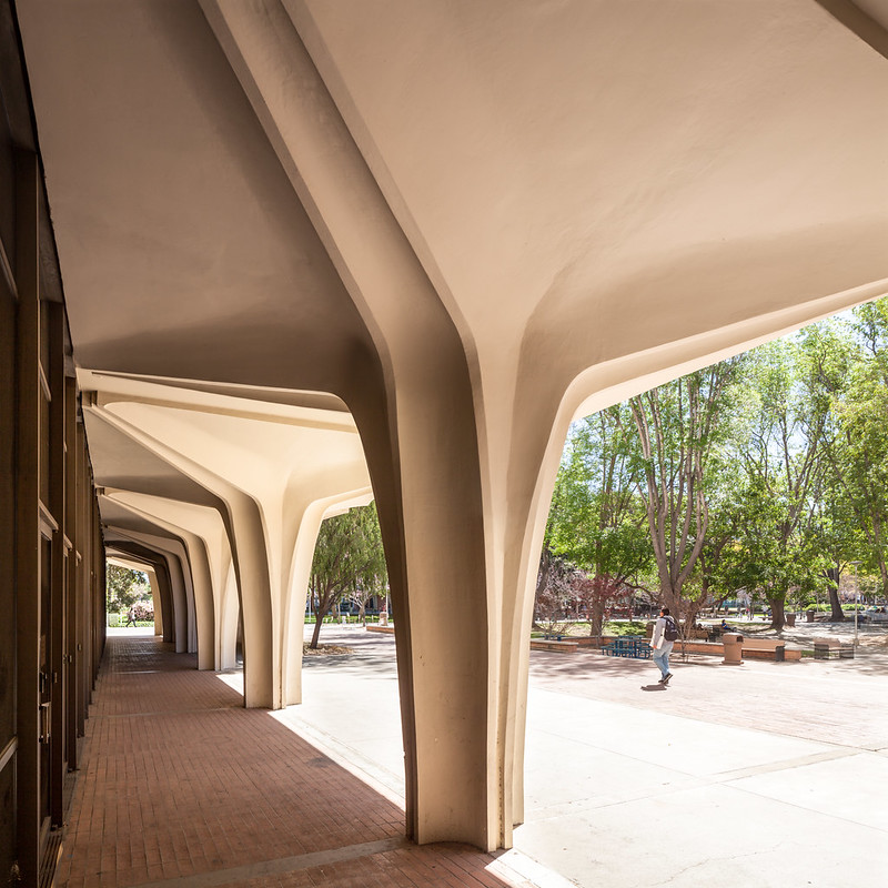 |
| Those columns are used on several of the buildings on campus. This is the library. Photo ©Darren Bradley |
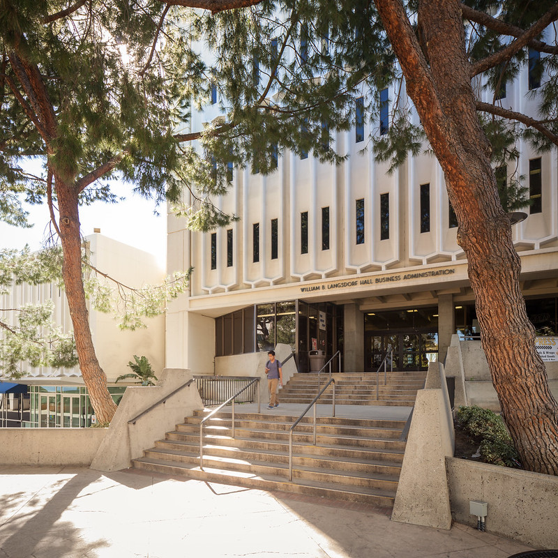 |
| Other side of Langsdorf Hall. Photo ©Darren Bradley |
I read that van Heuklyn was inspired for the design by the numerous Googie-style buildings in the surrounding area. But to be honest, I don't really see Googie here in his designs. This is more classic brutalist modernism.
Anyway, this is not a comprehensive set of photos of the modernist buildings on the campus. There were some that required an afternoon light (I was there in the morning), and I didn't have the patience to wait there all day, and forgot to go back later.
 |
| Titan Shops. Photo ©Darren Bradley |
 |
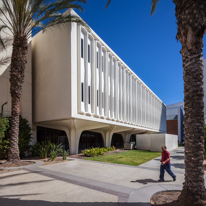
| McCarthy Hall. Photo ©Darren Bradley |
I'll have to make sure to be back in the afternoon next time to get the Titan Gym (complete with the Claire Falkenstein sculptures in the entry) and several other buildings in the right light.
In the meantime, go to Esoteric Survey for some additional photos and info.
For photos of another brutalist modern university campus in Orange County, go the my recent post in UC Irvine.
I'll blog more about Fullerton's architectural treasures later, if/when I find the time.
 |
| Last shot of the library. Photo ©Darren Bradley |

6 comments:
https://www.fiverr.com/s/7y8gtn
Darren,
great article as always.
When I am faced with problems similar to your blue banner, e.g. red hydrant, blue mail box, trash can, I try to either desaturate them into grey, or change colors to match the surroundings until they practically blend in.
Boris
Outstanding job photographing my alma mater! I always knew the architecture there was quite unique, but I could never quite capture it like you have. Kudos!
Here is my attempt:
http://ocstructure.blogspot.com/2014/08/short-campus-tour-of-cal-state-fullerton.html
Outstanding job photographing my alma mater! I always knew the architecture there was quite unique, but I could never quite capture it like you have. Kudos!
Here is my attempt:
http://ocstructure.blogspot.com/2014/08/short-campus-tour-of-cal-state-fullerton.html
Good post.
v2t48n9c59 l9w11t7l79 a0u38f5g21 v7w06k6z23 k5j74v7l50 b9n46i4a57
Post a Comment