 |
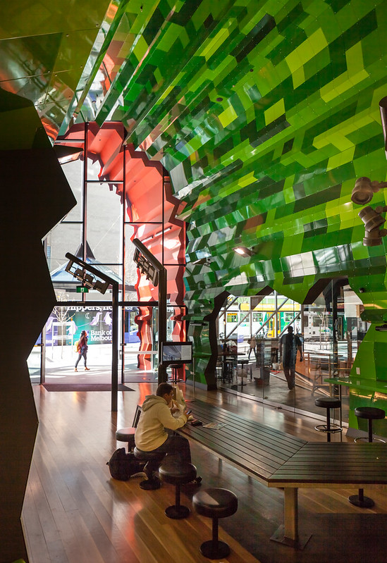
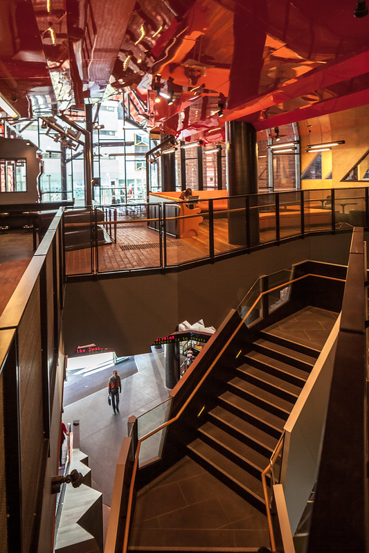
| One of many interior study areas at RMIT. Photo ©Darren Bradley. |
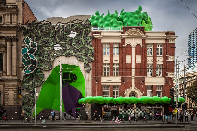 |
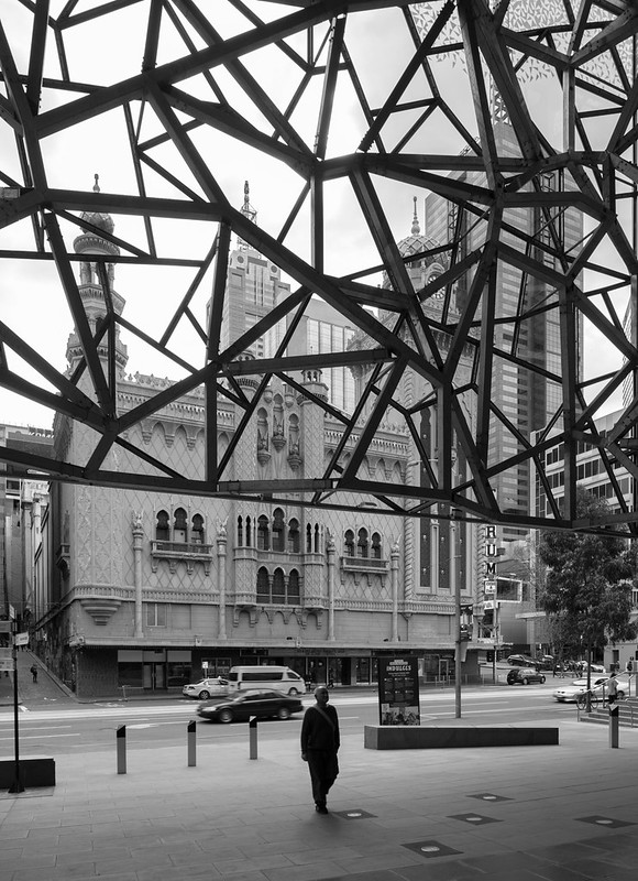
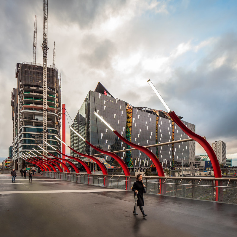
| I suspect that the building on the left may have done something to the building on the right. Both are part of RMIT. Both by the same architects (Ashton Raggatt McDougall - RMIT alums. Ian McDougall is an associate professor there, as well). The additions to the one on the right are more recent. Photo ©Darren Bradley |
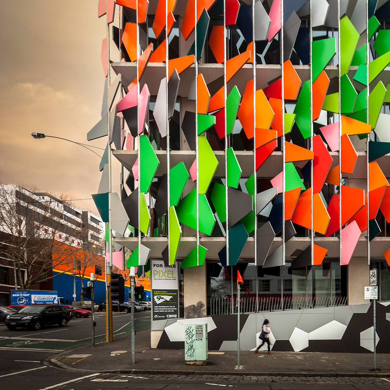
Modern architecture in Melbourne today has a unique and distinct character, compared to other cities I've been in. This is great in that it gives the city an identity.
But a lot of that design and architecture seems to be about flashiness for the sake of being flashy. It
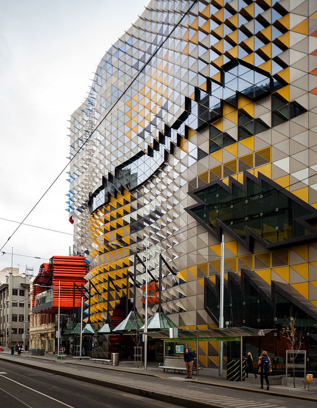 |
| Photo ©Darren Bradley |
Perhaps it's trying to make up for all of those years of conservatism in the past.
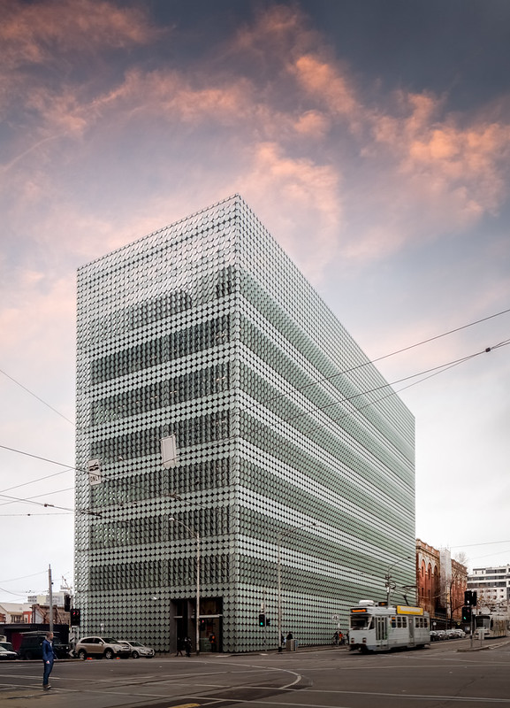
There is one notable exception on the "campus" of RMIT (the term "campus" used loosely here since it's really just a lot of buildings clustered loosely around the north end of Melbourne's downtown core). That building is the RMIT Design Hub by Sean Godsell.
 |
| Photo ©Darren Bradley |
It definitely stands out for its restraint. It's sheathed entirely in textured glass disks that can rotate to let in more or less light. The disks remind me of patterned brick from classic mid-century modern buildings like this one in Palm Springs.
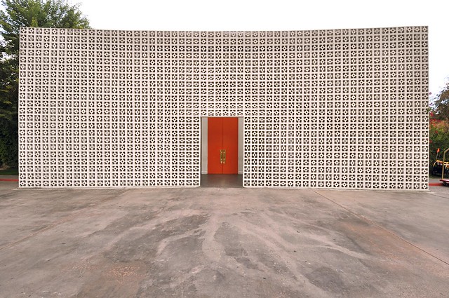
Here's another view of the RMIT Design Hub showing the scale.
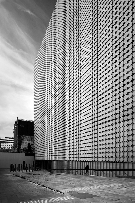
It's been criticized for its scale and lack of street presence, but I like the building quite a bit and appreciate it how it contrasts to its crazier counterparts in the neighborhood. It expresses a confidence, maturity, and peacefulness that the other designs seem to lack.
 |
| They are watching you. Photo ©Darren Bradley |
My dislike for post-modern architecture is pretty widely known (at least by people who know me), but I have to say that I do appreciate the whimsy of some of the post-modern designs that seem to be everywhere in Melbourne these days. They are fun. And some of them really work, functionally (like that RMIT building).
But overall, I suspect that many of these may not age well. Time will tell...
For more photos of Melbourne, please see my previous blog entry here.

2 comments:
Just read a book from 2006 about architecture and tourism, probably prompted by the 'Bilbao effect' but one of the essays made the point that architecture these days is often about 'spectacle', that is, to provide a visual landmark. That seems obvious when you look at most of the stadiums, galleries, cultural facilities designed by 'name' architects these days. And yes many Melbourne buildings of late are practically competing to be the most visually exiting. RMIT has commissioned architects since the 1980s who are the most experimental and the results are crowding around the upper end of Swanston Street, but the Lyons student centre has to be the most 'spectacular' of the lot. I think RMIT wanted it to be, so that goes some way to explaining the preponderance of such things there. But it prob all started with the very strong intellectualism of the 1980s post modern scene in Melbourne carrying on to become a culture of 'innovative' architecture, which often now just becomes 'look at me'. Some of them still have an intellectual basis, like Storey Hall - the green one - its about mathematic and brain power (really) - but many of the apartment towers are just fiddly to make them 'interesting' and get planning permission to go higher because of it.
rohan storey
Thanks, Rohan. Appreciate the comment. Yes, I understand the idea of architectural tourism and architecture as a spectacle. Not my favorite thing, but to each his/her own. As far as Storey Hall goes, I know it's called "the green brain" and it seems like ARM is going very literal on their interpretations these days (witness the Recital Hall). I don't really see the brain in that design, though.
Post a Comment