I've recently created a new website and am hosting my blog over there now.
So for the most recent blog postings, please head over to www.darrenbradleyphotography.com
Modernist Architecture
Modernism through the eyes of an architectural photographer.
Sunday, September 30, 2018
Sunday, June 10, 2018
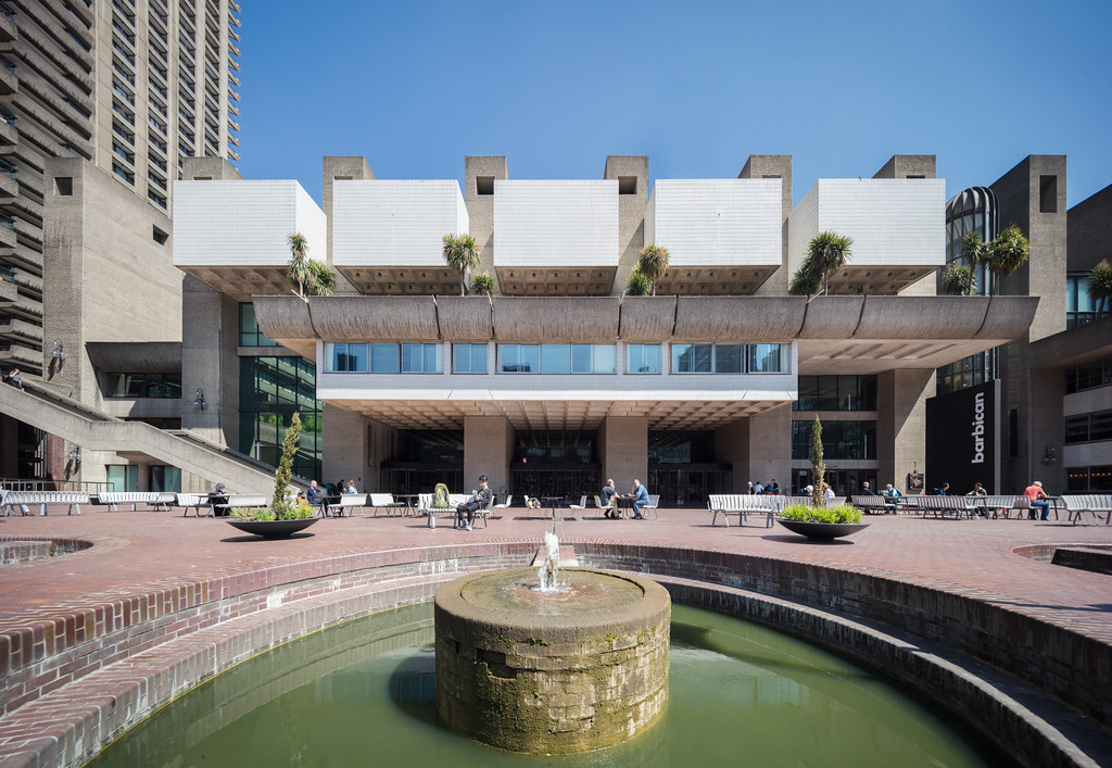
The Barbican Complex: Exploring London's Radiant City
I have been to London at least a dozen times - sometimes for extended periods for both holidays and for work. Also, I used to live in Paris, and it was an easy weekend trip from there. But believe it or not, until just a few weeks ago I had never been to the Barbican. Sure, I knew about it, and had always been meaning to visit. But to be honest, based on the photos I'd seen, I was never really blown away by it. Of course I thought it seemed interesting, but I wasn't really in a hurry to get there for some reason. It was on my list... just not at the top of it. Anyway, I finally did see it a few weeks ago, and now realize what an idiot I've been. The place blew me away. It's over 50 years old, and it's still revolutionary.
Sunday, June 3, 2018
Mixed feelings about the Venice Architecture Biennale...
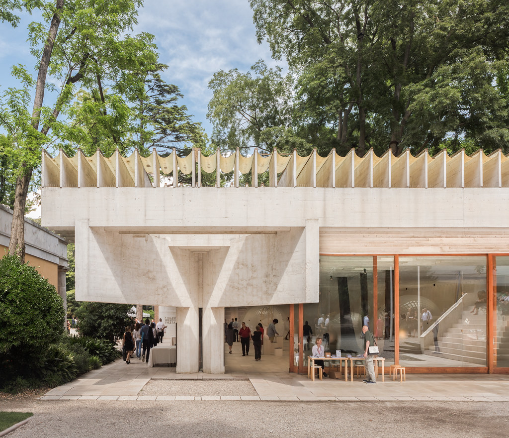 |
| My favorite pavilion at the Venice Biennale, the Nordic Pavilion by Sverre Fehn (1959). Photo ©Darren Bradley |
As you probably know if you follow my Instagram account, I just attended the opening week of the Venice Architecture Biennale. I was invited this year to exhibit some of my work, as part of the TIME SPACE EXISTENCE show at the Palazzo Bembo, which was a great excuse to finally get to see what is essentially the largest self-love event for architects in the world.
Monday, May 28, 2018
My Pilgrimage to Tomba Brion
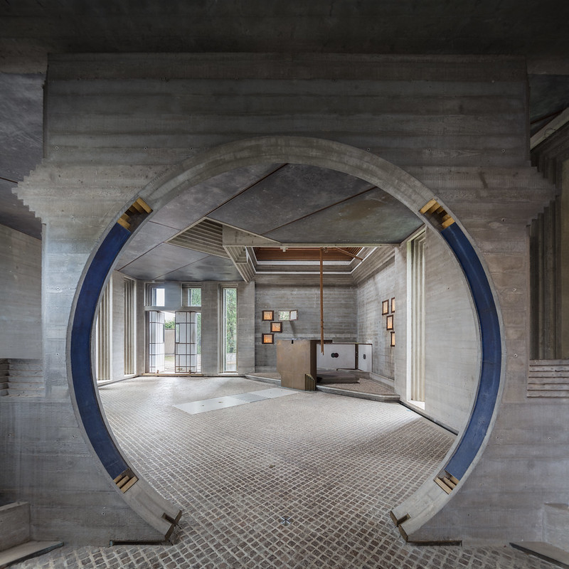 |
| This circular portal forms the entrance to the chapel. Photo ©Darren Bradley |
Thursday, June 29, 2017
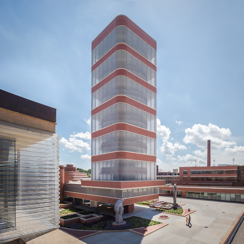
Rediscovering Frank Lloyd Wright in Wisconsin...
Ask most people how they first got into Modernist architecture (assuming, of course, that everyone is into Modernist architecture...), and the name of Frank Lloyd Wright almost inevitably comes up at some point. In fact, it's usually the starting point on anyone's journey of discovery about Modernist architecture... a sort of "gateway drug", if you will, before getting into the harder stuff like Le Corbusier's Brutalism or Mies van der Rohe's International Style. Even most people who don't care about architecture at all can usually name one architect: Frank Lloyd Wright. I suppose it's for these reasons that I tend to overlook Wright's work now. It's not that I don't love and respect it... it's just that it feels like I've moved on.
But then I was contacted by Travel Wisconsin, and invited to come out to their beautiful state to spend a week on the Frank Lloyd Wright Heritage Trail, to celebrate Mr. Wright's 150th Birthday. Wright is from Wisconsin, of course, and many of his most iconic works are located there. It was an offer that was to good to pass up. I've travelled around the world, but I've never been to Wisconsin. And while I had been in some FLLW homes and buildings, getting a chance to see mythical places like Taliesin and the Johnson Wax Factory in person was a dream come true. It was also a chance for me to take a fresh look at an iconic architect I thought I already knew well. It was one of the best weeks I've every spent - a truly once-in-a-lifetime experience.
Sunday, March 19, 2017
Canberra: The Palm Springs of Australia?
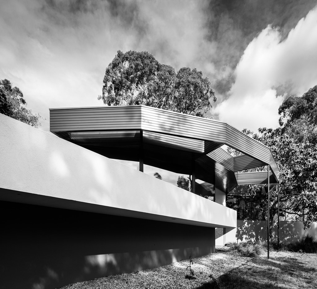 |
| The Benjamin Residence, or "Round House" as the locals call it, was designed by Alex Jelinek in 1956. Photo ©Darren Bradley |
Yes, yes. I know. On the face of it, it seems like an absurd claim. Australia's sleepy little capital city has been called a lot of things over the years, but "Palm Springs-like" is not generally one of them. The city was essentially invented in the early 20th century as a compromise between rivals Sydney and Melbourne, who were both vying for the right to be the nation's capital. It's an administrative city, full of bureaucrats, technocrats, and diplomats. It's a staid, conservative place full of monuments, trying hard to convey both a sense of civic identity and national gravitas. It's very much like a smaller version of Washington, DC in that respect. It was not invented for leisure.
Sunday, February 26, 2017
Exploring [Late] Modernism in Santa Rosa, California
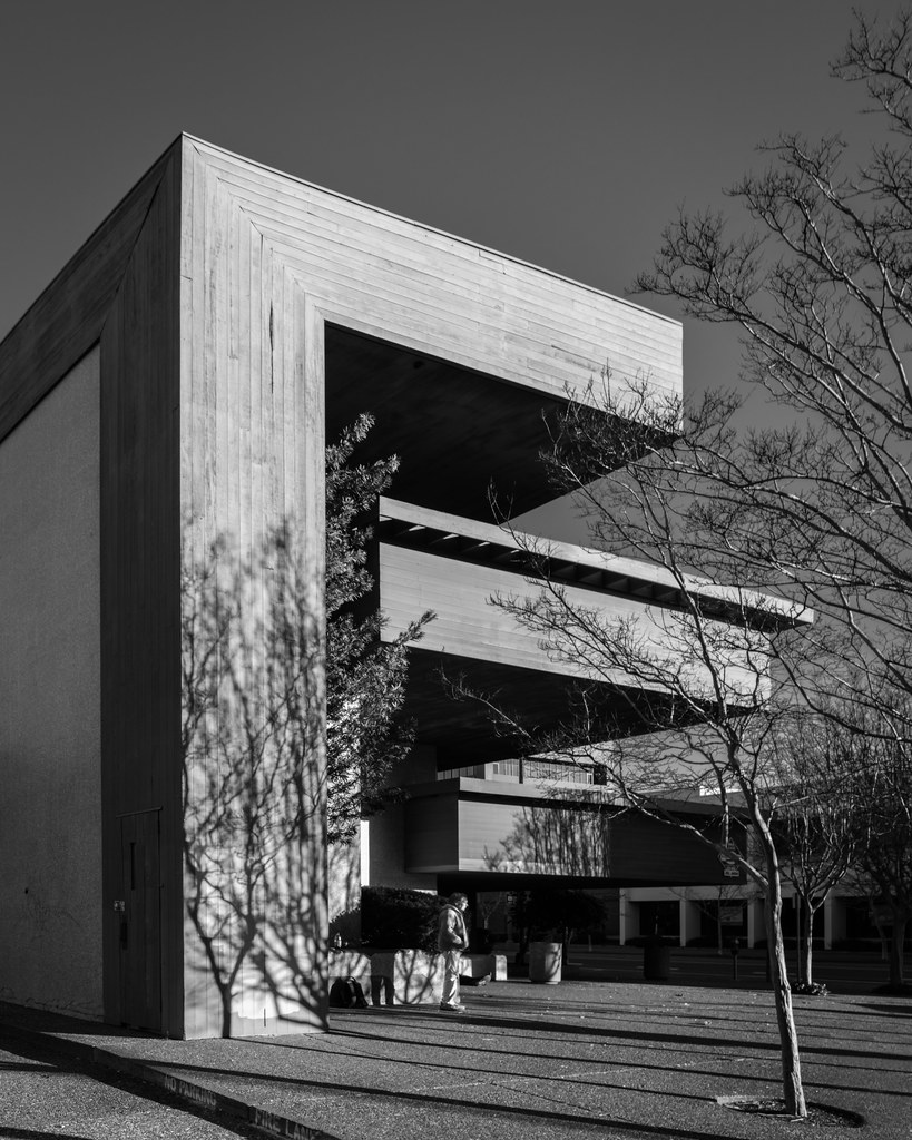 |
| An abandoned bank in downtown Santa Rosa. Photo ©Darren Bradley |
Mid-Century Modernist architecture is far from safe these days. But there’s a growing contingent supporting its preservation, and it’s now finally starting to at least be recognized - if not valued - by the public at large. The same cannot yet be said for its generally unloved - or at least under-appreciated - younger sibling, Late Modernism. Often confused with (*shudder*) Post-Modernist architecture, which admittedly overlaps it a bit, it’s nonetheless it’s own distinct genre, and one that is more firmly planted in the Modernist design philosophies that preceded it than in the post-Modernist follies that followed. And strange as it may seem, I’ve just discovered that one of the best places to experience this type of architecture is in Santa Rosa, in the heart of Sonoma County.
Saturday, February 4, 2017
Mission Valley Macy's: What's Left of San Diego's Modernist Mecca
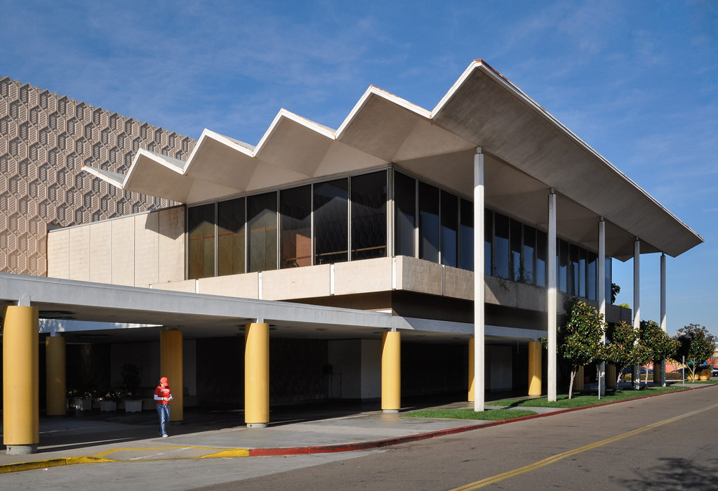 |
| The former restaurant of what was once May Co. department store at Mission Valley Center. Photo ©Darren Bradley |
Anyone who's ever spent any time in San Diego will probably recognize this place. It's hard to miss. This Macy's department store at Mission Valley Center is strikingly clad entirely in formed concrete hexagons around its entire exterior. Even cooler, there's a cantilevered glass box attached to the south side, closest to the freeway, with a great bi-fold roof. The building has anchored Mission Valley Center since 1961, and it's become a landmark in the city. But with Macy's closing, its days may now be numbered...
Thursday, January 12, 2017
A Funny Thing Happened on The Way To The Forum...
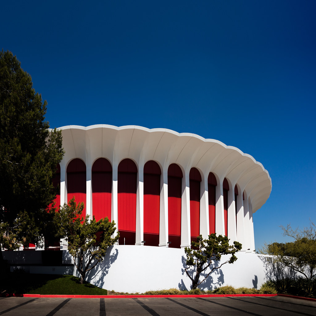 |
| LA Forum by Charles Luckman (1967)... See what I did there with the title of the blog? I know... I crack myself up. Photo ©Darren Bradley |
Sunday, January 1, 2017
Double Diamond: My Summer Adventure in the Hamptons
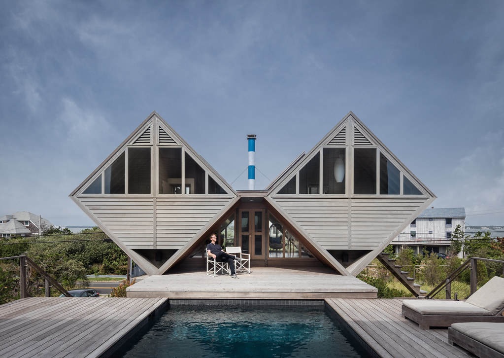 |
| The Pearlroth House (aka "Double Diamond") on Westhampton Beach, NY. Photo ©Darren Bradley |
Welcome to the Pearlroth House, otherwise known as the Double Diamond. Like many of the homes designed by architect Andrew Geller, this one seems to defy gravity. It's completely over-designed and over-engineered for a modest little 600 square foot beach house, and that's exactly what I love about it.
Subscribe to:
Comments (Atom)
